

Painting your house is one of the quickest ways to completely transform its character. But let's be honest about the nightmare scenario that keeps every homeowner up at night: spending thousands of dollars on labor and materials, only to watch the scaffolding come down and realize your "warm neutral gray" looks like a cold, institutional blue.
Here is the thing: learning how to test paint colors before painting isn't just about painting tiny wooden sticks or slapping a random 6-inch patch onto a corner board.
To preview paint colors accurately, you have to understand how color pigment behaves when multiplied across hundreds of square feet of siding or drywall. The secret to a flawless result isn't luck—it's having a reliable process to try paint colors in real-world conditions before committing a single cent to a full crew.
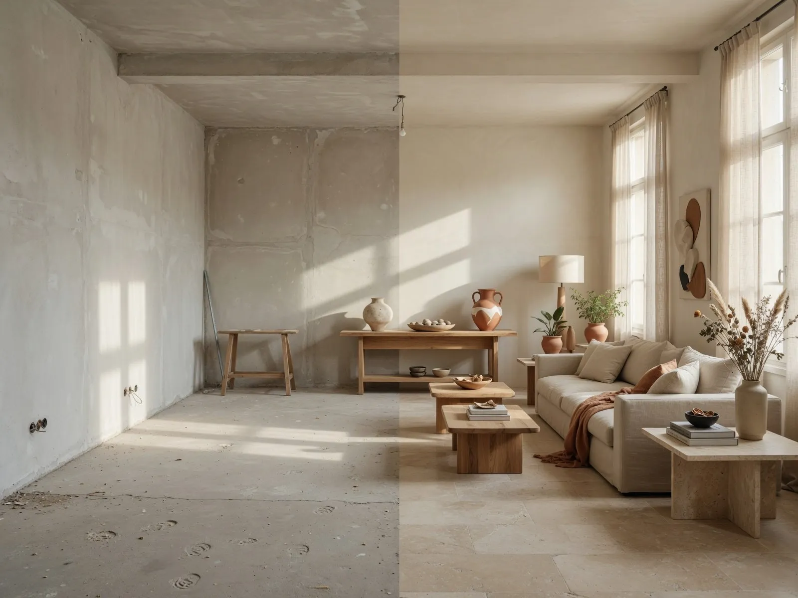
Why Paint Colors Look Different on a House
Ever wonder why a swatch that looked soft and creamy inside a bright home improvement store turns aggressively yellow or muddy once applied to your exterior wall?
It comes down to scale, context, and light absorption.
When you look at a tiny 2x2-inch paper swatch, your eye evaluates the color against a white cardboard backdrop under intense, cool fluorescent bulbs. But when you apply that same paint color visualization to a real structure, three massive environmental forces take over:
- Reflective Volume: Color intensifies as surface area grows. A subtle undertone on a small card becomes 10 times more prominent across an entire two-story facade.
- Surrounding Reflection: Your green lawn, neighboring red-brick walls, and dark asphalt driveway bounce colored light straight onto your house.
- Finish and Texture: Stucco, wood siding, smooth drywall, and rough brick all absorb and reflect light differently, drastically shifting how dark or light the hue appears.
Understanding that a paint color looks different once applied to a real-world building is the crucial first step toward taking control of your palette.
Test Colors in Natural Daylight
Light is the single biggest factor that changes how paint behaves. If you want to test paint colors in natural light, you need to stop evaluating swatches indoors under kitchen lighting.
Take your color concepts outside. Direct exterior paint color sunlight strips away subtle undertones and exposes the true base pigment.
Key Rule of Outdoor Sunlight: High-intensity paint color daylight washes out light shades by up to 20%. A off-white shade that looks rich and grounded in your kitchen can turn into a blinding, featureless white on a south-facing exterior wall.
If you are aiming for a crisp look outdoors, pick shades that are slightly darker and more muted than what you think you need indoors. The midday sun will do the rest of the work softening the color for you.
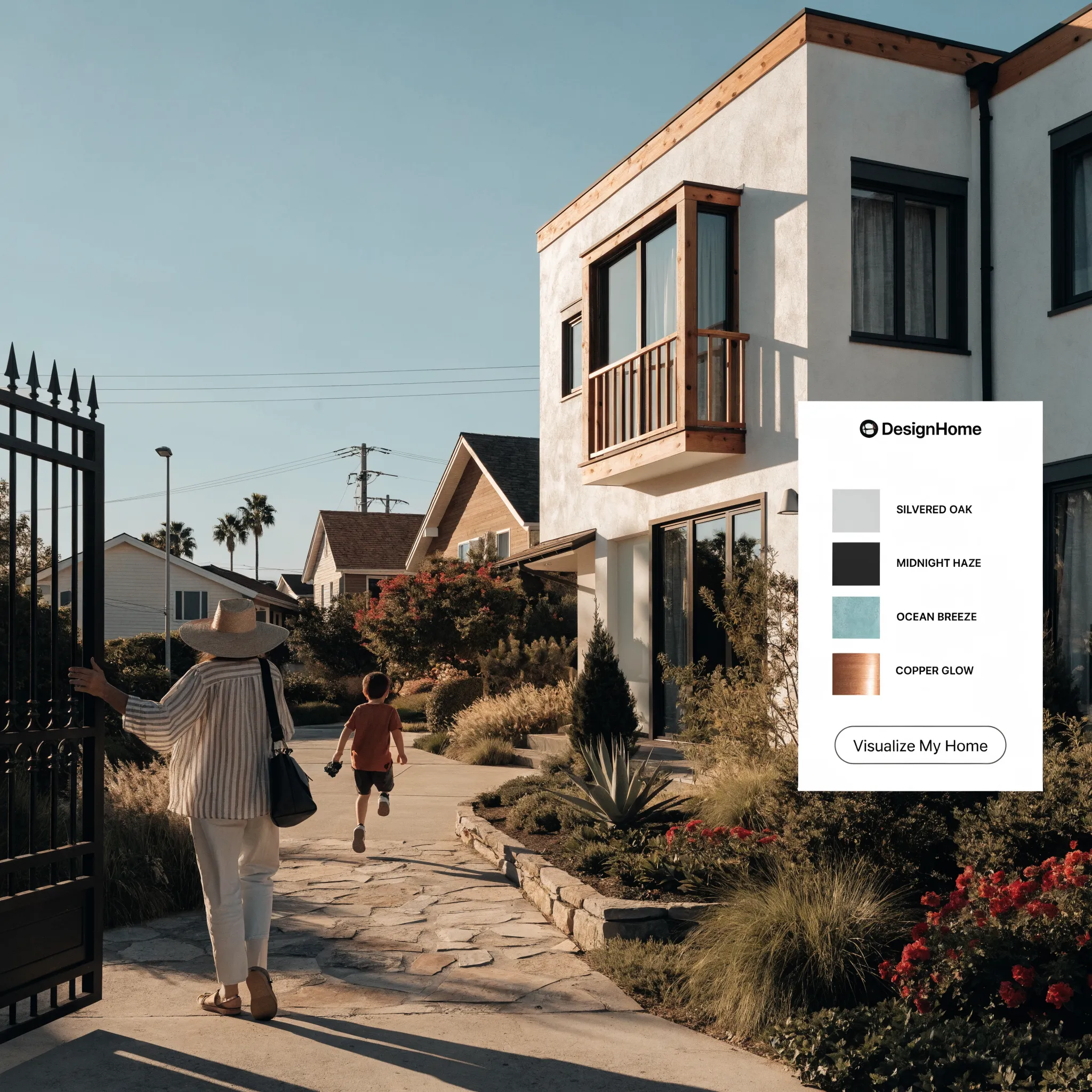
Check the Color in Morning, Afternoon, and Evening Light
Here’s a common trap: painting a test swatch at 10 AM, loving how it looks, and immediately placing the full paint order.
Then 6 PM rolls around, the sun sets, and your beautiful mineral greige suddenly shifts into a dreary, flat purple.
To test paint color in different lighting, you have to track its behavior across the entire 24-hour sun cycle. The warmth and angle of natural light shift dramatically throughout the day:
- Morning Light (Golden & Low): East-facing light brings out warm yellow and red undertones, making soft creams look extra rich and deep tones feel inviting.
- Afternoon Light (Direct & Intense): Overhead sunlight flattens visual texture, making colors appear significantly lighter and exposing hidden undertones.
- Evening Light & Shadows (Cool & Blue): West-facing dusk and northern shade throw cool, blue-tinted shadows across your walls, which can make gray and beige tones feel cold or muddy.
Checking your evening paint color under real ambient shade ensures there are no unpleasant surprises when the sun starts to drop.
Test Paint Colors Against Your Existing Exterior
Your paint doesn't exist in a vacuum. Unless you are building from scratch, your new paint color has to share space with fixed architectural elements that aren't changing anytime soon.
Applying visual Gestalt principles, the human brain constantly seeks harmony between neighboring objects. To properly test exterior paint colors, you must evaluate sample patches directly alongside your permanent trim and masonry finishes.
Hold your sample previews right up against:
- Your roof shingle line or tile overhang
- Fixed stonework, brick cladding, or foundational concrete
- Window casing finishes and aluminum gutter lines
- Unpainted hardwood decks or porch flooring
An exterior paint color test that ignores these fixed textures will always result in visual friction. If your roof carries warm brown tones, pairing it with a stark, cold-gray body paint will make both elements clash—no matter how nice the paint looked on its own.
Compare Several Paint Colors Side by Side
Never test just one color at a time. Evaluating a single swatch in isolation forces your brain to guess its undertones, which almost always leads to mistakes.
To make an accurate decision, apply Hick’s Law: limit your selection to three or four strong contenders, then compare paint colors directly side by side.
When you perform a direct paint color comparison, subtle differences immediately become obvious. The "neutral gray" sitting next to a true cool gray will instantly reveal whether it leans green, purple, or blue.
Comparing options together takes the guesswork out of the process, leaving you with a clear winner.
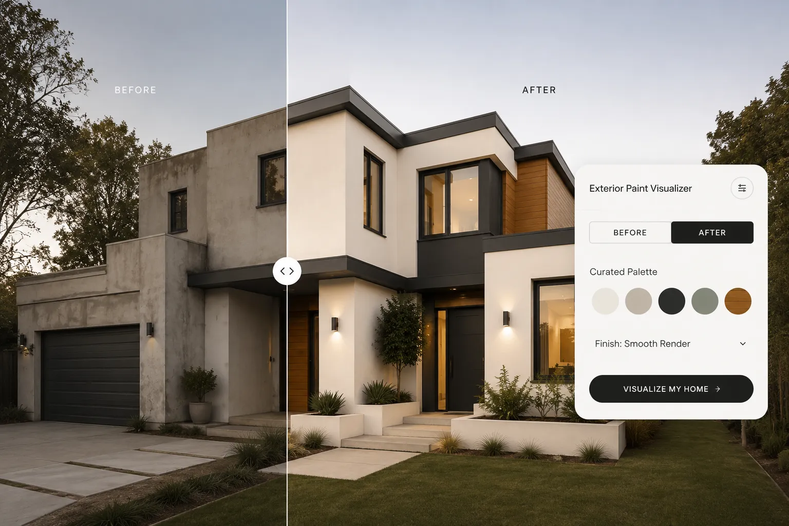
Test Paint Colors on Different Parts of the House
Different areas of your home serve completely different visual roles. Applying a single wall color across every accent zone flattens your home's geometry and destroys its depth.
When planning exterior paint color combinations, test your proposed colors across three distinct architectural zones:
- The Primary Body (60%): Test main siding, stucco, or brick colors on large flat wall areas to evaluate overall visual weight.
- The Framing Trim (30%): Apply potential trim shades to window casings, roof eaves, and corner boards to verify shadow line contrast.
- The Accent Point (10%): Run a front door color test on your entry focal point using bold, high-contrast accent options.
Testing placement variations helps you build a balanced house color combination where every architectural element plays its proper role.
Preview Paint Colors Without Painting the Wall
Let's address the elephant in the room: buying dozens of liquid sample pots, cleaning brushes, painting messy patches on your walls, and trying to sand them flat later is exhausting, messy, and expensive.
Worse yet, many people assume that properly previewing a home redesign requires mastering complex 3D software or hiring an expensive architectural rendering agency just to predict basic paint outcomes.
It doesn't have to be a struggle.
You don't need technical skills or a huge budget to visualize paint colors with complete accuracy. Modern visual technology has made testing paint an enjoyable, creative experience rather than a tedious chore.
By using DesignHome Synthesis™, you can bypass messy physical samples entirely. Simply upload a photo of your existing room or exterior facade into our intuitive layout intelligence system to test a wide variety of custom colors instantly.
Unlike simple photo filters or flat color fill tools, DesignHome Synthesis™ evaluates real-world lighting models and architectural surface textures. You can test dark charcoal body paint, warm alabaster trims, and stained timber front doors on your actual home before opening a single can of paint.
Testing your home design becomes an inspiring, stress-free process that saves you time and protects your budget.
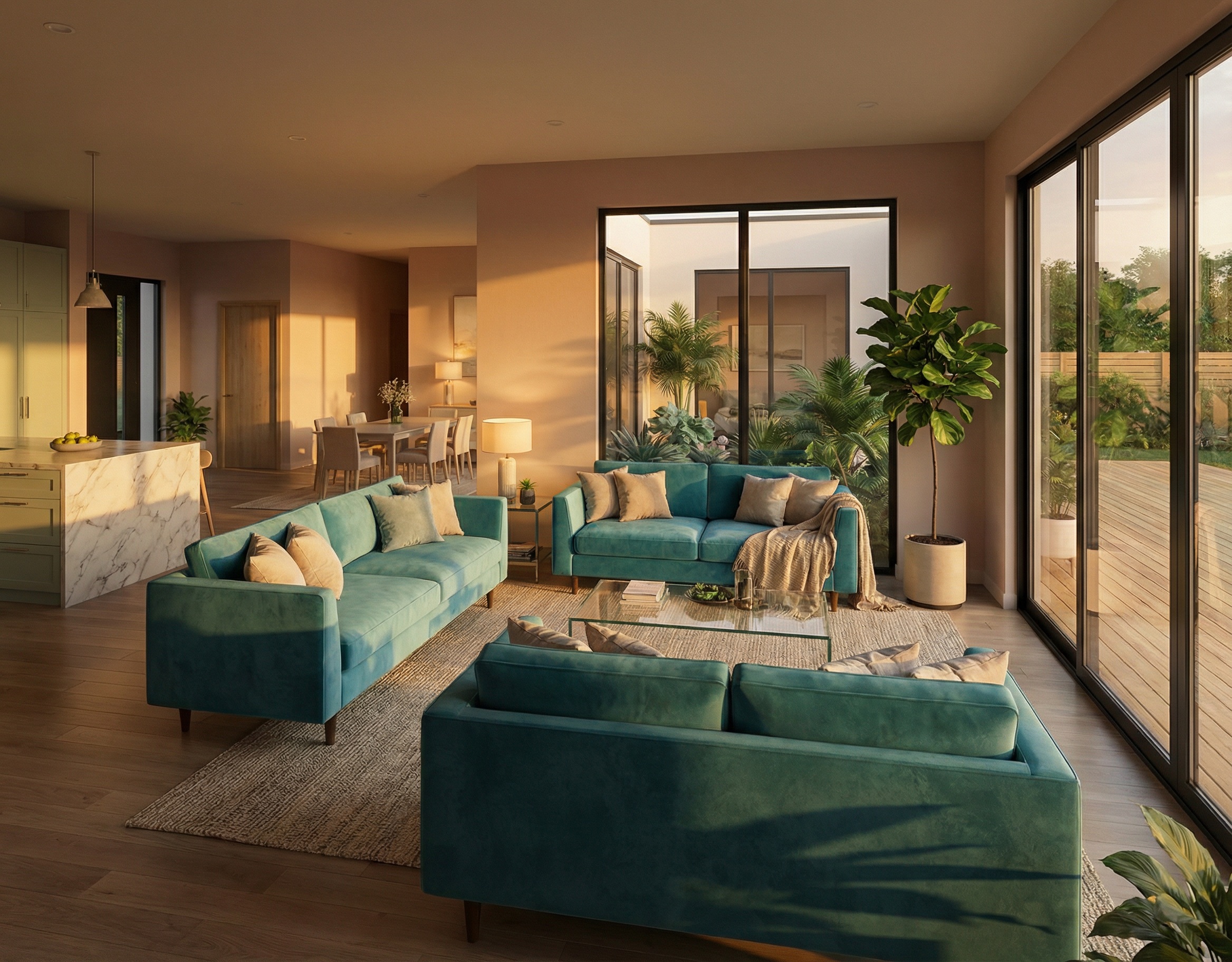
Test Interior Paint Colors Room by Room
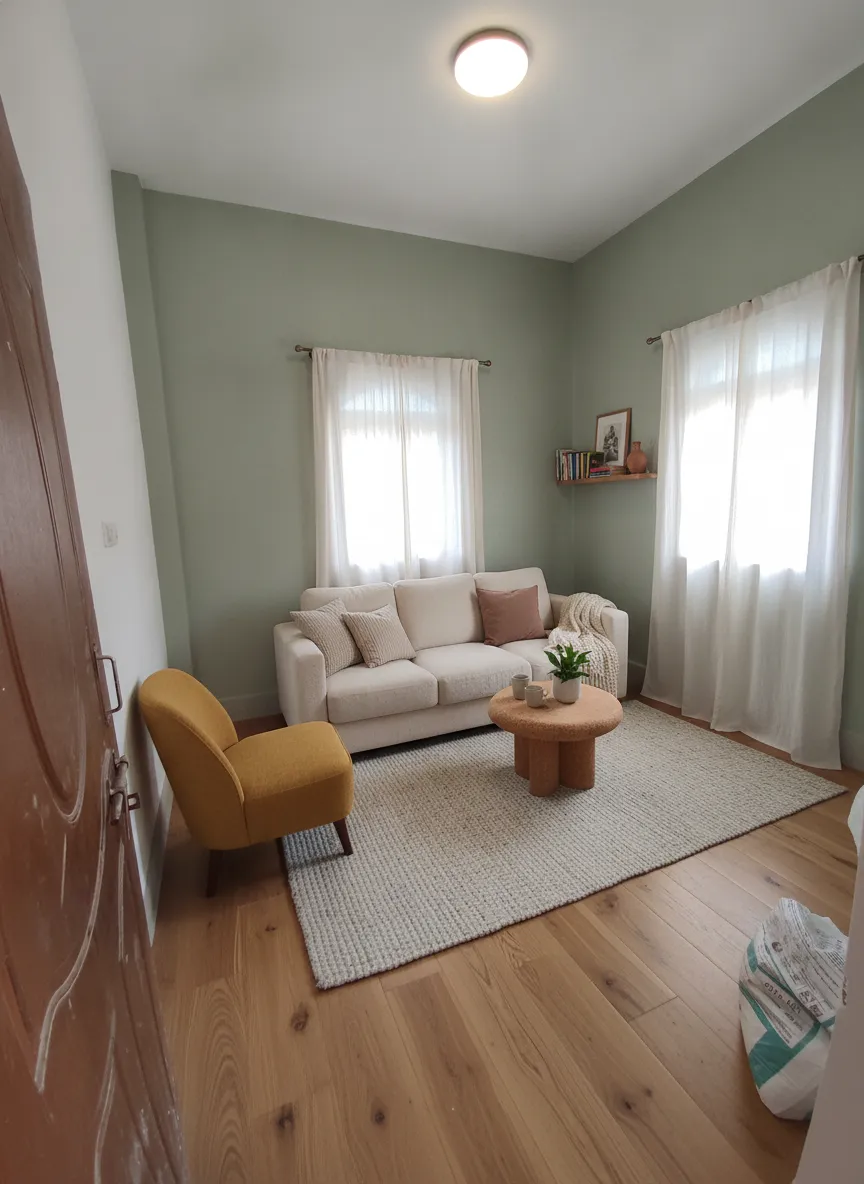
The rules shift when you step inside. While exterior paint responds to sunlight, indoor wall colors depend heavily on window orientation and artificial lighting.
When you test interior paint colors, evaluate each room as its own distinct environment:
- North-Facing Rooms: Receive cool, diffused light that exaggerates blue or green undertones. Warm tones balance out these space nicely.
- South-Facing Rooms: Flooded with warm, continuous light all day long. These spaces can handle cooler grays, deep blues, or rich earth tones without feeling dark.
- Windowless Spaces (Hallways & Baths): Rely entirely on artificial bulb temperature. A 2700K warm LED bulb makes yellow undertones pop, while a 4000K daylight bulb brings out cooler grays.
Using a reliable room paint color visualizer lets you check how colors transition from the hallway into bedrooms, ensuring a smooth, cohesive palette throughout your entire home.
Test Exterior Paint Colors Before Painting Your House
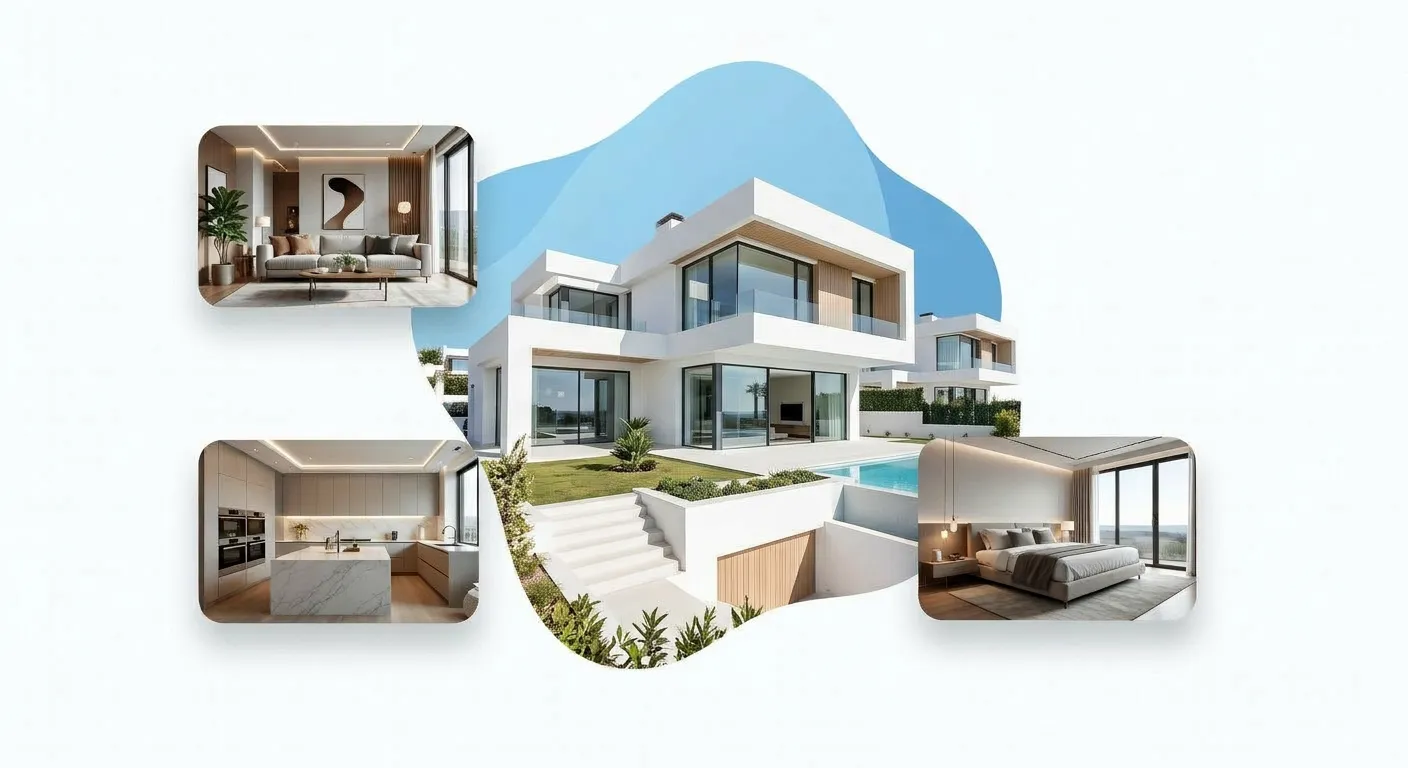
A full exterior paint job is a major financial investment. The fear of choosing the wrong color scheme often leads to "design paralysis," causing homeowners to settle for boring, safe choices they don't truly love.
Applying Loss Avoidance principles, you want total confidence in your full building transformation before signing a contractor contract.
Running a comprehensive test exterior house paint colors process lets you spot potential visual issues early.
Whether you are testing high-contrast bronze window trims or soft mineral siding tones, seeing the complete design on your building ahead of time removes all the anxiety from your home renovation.
What to Check Before Choosing the Final Color
Before ordering your final paint gallons, run through this final sanity check to make sure your choice holds up across every real-world condition:
When your proposed color passes all four checks, you can hand your paint codes to your contractor with complete peace of mind.
See Your House With Different Paint Colors Before You Paint
Testing paint colors for your home should be an exciting creative project—not an exhausting cycle of trial-and-error swatches, messy cleanup, and constant second-guessing.
You don't need to hire expensive consultants or wrestle with complicated architectural software to get stunning results.
With DesignHome Synthesis™, you can upload photos of your home's exterior or interior spaces right now to visualize house with different paint colors in seconds. Compare warm neutrals against dramatic modern charcoal tones, test custom trim combinations, and see exactly how your house will look before spending a dime on paint.
Take the guesswork out of your next home project, protect your hard-earned budget, and create a space you'll love coming home to every single day.
Testing Paint Colors Before Painting: Essential FAQs
Evaluating paint colors before buying gallons of paint prevents expensive mistakes, eliminates design paralysis, and guarantees your selected palette behaves as expected under real-world lighting.
Here are the definitive answers to the most critical questions about testing paint swatches, evaluating lighting shifts, and previewing colors accurately.
Why does a paint swatch look completely different on my wall than it did in the store?
Paint swatches in home improvement stores are illuminated by high-intensity commercial overhead fluorescent or cool LED lighting against pure white backgrounds. When brought into a home, three primary factors alter the color's appearance:
- Surrounding Context: Painting directly over an existing tinted wall forces your eyes to evaluate the new shade relative to the old background rather than in isolation.
- Light Temperature: Retail store lighting averages around 4000K–5000K (cool/blue-white), whereas home interior LED lighting typically ranges from 2700K to 3000K (warm/yellow-gold).
- Reflective Volume: A tiny 2x2-inch paper card reflects minimal light. When that same pigment expands across a 100-square-foot wall, the reflected color volume multiplies, making the hue feel significantly more intense.
What is the biggest mistake homeowners make when painting test swatches?
The most common mistake is painting sample patches directly onto existing colored walls without leaving a neutral border.
Painting directly on the wall also leaves raised paint ridges and texture lines that can show through your final topcoat unless thoroughly sanded flat down to the drywall.
Should I use peel-and-stick paint samples or liquid sample pots?
Peel-and-stick samples (made with real manufacturers' paint) are faster, mess-free, and allow you to move the sample around the room instantly. However, liquid sample pots are necessary if you need to test paint on rough, textured exterior surfaces like stucco, brick, or deep-grain wood siding where adhesive backing cannot stick evenly.
How large should a paint sample patch actually be?
A paint sample should measure at least 12x12 inches, with 24x24 inches being ideal for large open spaces or building exteriors. Anything smaller prevents your eyes from properly assessing how the light reflects across the pigment surface.
What is metamerism, and how does it ruin paint selection?
Metamerism is an optical phenomenon where two color shades match under one specific light source but appear drastically different under another.
Optical Shift Example: A greige paint shade with subtle green undertones may look like a perfect warm neutral under afternoon sunlight, but shift into an intense olive shade at 8:00 PM under 2700K incandescent indoor lighting.
To account for metamerism, evaluate every test sample across four distinct time periods: morning daylight, midday sun, golden hour dusk, and night lighting with your home's artificial fixtures turned on.
How does Light Reflectance Value (LRV) dictate how a test paint behaves?
Light Reflectance Value (LRV) measures the percentage of visible light a paint color reflects on a scale from 0 (pure absorption/black) to 100 (pure reflection/white).
- High LRV (70–90): Reflects maximum ambient light. Ideal for low-light north-facing rooms, but can cause blinding glare on bright south-facing exteriors.
- Low LRV (10–30): Absorbs ambient light. Adds depth and drama to rich interiors, but can make dark exterior walls absorb excess thermal heat.
Evaluating the LRV index on the back of your swatch card helps you predict whether a color will brighten or dim a given space before testing it on the wall.
How do I test paint colors across different directions of natural light?
Natural daylight changes temperature based on window orientation and exterior elevation.
How do I test exterior paint colors against fixed masonry and roofing?
Do not hold paint swatches flat in your lap or against an open lawn. Always hold or attach your test boards vertically at a 90-degree angle right up against fixed building elements:
- Rooflines & Fascia: Hold the sample vertically directly below roof shingles to check undertone harmony.
- Brick & Stonework: Place the sample against the darkest and lightest mortar lines to verify cohesion.
- Trim Lines: Mount sample boards directly adjacent to unpainted window casings or door frames.
How can I preview paint colors digitally without buying liquid sample pots or making a mess?
Digital visualization allows you to test dozens of custom palettes instantly without touching a paintbrush or damaging your walls.
Using DesignHome Synthesis™, you can upload photos of your room or home exterior directly into our spatial layout intelligence system. The software models real-world lighting conditions, surface textures, and shadow lines on your actual building, allowing you to preview dark body paints, trim contrasts, and front door options with complete accuracy before making a purchase.
Does paint sheen change how light reflects off the color?
Yes. Sheen changes light dispersion and color perception significantly:
- Flat/Matte: Absorbs light, hiding wall imperfections and making colors look deeper and richer.
- Eggshell/Satin: Reflects a soft glow, making colors appear slightly lighter and easier to wipe clean.
- Semi-Gloss/Gloss: Bounces light directly off the surface, intensifying undertones and highlighting any underlying wall bumps or texture flaws.
Always request or paint sample patches in the exact sheen level you plan to purchase for your final coat.
How do I isolate hidden undertones in neutral paint colors before buying?
Isolate neutral paint swatches by placing them side-by-side on a sheet of pure white printer paper. When viewed against pure white, the hidden base pigments immediately become clear:
- "Gray" will instantly reveal if it leans pink/purple, green, or cool blue.
- "Cream" will instantly reveal if it leans yellow, orange, or peach.
Comparing three competing swatches side-by-side against a white background prevents you from accidentally buying a color with an unwanted secondary undertone.
How long should I leave test paint samples up before deciding?
Leave your paint samples mounted for at least 48 hours. This gives you enough time to view the color through different weather conditions (clear sunny days versus overcast cloudy days) and observe how the paint interacts with your daily routine across morning, noon, and night.


