

Living in an open-concept home is fantastic for family connection, entertaining, and keeping daily life feeling spacious. But when it comes to picking wall colors, that wide-open layout can quickly turn into a decorating nightmare.
When your living room, dining area, kitchen, and entryway all share the exact same sightlines, every single wall is visible at once.
Here is the truth: choosing the wrong paint colors for an open home matters immensely. When you live with your family, an ugly, clashing, or overly harsh wall color isn't something you can just hide away behind a closed door. You look at it every single day while eating breakfast, watching TV, and hosting friends—and you will regret it constantly.
You might think the only way out is to spend weeks struggling with paint chips, learning complex 3D interior design software, or paying thousands of dollars to a high-priced interior design agency.
It doesn't have to be that hard or expensive. Modern design tools like the DesignHome app do the heavy lifting for you in minutes. You can visualize custom, gorgeous open plan home paint colors instantly, eliminating hours of frustrating trial-and-error while saving you a massive amount of money.
Whether you are moving into a brand-new build or giving your current open floor plan a much-needed refresh, this guide will walk you through building a harmonious, stunning palette step by step.
Choose a Main Color for the Shared Space
When every corner of your ground floor flows together, your first major decision is establishing an anchor. You are probably asking: “Which color should lead the whole space?”
Before you worry about accent walls or cabinet paint, select a single main color for open plan walls. This dominant shade will cover approximately 60% to 70% of the continuous perimeter walls across your entryway, living room, and main corridors.
Selecting your open concept main wall color brings instant visual stability. When one main paint color runs along the outer frame of the home, your eyes move across the layout smoothly without getting jarred by constant color stops.
To pick a foolproof anchor shade:
- Look at your largest uninterrupted wall: Identify the long wall that stretches across multiple functional zones (e.g., from the living room couch past the dining table). This wall dictates your primary color.
- Avoid harsh stark whites: Unless your home receives intense natural sunlight from all four directions, optic white paint will turn cold and clinical in shaded corners.
- Lean into soft, luminous undertones: A creamy off-white or light warm greige gives your primary wall surface enough body to reflect light without feeling sterile.
Decide Whether to Use One Color or Several
Once you have an anchor shade in mind, a critical dilemma pops up: “Do I paint everything the same or give each area its own color?”
Understanding one color or multiple colors open plan strategies comes down to how your architecture is structured.
Here is how to choose the right path for your family's space:
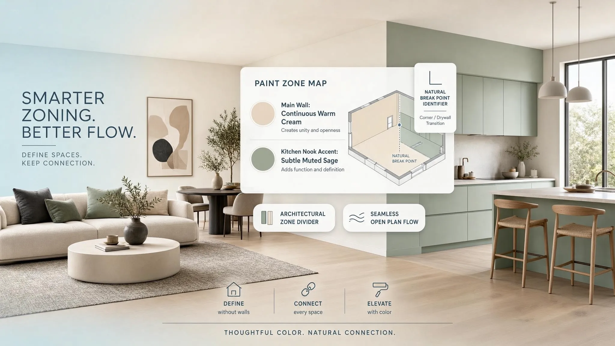
- When to paint open plan one color: If your ceiling height is uniform and your perimeter walls run straight without natural breaks (like archways, pillars, or recessed nooks), stick to a single wall shade. Introducing different colors open concept spaces without natural architectural boundaries creates awkward, jagged lines where two colors meet on a flat corner.
- When to introduce variation: If your home features structural columns, drop ceilings, or distinct drywall corners between the kitchen and living room, you can safely explore open plan color zoning by using lighter or darker shades from the exact same color strip.
Best Neutral Paint Colors for Open Floor Plans
If you want a palette that handles living, cooking, dining, and lounging without clashing, neutrals are your best friend. But you need a neutral that is versatile: “I want something that works from the kitchen through the living room.”
The best neutral paint colors for open floor plans are flexible, light-reflecting shades with warm or balanced undertones. These colors adapt gracefully as natural light shifts from the kitchen windows in the morning to the living room patio doors in the evening.
Here are top-performing neutral options favored by interior designers:
Selecting a rich neutral ensures your backdrop remains serene, letting your furniture and family life take center stage.
Use Accent Colors Without Breaking the Flow
Living with neutrals doesn't mean your house has to look like a plain hotel lobby. You might think: “I want color, but I don't want random walls everywhere.”
The key to applying accent colors for open plan homes is placing deeper shades only where architecture gives them permission to exist.
Follow these rules for a seamless open concept accent wall:
- Leverage Architectural Enclosures: Place open plan accent colors inside alcoves, behind fireplace mantels, along built-in shelving, or on the back wall of a dining nook. Never stop an accent paint shade midway down a continuous, flat wall.
- Paint Functional Elements Instead of Drywall: One of the smartest accent wall ideas in an open plan is painting your kitchen island or built-in pantry cabinetry a rich color (like navy blue, forest green, or charcoal) while keeping all surrounding walls neutral.
- Keep Tone Intensity Balanced: If your main wall shade is a light, dusty greige, choose an accent color that shares a similar desaturated or muted quality (like slate blue or muted sage) rather than a hyper-saturated neon shade.
Create Color Zones Without Closing Off the Space
When you get rid of physical interior walls, you lose defined rooms. A common question from homeowners is: “How can I make the dining area feel different without adding a wall?”
You can use open plan color zoning to establish clear boundaries for eating, working, and relaxing while keeping the layout light and airy.
Here is how to execute paint color zoning like a professional:
- Use Half-Wall and Archway Shifts: If you have half-walls, breakfast bars, or arched passageways, use them as transition points to change wall paint shades subtly.
- Embrace the Two-Tone Ceiling Trick: Keep perimeter wall paint consistent, but apply a deeper tone on the ceiling directly above a specific zone (like a dining area or reading corner) to ground it.
- Connect Zones with Complementary Color Families: If your living area features dusty blue throw pillows, use a lighter wash of that same blue on a recessed dining wall.
For a deeper dive on handling physical doorways and adjacent sightlines, explore our guide on choosing colors for adjoining rooms.
Coordinate Living Room, Kitchen, and Dining Room Colors
Because these three functional areas interact constantly, building a unified living room kitchen dining room paint colors palette is non-negotiable.
You find yourself thinking: “Each area has a different purpose, but they all need to look intentional.”
Navy Island Cabinetry
Navy Seat Cushions
Navy Accent Pillows
To create a flawless open plan living kitchen colors flow, use the 60-30-10 Triad Formula:
- 60% Main Neutral (Walls): Use your dominant warm white or greige continuously across all three zones.
- 30% Secondary Shade (Cabinetry & Furniture): Let your living dining paint colors connect through major furniture pieces—like wood dining tables, kitchen island finishes, and large sectional sofas.
- 10% Accent Color (Decor & Textiles): Tie the entire kitchen living room color scheme together by repeating a signature accent shade across small details in every zone (e.g., repeating brass hardware in the kitchen, brass dining light fixtures, and brass accents in the living room).
If you want to map out color schemes for your entire house, check out our master guide on how to create a whole house color palette.
Match Paint Colors With Cabinets, Flooring, and Furniture
Wall paint doesn't exist in a vacuum. Your kitchen cabinets, wood floors, and large furniture pieces cover huge surface areas and dictate what wall shades will actually work: “My cabinets and floors are already here. What wall colors will actually work?”
When choosing open plan paint colors with cabinets and flooring, undertone matching is critical:
- Work Around Wood Flooring Undertones: When selecting paint colors with wood floors, look at the raw tone of the timber. Honey oak and warm pine pair best with warm greiges and creamy off-whites. Cool gray-stained woods require crisp whites or cool-leaning neutrals to avoid looking yellowed.
- Balance Kitchen Cabinetry: If you have rich espresso or dark walnut cabinets, pick a high-LRV (Light Reflectance Value) shade when choosing a wall color with kitchen cabinets. This reflects light back into task areas and prevents the kitchen from feeling like a dark cave.
- Align Furniture and Wall Colors: Pair dark leather couches or heavy dining sets with light neutral backdrop walls to create crisp, high-contrast separation.
To learn how to coordinate existing sofas, tables, and wood tones seamlessly, read our article on how to match wall colors with furniture.
Consider Natural Light From Different Directions
In an open concept floor plan, a single continuous room can span from a north-facing kitchen window at the front of the house to a south-facing living room patio door at the back.
This causes a common headache: “The same wall looks completely different depending on the time of day.”
Understanding open plan paint colors and lighting requires analyzing how sunlight travels through your open space:
- North-Facing Light: Cool, indirect, and slightly blue. It drains warmth out of paint, turning cool grays into drab concrete. Use warm light paint colors with cream or yellow bases to combat northern shadows.
- South-Facing Light: Bright, intense golden sunlight all day. It enhances all colors, allowing you to use both delicate pale neutrals and rich deep tones easily.
- East & West Light: Open concept lighting shifts dramatically throughout the day. East light is warm in the morning and cool by afternoon; West light is flat in the morning and blazing amber at sunset.
If you are dealing with gloomy corners or deep porch overhangs, learn how to improve lighting in a dark room using layered fixtures and light-reflecting paint sheens.
Use Ceilings, Trim, and Doors to Connect the Zones
Walls get all the attention, but secondary architectural surfaces bind open plans together. You might wonder: “What about all the white trim, doors, and ceiling running through the space?”
Establishing cohesive open plan ceiling and wall colors transforms a chaotic room into a polished, high-end interior.
To maximize visual harmony across secondary surfaces:
- Unify Trim Colors Open Plan Layouts: Keep all baseboards, door frames, window casings, and crown moldings in the exact same crisp shade and sheen (such as semi-gloss off-white) throughout the entire open space. This creates a continuous physical outline that binds different zones together.
- Lift the Space with Ceiling Color Open Concept Choices: Instead of flat, chalky white, paint the ceiling a luminous warm white, or paint it a half-shade lighter than your main wall color to make low ceilings feel soaring.
- Ground High-Touch Areas: Use durable satin or semi-gloss finishes on doors and trim colors to resist handprints and allow quick wiping in high-traffic family zones.
For detailed formulas on pairing wall shades with architectural trim, explore our breakdown of trim and wall color combinations.
Test Open Plan Paint Colors Before You Commit
Never buy full gallons of paint based on how a color swatch looks under the fluorescent lights of a home improvement store. You need certainty: “I need to see these colors together before I buy paint.”
To avoid costly repainting disasters, follow a structured workflow to test open plan paint colors:
- Order Peel-and-Stick Swatches: Instead of painting messy patches on your drywall, order peel and stick swatches or buy paint sample pots to paint onto 2x2-foot poster boards.
- Move Swatches Across Zones: Tape your sample boards near kitchen cabinets, beside living room windows, and along shaded hallways. Observe them at 8:00 AM, 1:00 PM, and 8:00 PM under artificial lamps.
- Use an Open Plan Color Visualizer: Skip the headache of manual testing altogether by using digital tools.
With the DesignHome app, you can access a powerful open plan color visualizer and paint color visualizer. The app lets you visualize open concept colors across full 3D room models instantly. You can test wall shades, cabinet tones, and flooring interactions in photorealistic detail before spending a single dollar on physical paint cans.
For professional step-by-step swatch testing techniques, review our guide on how to test paint colors before painting.
Build a Cohesive Open Plan Color Scheme
You have evaluated your lighting, checked your floor undertones, and tested your swatches. Now it's time to pull everything together into an actionable plan: “Now I want a simple plan showing what goes where.”
Creating a documented plan guarantees that your painting crew (or your weekend DIY team) executes your vision without mistakes.
Master Cohesive Open Plan Palette Template
Use this structured plan to organize your cohesive open plan colors:
Transforming your house into a harmonious, light-filled space doesn't have to be overwhelming or expensive. By using an interactive color palette generator tool or following complete home painting project guidance on DesignHome, you can build a customized open concept color palette effortlessly.
Stop stressing over tiny paint swatches and expensive designer fees. Try DesignHome today, eliminate hours of frustrating work, and create an open plan home color scheme that your family will love living in every day.
Open Plan Home Paint Colors: 10 Fresh FAQs
What is the quickest way to pick open concept paint colors without losing weekends to testing or paying thousands to a designer?
Staring at dozens of tiny paint chips across a massive, multi-functional room will make anyone feel stuck. Hiring an interior design studio to build 3D renderings usually costs thousands of dollars and takes weeks of waiting. You can skip the high design fees, long wait times, and endless frustration. The DesignHome app turns your color selection process into an instant, interactive experience. By rendering photorealistic color transitions across your entire open floor plan in minutes, you can lock in gorgeous open plan home paint colors with absolute confidence before buying your first gallon of paint.
How can I make my kitchen, dining, and living room feel like distinct spaces using paint without putting up physical walls?
You don't need drywalls to define where one living area ends and another begins. Visual zoning creates functional boundaries while keeping your open floor plan spacious and airy.
- Anchor the Kitchen: Apply a distinct, rich shade to your kitchen island cabinetry while keeping surrounding perimeter walls neutral.
- Define the Dining Area: Frame a dining nook by applying a slightly deeper, complementary tone on a recessed accent wall or inside a coffered ceiling cutout.
- Soften the Living Zone: Ground your seating area by carrying your primary


