

Walking into a dark, low-light room can instantly drain your mood. Shadows gather in corners, walls feel like they are closing in, and architectural details seem completely flat.
You might think the easiest solution is to slap a fresh coat of bright, optic white paint on every wall.
Here’s the problem: stark white paint requires strong daylight to look good.
Without natural sunlight to bounce off the wall, brilliant white paint transforms into a dull, cold, cement-like gray shadow. Selecting successful paint colors for a dark house isn't about forcing brightness where light doesn't exist. It's about choosing shades that gently capture, bounce, and warm whatever ambient light is already present.
Whether you are dealing with a shaded north-facing living room, an overcast climate, deep porch overhangs, or simply handling spaces without abundant sunlight, finding the best paint colors for dark house interiors comes down to understanding undertones, reflectance values, and lighting dynamics.
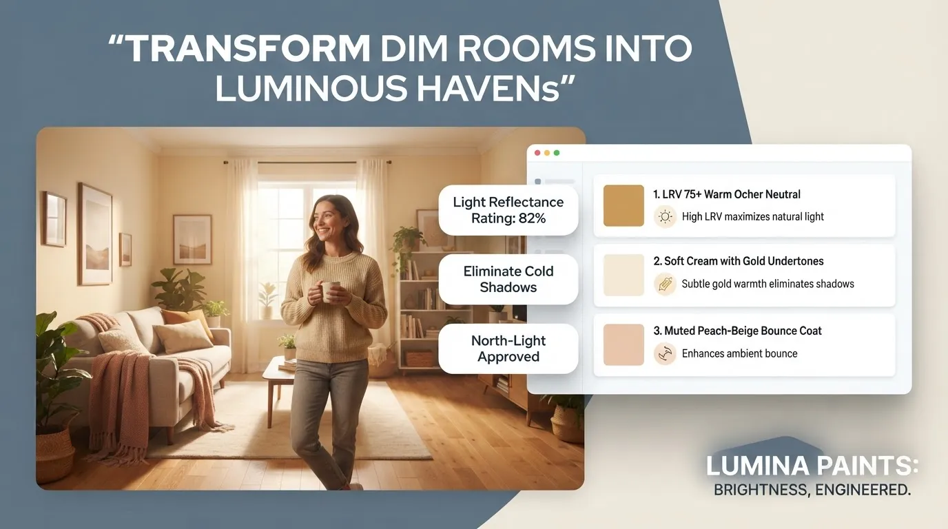
Look at the Light Before Choosing a Color
Before looking at swatches, you need to analyze the quality of light moving through your home. The exact same can of paint will look entirely different depending on which direction your windows face.
Here is why that happens:
When choosing paint colors for low light, always inspect the Light Reflectance Value (LRV) printed on the paint swatch or manufacturer spec sheet. LRV measures the percentage of light a color reflects on a scale from 0 (pure black) to 100 (pure white).
For ideal low light paint colors, look for shades with an LRV between 60 and 75. Paints with an LRV above 80 depend too heavily on direct sunlight to look vibrant, while paints below 50 absorb too much light, making dim rooms feel even smaller unless paired with supplementing daylight with layered lighting fixtures.

Choose Light Colors With Enough Warmth
If cold shadows are your main issue, you need light paint colors for dark rooms that feature subtle warm undertones—like cream, soft honey, peach, or warm greige.
Think about it this way:
Cool pigments (blue, pure gray, cool green) absorb low light and amplify shadows. Warm pigments (yellow, red, warm beige) act like a subtle filter, transforming dim ambient light into a soft, cozy internal glow.
Using warm light paint colors maintains visual lightness while adding depth and structure to the space. Selecting bright paint colors for dark rooms with warm undertones keeps the room bright without feeling clinical or sterile.
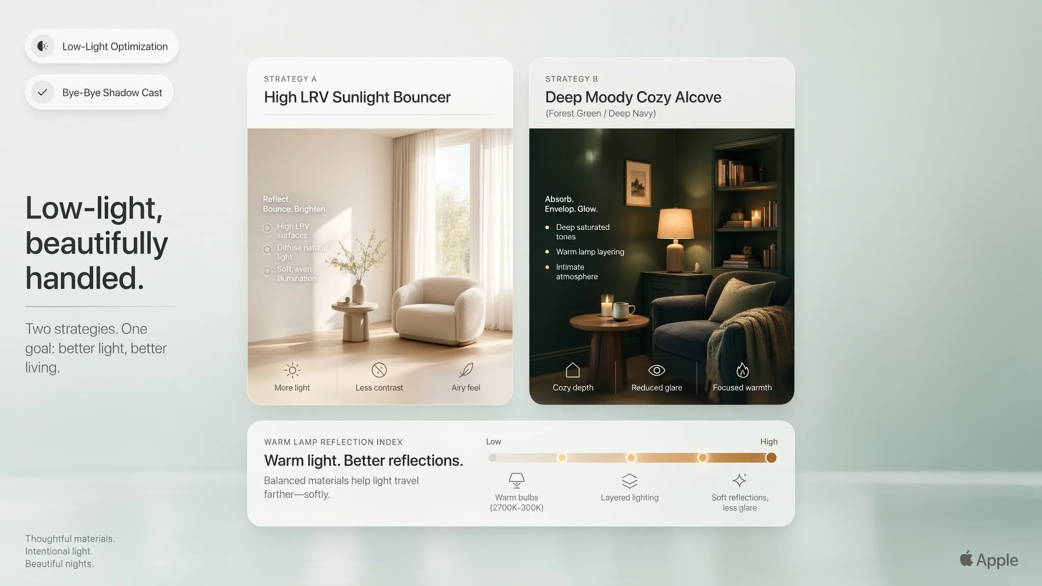
Try Soft Whites Instead of Harsh White
If you want the clean appeal of white walls, skip pure "ceiling white" or stark optic whites. Instead, choose the best white paint for dark rooms—shades containing a hint of cream, yellow, or soft tan.
The contrast between pure white and soft white becomes obvious once paint hits a shaded wall:
Selecting a warm white for dark rooms protects your walls from turning muddy in shadow. A rich off white paint or soft white paint gives you the clean aesthetic of white while creating an inviting, sun-kissed feel.
Use Pale Neutrals to Reflect More Light
When white feels too plain, light neutral paint colors offer a rich alternative. Pale earth tones bring quiet warmth into low-light areas while maintaining high reflectivity.
Here is how to narrow down your neutral choices:
- Light Beige Paint: Buttery, warm light beige paint injects life into dim entryways and north-facing bedrooms without feeling dated.
- Light Greige: A blend of gray and beige gives you light greige—the perfect modern shade that keeps the sleek feel of gray without the cold shadow cast.
- Pale Taupe & Mushroom: These pale neutral colors feature subtle violet or rose base notes that mask gray shadows in windowless interior corridors.
Choosing thoughtfully blended neutral colors for dark rooms gives your home an intentional, elevated feel while selecting light-reflecting wall shades to bounce available lamp and window light effortlessly.
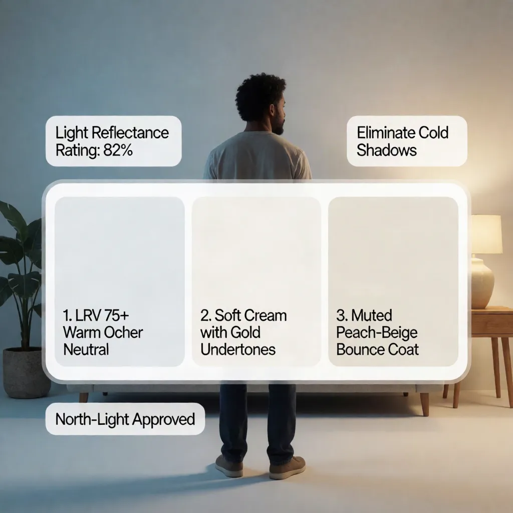
Can Dark Rooms Use Blue, Green, or Gray?
You don't have to restrict yourself exclusively to cream and beige. Real colors work beautifully in low-light environments if you choose muted, desaturated tones.
Here is how to choose real colors for dark rooms:
- Blue Paint for Dark Rooms: Avoid bright royal blue or cold sky blue. Choose soft powder blues infused with warm red/gray undertones, or lean into deep, rich navy shades to embrace the low light and build a cozy, dramatic aesthetic.
- Green Paint for Dark Rooms: Muted sage, soft olive, and pale eucalyptus thrive in dim light. Earthy green pigments absorb low light gracefully without looking dirty.
- Gray Paint for Dark Rooms: Choose warm grays containing yellow, magenta, or taupe base notes. Avoid blue-based charcoal or slate grays, which turn cement-colored in dark rooms.
When applying these shades in adjoining spaces, consider creating subtle transitions between adjacent rooms so color shifts feel balanced across open doorways.
Use Ceiling and Trim Colors to Lift the Room
Walls are only part of the solution. Your ceiling and trim cover significant surface area and dictate how light travels around the room.
To maximize openness across architectural surfaces:
- Ceiling Colors for Dark Rooms: Instead of flat, chalky white, paint the ceiling a half-shade lighter than your wall color, or use a luminous warm white. Explore choosing complementary ceiling treatments to reflect light smoothly overhead. Applying an eggshell or satin finish on the ceiling bounces light around the room far better than flat ceiling paint.
- Trim Colors for Dark Rooms: Frame your walls with crisp, semi-gloss white trim dark room details. Bright baseboards and door frames add sharp contrast that makes wall colors pop. Learn more about pairing walls with architectural moldings for high-impact trim styling.
Color Drenching: In tiny, shadow-filled spaces like powder baths or dens, paint the walls, trim, and ceiling in the exact same soft warm color. Removing hard visual lines tricks the brain into perceiving the ceiling as higher and the room as wider.
Match Paint With Floors, Furniture, and Cabinets
If your home features dark hardwood floors, espresso cabinets, or heavy dark furniture, wall color selection requires extra care to prevent the room from feeling heavy.
How to pair paint colors with dark furniture:
- Establish Clear Contrast: Pair dark brown leather or mahogany with pale alabaster or soft greige walls to create separation.
- Wall Colors with Dark Floors: If you have dark stained oak floors, stick with high-LRV wall colors and cover a portion of the floor with a light-colored wool rug.
- Paint Colors with Dark Cabinets: In kitchens with dark espresso cabinetry, keep walls and backsplashes light (LRV 70+) to reflect countertop task light back into the workspace.
For a cohesive look, focus on coordinating wall paint with existing wooden decor to prevent heavy finishes from overpowering the room.

Use Color to Make a Dark House Feel More Open
Low-light spaces feel smaller because dark corners draw the walls inward. Strategic paint choices can visually expand your home's footprint.
To find colors that make a dark room look bigger:
- Reduce Wall-to-Trim Contrast: Keep wall and trim values close to each other so the eye glides smoothly across surfaces without stopping at hard borders.
- Use Reflective Sheens: Move away from flat matte paint. Use eggshell or satin finishes on walls so ambient lamp light glides across the surface.
- Maintain Value Continuity: Use similar light values from room to room to make connected spaces feel like one continuous, expansive layout—especially when painting expansive open layout interiors.
Applying these paint colors to make room look bigger combines smart visual strategies to make small rooms feel larger with proper lighting tricks to open up shadowy footprints.
Avoid Paint Colors That Make Low-Light Rooms Heavier
Knowing what shades to avoid is just as critical as finding the right paint chip.
Steer clear of these common low-light paint pitfalls:
- Stark, Blue-Based Whites: Turns dingy slate-gray in shadows.
- Bright Primary Yellows: Looks vibrant on the swatch, but turns muddy and neon-tinted in dark corners.
- Cool Medium Grays: Feels like cold wet concrete under northern light.
- Desaturated Muddy Tans: Swallows available light without adding warmth, leaving rooms feeling outdated and heavy.
Avoiding these colors to avoid in dark rooms saves you the headache and expense of an unexpected repaint.
Test Paint Colors Under Your Actual Lighting
Never buy full gallons of paint based on how a color looks under the bright fluorescent lighting of a home improvement store.
Instead, follow a structured testing process:
- Get Real Samples: Order peel-and-stick paint swatches from suppliers like Samplize or buy 8oz sample paint pots.
- Test on Poster Boards: Paint two coats onto 2x2-foot poster boards rather than directly on the wall so you can move them around.
- Observe Throughout the Day: Check samples at 8:00 AM, 1:00 PM, and 8:00 PM under artificial lamps, carefully evaluating swatches in changing daylight.
- Use Visualizer Tools: You can digitally preview combinations before buying paint. Try visualizing virtual wall colors or using an online paint palette builder to see how different values interact across 3D room models before making a final purchase.
Once you confirm your choices, expect premium interior paint (like Sherwin-Williams Emerald or Benjamin Moore Regal Select) to cost $65 to $90 per gallon, with sample pots running $5 to $8 each.
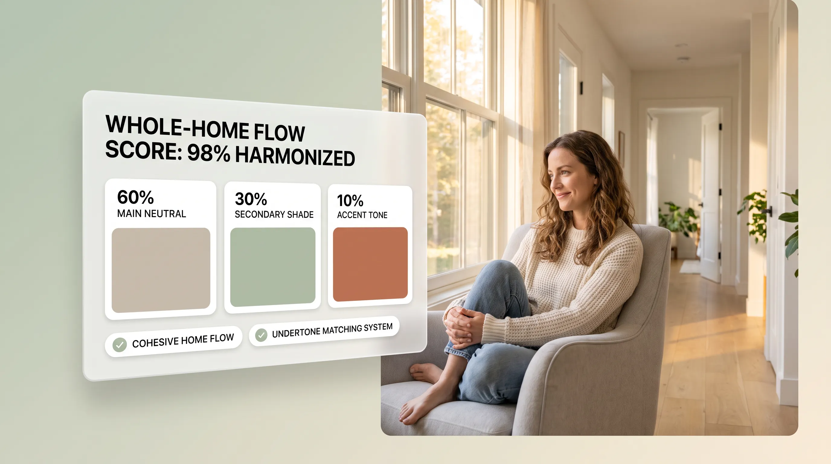
Build a Brightening Color Palette for Your House
To pull your home together, turn your individual color choices into a cohesive, room-by-room low-light palette. If you are preparing for a broader overhaul, review our guide on full interior home painting project planning.
Developing a tailored color palette for a dark house by building an interconnected whole-house color scheme gives your home a bright, welcoming flow that makes every room feel intentional and light-filled.
Paint Colors for a Dark House: 10 Frequently Asked Questions
How can I quickly choose the right paint colors for a dim, shadowy house without spending thousands on an interior designer?
Selecting paint colors for low-light rooms can feel overwhelming, especially when traditional paint chips look muddy or drab on dark walls. Hiring an interior design consultant or ordering expensive physical render packages often costs thousands of dollars and takes weeks.
With the DesignHome app, you can bypass the high agency costs and endless guesswork. DesignHome’s realistic interior visualization tools allow you to test high-reflectance wall shades, warm neutral palettes, and light-maximizing trim combinations instantly. You get photorealistic custom color previews for your entire house in minutes—eliminating hours of frustrating trial-and-error before spending money on paint cans or hiring professional painters.
What are the best wall paint colors to instantly brighten up a dark house?
The best paint colors for dark spaces are soft, warm neutrals with high Light Reflectance Value (LRV) numbers—ideally 65 or above. Opting for crisp, stark whites often backfires in low-light environments because without strong natural sunlight, bright white turns cold, chalky, and shadowy gray.
- Warm Off-Whites: Shades like Sherwin-Williams Alabaster or Benjamin Moore Swiss Coffee contain subtle cream or yellow undertones that bounce light around dim rooms without feeling clinical.
- Soft Light Greiges: Colors like Benjamin Moore Pale Oak bridge the gap between warm beige and modern gray, giving shadowy spaces a cozy, elevated warmth.
- Pale Luminous Pastels: Muted sage greens, dusty blush pinks, and pale buttery yellows reflect ambient artificial light beautifully while infusing character into dark corridors.
Why does bright white paint look gray and gloomy in my dark rooms?
White paint needs abundant natural light to reflect its true, brilliant tone. When applied in windowless rooms, north-facing spaces, or dark corridors, stark white paint lacks the natural illumination required to bounce light back into the space. Instead, it absorbs ambient shadows, appearing flat, clinical, and drab.
To prevent this gloomy effect, choose warm off-whites or pale greiges with undertones that compensate for missing sunlight. If you want to explore specific strategies for picking light-maximizing shades, review our comprehensive guide on colors that make a room feel brighter.
How do I choose paint colors for dark, north-facing rooms with cool light?
North-facing windows receive indirect, cool, bluish light throughout the day. This cool light drains warmth from paint colors, causing cool grays, icy blues, and stark whites to look cold and uninviting.
To make north-facing spaces feel bright and cozy:
- Avoid Cool Undertones: Steer clear of gray or white paints with blue, green, or violet bases.
- Select Warm Bases: Choose wall colors formulated with warm yellow, pink, or golden undertones (such as warm cream, soft peach, or buttery beige).
- Use Satin or Eggshell Sheens: Apply eggshell or satin finishes rather than flat matte paint. Satin sheens have a subtle sheen that helps reflect available light around dim corners.
How can I test paint colors in my dark rooms before buying full gallons?
Testing paint colors under your actual home lighting is essential because artificial bulbs and dynamic outdoor conditions alter undertones drastically throughout the day.
- Step 1: Test Digitally First: Use the DesignHome app to preview how different paint shades reflect light across 3D room layouts. This filters out weak options in seconds without making a mess.
- Step 2: Order Peel-and-Stick Swatches: Place 12x12 peel-and-stick samples from services like Samplize on multiple walls in your dark room.
- Step 3: Observe Under Dynamic Light: Check your test swatches at 8:00 AM, 1:00 PM, and 8:00 PM under artificial lamps to ensure the undertones remain warm and inviting.
For additional swatch testing tips, check out our guide on how to test paint colors before painting.
What paint sheen should I use on walls and ceilings to bounce more light?
The paint finish you choose plays a huge role in how light bounces around a dim room. Flat or matte paints absorb light, whereas higher sheens bounce light across the room:
- Walls: Choose Eggshell or Satin sheens. They provide a soft, low-luster reflection that brightens dark walls while hiding minor drywall imperfections.
- Ceilings: Use Flat or Soft-Glow Ceiling Paints in a warm, luminous white. Avoid high-gloss on ceilings, as it creates harsh glare from overhead light fixtures.
- Trim, Moldings, and Doors: Apply Semi-Gloss or Gloss finishes in a reflective white. Shiny trim captures ambient lamp light, framing the room in crisp, bright outlines.
How do I paint adjacent dark rooms so the entire house feels connected and open?
When dark rooms lead into dim hallways or adjoining spaces, applying vastly different wall colors creates a choppy, claustrophobic feel. Establishing visual continuity expands the perception of space.
To create seamless flow:
- Use One Color Family: Apply lighter and medium variations of a single warm neutral strip across adjacent spaces.
- Unify Architectural Trim: Keep baseboards, door frames, and ceiling moldings painted in the exact same reflective white throughout every room.
- Maintain Continuous Flooring: Matching wood or tile floors across thresholds anchors connected spaces.
For detailed floor plan color mapping, read our expert guides on choosing colors for adjoining rooms and how to create a whole house color palette.
Can dark or moody paint colors ever work in a house with limited natural light?
Yes! Trying to force a deeply shadowed, windowless room to look bright with white paint can sometimes feel flat and uninspired. Embracing the darkness by leaning into rich, dramatic shades can turn a dark space into a cozy, intimate retreat.
Dark charcoal, deep forest green, navy blue, or moody espresso work exceptionally well in:
- Small Powder Rooms & Laundries: Embracing deep color creates a luxurious "jewel box" atmosphere.
- Cozy Dens & Media Rooms: Dark walls reduce reflection from TV screens and build an inviting evening environment.
- Formal Dining Rooms: Moody tones illuminated by warm dining chandeliers create an intimate dinner party mood.
When using moody paint in a dark home, keep the ceiling light and layer warm artificial lighting (2700K to 3000K bulbs) generously.
How can I make dark wood floors, cabinets, and furniture look lighter with paint?
Dark mahogany floors, espresso kitchen cabinets, or heavy wood furniture absorb light, making dark rooms feel even smaller. You can balance these heavy elements with strategic wall paint pairings:
- High-Contrast Wall Backdrops: Pair dark wood cabinets and floors with high-reflectance warm off-whites (LRV 70+). The high contrast makes dark wood look intentional, modern, and rich rather than overwhelming.
- Color-Drench Architectural Trim: Paint baseboards, door casings, and window trim in a bright white to create a clean visual border between dark flooring and wall paint.
- Bridge with Area Rugs: Place light cream, beige, or pale patterned rugs over dark hardwood floors to bounce light upward onto surrounding walls.
To discover step-by-step wood tone matching formulas, explore our guide on how to match wall colors with furniture.
How do I create a complete, light-maximizing color plan for my dark house?
Building a cohesive color strategy for a low-light house requires moving from broad ideas to a documented execution plan.
By organizing your main neutral backdrop, light-reflecting trim, and warm artificial lighting, you transform a dark, shadowy house into a bright, welcoming sanctuary.
Ready to brighten up your home effortlessly without spending thousands on interior designers? Use the interactive color palette generator tool or explore full home painting project guidance on DesignHome today to craft and preview your perfect paint palette in minutes!


