

Standing in a hallway and looking simultaneously into two adjacent spaces should feel like taking in a beautifully composed painting. Yet for many homeowners, open doors reveal a jarring clash: a cool slate gray living room staring directly into a warm butter-yellow dining space.
When done right, choosing colors for adjoining rooms transforms how your entire floor plan functions. Moving from room to room feels harmonious, open, and effortless—making living in your home every single day genuinely wonderful.
Here is the challenge: paint companies flood showrooms with pre-packaged color strips that look flawless in glossy brochures, but feel stiff or flat inside real houses. On the flip side, hiring interior design consultants or rendering high-end 3D architectural mockups can cost thousands of dollars and take weeks to complete.
You don't need to spend a fortune or struggle through trial-and-error with dozens of paint sample pots. The DesignHome app lets you virtually craft stunning adjoining room colors in minutes. By previewing photorealistic room-to-room transitions on screen, you can lock in ideal adjacent room paint colors effortlessly before spending money on full paint gallons or hiring professional house painters.
Look at the Colors You Can See From Both Rooms
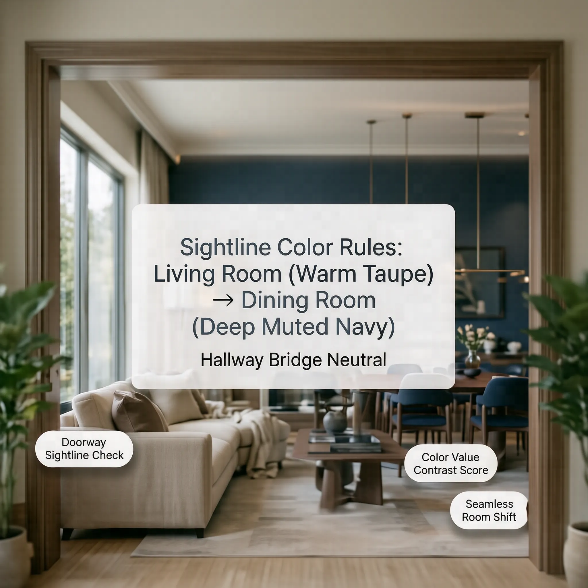
Before unapping a single paint swatch, stand in the doorways and threshold pathways connecting your rooms. Pay close attention to what your eyes actually catch in a single glance.
When evaluating adjoining room color schemes, you are rarely viewing a wall in isolation. You are looking through an architectural frame that captures multiple surfaces at once:
- The perimeter walls of the far room.
- Kitchen cabinetry or built-in shelving visible down the hall.
- Large upholstered sofas, area rugs, or dining chairs.
- Hardwood flooring undertones stretching across the threshold.
Treat every open doorway like a picture frame. Designing adjacent room color schemes means selecting connecting room colors so the background view naturally enhances the room you are currently standing in. When these spaces talk to each other, rooms that flow together make your entire floor plan feel intentionally designed.
Choose Between Matching and Coordinating Colors
Once you map your sightlines, decide on your core relationship strategy. You find yourself asking: “Do these adjacent spaces need the exact same wall color?”
You generally have three distinct routes when balancing matching colors in adjoining rooms versus coordinating colors in adjoining rooms:
Deciding early whether you want identical wall shades or different colors adjoining rooms narrows your choices quickly, preventing swatch overload.

Use One Color Family Across Connected Rooms
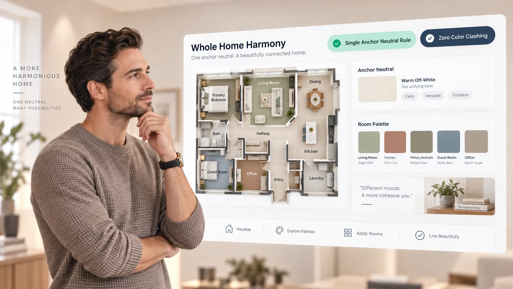
If you prefer visual variety without risking a chaotic layout, build your plan around a single, cohesive color strip.
Creating a unified color family for adjoining rooms allows you to shift the depth of color from space to space while maintaining seamless harmony. By using coordinating paint colors that share a common foundation, you develop rich adjoining room color combinations without making rooms clash.
For instance, if your central hallway uses a soft warm off-white like Sherwin-Williams Alabaster, you can step into an adjacent living room painted in a medium greige like Benjamin Moore Pale Oak. Because both shades share warm, creamy undertones, these related paint colors feel naturally connected.
If you are structuring a broader palette across multiple levels, explore our framework to create a whole house color palette.
Create a Transition From One Room to the Next
The boundary where two spaces meet requires careful handling so the color shift doesn't feel abrupt. You might wonder: “The doorway is where the colors meet. How should they change?”
Using dedicated transition colors between rooms softens the visual bridge across open doorways:
- Use a Unifying Neutral Corridor: If Room A is a deep navy and Room B is a warm terracotta, paint the connecting hallway or vestibule a soft, high-reflectivity neutral shade.
- Bridge with Millwork: Keep trim, casing, and baseboard finishes identical across both spaces to wrap the transition in a crisp, clean border.
- Echo Colors Across Thresholds: Repeat a subtle accent from Room A inside Room B. If your living room features olive green walls, use an olive green rug or artwork in the adjacent foyer to ease the room-to-room color transition.
Executing a smooth paint color transition between rooms ensures your connecting room paint colors feel intentional rather than accidental.
Use Doorways and Sightlines to Decide Where Colors Change
A common DIY dilemma happens right at the door frame: “Where exactly do I stop one paint color and start the next?”
Stopping a wall color in the wrong spot creates awkward paint lines on flat surfaces. Follow these physical rules to establish clean room color boundaries:
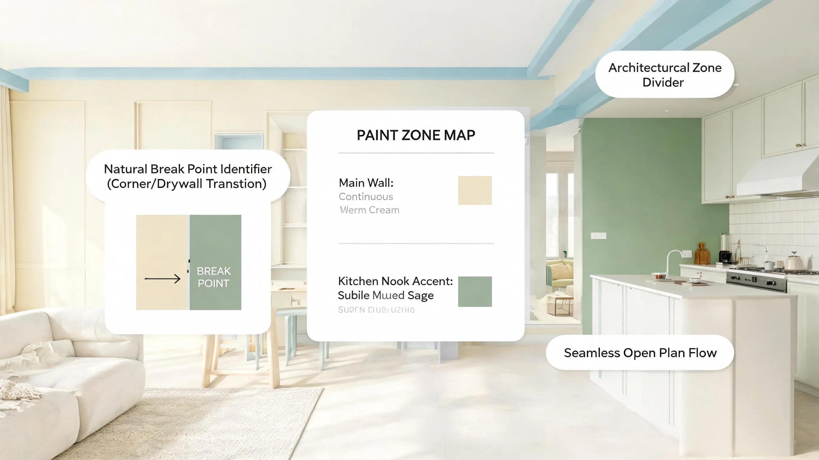
- Stop at Inside Corners: Always break paint colors at an inside corner where two walls meet at a 90-degree angle. Never end a color on an outside corner unless covered by architectural casing.
- Use the Door Jamb Rule: For open doorways without doors, stop the first color on the inside edge (jamb) of the doorway frame that faces away from the main living area.
- Respect Architectural Casing: When doorways feature finished wood or painted trim, let the trim act as the natural separator between adjoining room walls.
Knowing exactly where to change paint color between rooms guarantees sharp, professional paint color at doorways without messy tape lines.
Pair Warm and Cool Colors Without Making Them Clash
You don't have to restrict yourself entirely to warm tones or entirely to cool tones across your whole home. You might think: “Can I use a warm color next to a cool one without creating a jarring mess?”
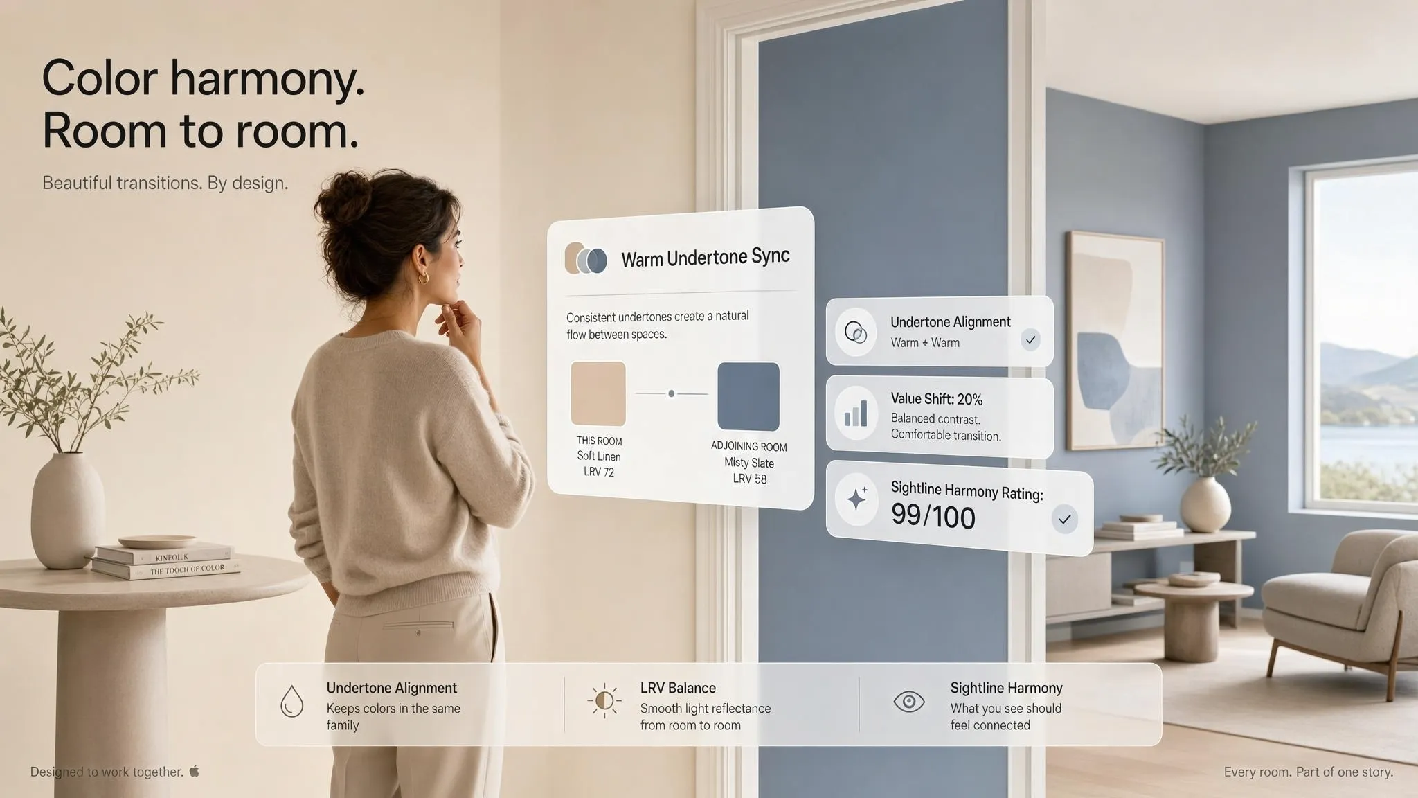
You can successfully balance warm and cool colors adjoining rooms by anchoring their shared undertones.
- Match Temperature Intensity: Pair muted, warm greiges with desaturated, cool sage greens. Avoid putting hyper-saturated neon warm yellows directly next to icy slate blues.
- Bridge with Neutral Undertones: When balancing warm and cool room colors, choose shades that share taupe or gray base notes.
- Check the Paint Undertones: Inspect sample chips to identify hidden base pigments. A cool gray with subtle purple adjoining room undertones will sit far more comfortably next to a warm blush tan than a gray with harsh blue undertones.

Coordinate Colors With Flooring, Trim, and Furniture
Wall paint is only one piece of the puzzle. Permanent surfaces like hardwood flooring, kitchen counters, and large sofas dictate how colors feel across open doorways.
When organizing adjoining room paint colors with flooring:
- Unify the Flooring Surface: Continuous hardwood or tile running through adjacent rooms provides an instant visual anchor, allowing you to use slightly bolder wall color shifts overhead.
- Harmonize Wall Colors with Flooring: If your oak floors have strong amber undertones, avoid cool, blue-based grays in connected spaces, which can make natural wood look overly orange.
- Tie In Large Furniture: Ensure major upholstery pieces in Room A share accent tones with the wall paint in Room B.
To balance built-ins, baseboards, and furniture finishes seamlessly, read our guides on how to match wall colors with furniture and select the best trim and wall color combinations.

Make Small Adjoining Rooms Feel Connected
In compact homes, chopping up small spaces with contrasting wall paint makes footprints feel cramped and disjointed. You want to avoid visual fragmentation: “The rooms are small, and different colors might make them feel chopped up.”
Applying smart colors for small adjoining rooms visually expands your floor plan:
- Use High-LRV Palette Selections: Select shades with a Light Reflectance Value (LRV) above 65 to bounce ambient light between small, connected spaces.
- Limit Contrast Across Thresholds: Keep the color value (lightness/darkness) nearly identical between rooms, even if the hues differ slightly.
- Paint Ceilings Luminous White: Keep ceilings identical across connected rooms to draw the eye upward without interruption.
Utilizing cohesive small room color combinations across small adjoining rooms uses proven colors to connect small rooms, turning tight layouts into open, airy living areas.

Know When Contrasting Room Colors Actually Work
While visual flow is important, every room doesn't need to look identical. Sometimes, dramatic contrast is exactly what a home needs.
Strategic contrasting colors for adjoining rooms create functional mood shifts in specific scenarios:
- Enclosed Cozy Retreats: Transitioning from a light, airy living room into a dark, moody library or home theater painted in deep charcoal or midnight navy.
- Jewel-Box Powder Baths: Small powder rooms off neutral hallways are ideal spaces for bold adjacent room color contrast or rich floral wallpapers.
- Formal Dining Spaces: Applying bold adjoining room colors in a dining room creates an intimate, memorable atmosphere for evening dinners.
The secret to making contrasting room colors work is ensuring the doorway provides a defined architectural frame so the bold space feels like an intentional surprise rather than a visual mistake.
Test Adjoining Room Colors Under Real Lighting
Never rely solely on store lighting when selecting paint. Fluorescent store fixtures distort undertones, leading to disappointing surprises once paint dries on your walls.
Follow this structured process to test adjoining room colors:
- Buy Real Samples: Order 12x12 peel-and-stick paint swatches or buy 8oz paint samples from top manufacturers like Benjamin Moore.
- Observe Under Dynamic Light: Place test swatches on both sides of the connecting doorway. Check them at 8:00 AM, 1:00 PM, and 8:00 PM under artificial lamps.
- Visualize Rooms Digitally: Eliminate manual testing confusion altogether by using interactive software.
Using an online paint color simulator or a dedicated paint color visualizer like the DesignHome app, you can visualize adjoining room colors across realistic 3D models. The integrated room color visualizer shows you exactly how light bounces between connected spaces before you buy paint or hire a painter.
To master physical swatch placement, review our step-by-step walkthrough to test paint colors before painting.
Build a Color Flow From Room to Room
Now it's time to organize your room-to-room transitions into an actionable roadmap. Having a clear reference chart keeps your painting project organized from start to finish.
Master Room-to-Room Color Flow Template
Use this roadmap framework to execute your color flow between rooms:
Establishing a seamless room-to-room color flow builds cohesive room colors throughout your entire adjoining room color palette.
Ready to transform your home with a stunning connected room color scheme? Try our interactive color palette generator tool or explore full home painting project guidance on DesignHome today. Effortlessly build, test, and refine your perfect room-to-room paint choices in minutes—and turn your house into a masterclass in interior harmony.
Choosing Colors for Adjoining Rooms: 10 Essential FAQs
How do you pick paint colors for adjoining rooms so they don't clash?
Stepping through a doorway only to feel a jarring visual shock between two rooms is a common decorating pitfall. The secret to preventing clashing comes down to unified undertones and sightline planning. Every wall visible from a single vantage point must share a harmonious color relationship. To achieve this, choose paint colors that share the same warm or cool base tones. If your living room features a warm greige, carrying a warm cream or warm sage into the adjoining dining room ensures that as your eyes drift across the threshold, the visual flow remains completely smooth and inviting.
What is the 60-30-10 rule and how does it apply to connected spaces?
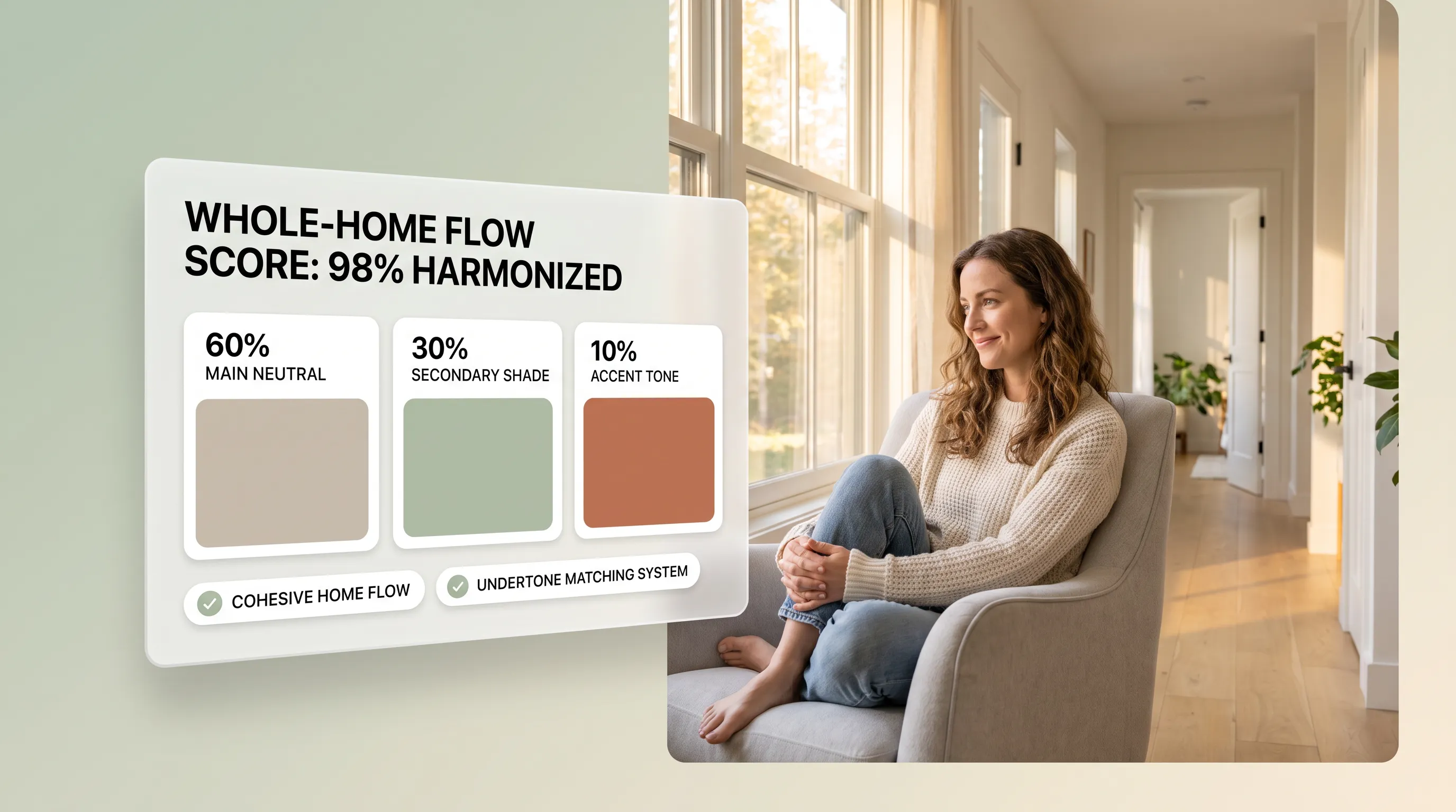
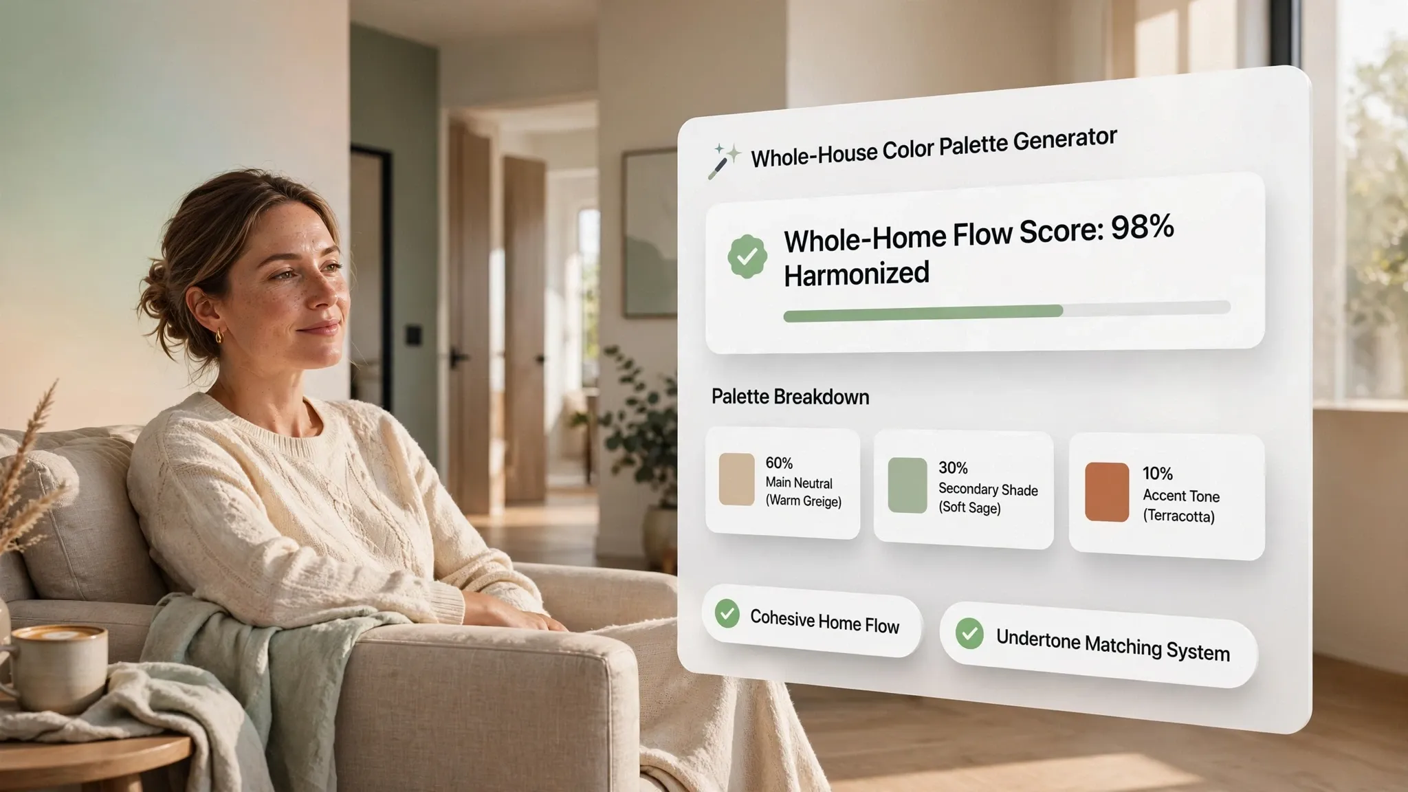
Balancing multiple colors across open archways or wide double doors can easily feel overwhelming without a clear framework. The 60-30-10 rule provides a foolproof ratio to keep adjoining spaces grounded and balanced.
- 60% Dominant Neutral: Apply a continuous neutral shade across shared walls, hallways, and main open areas to anchor the primary vista.
- 30% Secondary Color: Use a complementary hue in the adjoining room—such as on an feature wall, cabinetry, or major furniture pieces—to give that space its own distinct personality.
- 10% Accent Touches: Weave a shared accent shade across both rooms through textiles, artwork, or decor items to bind the two distinct environments into a single story.
Should adjacent rooms be painted the same color or different shades?
Painting adjacent rooms the exact same color creates a spacious, continuous look, but using different shades can add welcome depth and architectural interest. You don't have to choose between total monotony and wild contrast. A smart compromise is pulling shades from the exact same paint swatch strip. By painting the main room in a lighter shade and transitioning the adjoining room to a tone two steps darker, you maintain identical undertones while introducing subtle dimensional contrast that highlights where one room ends and the next begins.
How do you handle transition points like doorways, archways, and cased openings?
The exact spot where two distinct wall colors meet requires a clean architectural boundary, or the transition will look unfinished and messy. Drywall corners, door casings, and cased archways serve as natural stopping points for paint color changes. When dealing with a cased opening or door frame, stop the main wall color precisely at the outside edge of the trim. Keep the trim itself painted in a uniform, crisp white or off-white semi-gloss finish. This clean border acts as a visual palette cleanser, allowing two different room colors to sit side-by-side without visual friction.
What is the best way to transition from a light room to a dark, moody room?
Moving from an airy, sunlit living area directly into a dark, dramatic den or powder room can feel startling if the contrast isn't handled with intention. Embracing dark paint requires strategic framing to look polished rather than accidental. Instead of trying to hide the dark room, frame the doorway as a destination. Keep the hallway or outer room light and neutral, and let the view into the dark room act like a piece of framed artwork. Carrying a subtle element—such as matching trim work or repeating a metallic fixture finish—across the threshold bridges the light and dark zones seamlessly.
How does natural lighting affect color choices between connected spaces?
Natural daylight changes as it travels from room to room based on window orientation, causing the same paint color to look entirely different on opposite sides of a doorway. A warm white that looks golden in a south-facing room can turn cold and gray in a north-facing adjacent space. Before committing to paint, evaluate how light moves through your floor plan throughout the day. If an adjoining room receives cool, shadowy light, choose a paint color with a slightly warmer undertone than the adjacent sunlit room. This subtle adjustment compensates for the light loss and maintains a balanced color temperature across both spaces.
What role does trim color play in connecting adjoining rooms?
Trim work acts as the underlying grid that stitches an entire home together, regardless of how many different wall colors you use. Inconsistent trim colors across connected spaces make an layout feel broken and choppy. Painting all baseboards, door frames, window casings, and crown molding in the exact same shade and sheen throughout adjacent rooms establishes immediate continuity. A single, unified trim color creates a continuous visual ribbon that threads from room to room, giving you the freedom to experiment with distinct wall colors in every space.
Can you use accent walls in adjoining rooms without making the space feel busy?
Accent walls can look stunning in connected rooms, but placing them on flat shared walls or directly across from wide openings disrupts sightlines and creates visual confusion. Accent walls require clear architectural boundaries to work gracefully. Reserve accent walls for recessed alcoves, fireplace surrounds, or headboard walls that sit perpendicular to the main entry point. By placing the accent color deeper within the adjoining room rather than right at the doorway, you draw the eye inward naturally without cluttering the view from the primary room.
How do flooring transitions impact color choices for connected rooms?
Flooring serves as a large horizontal canvas that directly reflects color onto your walls, making wood stains and tile undertones major players in your room-to-room color strategy. If your flooring changes at a doorway—such as transitioning from warm oak hardwood in the hallway to cool gray tile in the kitchen—your wall paint needs to bridge that gap. Selecting a warm greige or versatile off-white wall paint that incorporates both the warm tones of the wood and the cool tones of the tile harmonizes the transition right at floor level.


