

Walking into a home where every room feels like an afterthought is jarring. One room is painted cool slate gray, the adjacent hallway is a warm creamy butter yellow, and the view straight into the dining room reveals a jarring teal accent wall.
You find yourself thinking: “I want my whole house to feel connected, but I don't know where to start.”
Building a cohesive whole house color palette isn't about painting every wall the exact same shade. It is about creating a deliberate color direction that weaves effortlessly from room to room. When your colors talk to each other, your home feels calmer, larger, and far more intentional.
Here’s the reality: narrowing down hundreds of paint chips while trying to envision an entire floor plan is overwhelming. We know how hard it is to see whole house color schemes on tiny paper swatches. That is why applying the DesignHome app takes the guesswork out of the process effortlessly. You get complete, photorealistic whole house color palettes quickly, transforming your home into a better place to live without wasting time or money on wrong paint cans.
Whether you are starting from scratch in a new home or updating an existing floor plan, this step-by-step framework will guide you from overwhelming choices to a finalized, foolproof home color palette.
Start With One Color You Already Love
When faced with thousands of paint samples, staring at a massive color wall causes instant decision fatigue. Your mind goes straight to: “There are so many colors. I need one place to begin.”
The secret? Don't start by choosing five paint cans at once. Choose one anchor color.
Your starting color for whole house design should be something you already own and genuinely love. Look around your home right now for immediate home color inspiration:
- A patterned Persian rug in your living room that contains a gorgeous muted terracotta or dusty sage.
- A favorite piece of artwork hanging in the entryway.
- The undertones in your kitchen countertops or warm oak flooring.
- A favorite velvet throw pillow or heirloom fabric.
By grounding your palette in a permanent fixture or cherished decor item, your main house color will feel naturally authentic rather than forced. Once you lock in that single anchor color, every subsequent decision becomes infinitely easier because you are simply choosing colors that complement your favorite color.

Choose Your Main Neutral for the House
Once you have your anchor accent or inspiration piece, you need a unifying background shade. You might wonder: “What color can connect most of my rooms?”
This is where your whole house neutral color does the heavy lifting. Your main neutral color will cover approximately 60% to 70% of your home’s walls—including busy hallways, entryways, staircases, and open living spaces.
Selecting the right whole house neutral paint creates an essential layer of visual continuity. When a single neutral house color flows through your primary corridors, the eye glides smoothly from space to space without stopping at harsh borders.
When choosing your dominant neutral:
- Identify Floor Undertones: If your floors have warm orange or red undertones (like classic oak or cherry), lean toward warm creamy whites, soft greiges, or warm tans.
- Assess Fixed Finishes: Look at unpainted brick, stone fireplaces, and kitchen cabinetry to ensure your main neutral shares complementary undertones.
- Select Luminous Shades: Standard go-to neutrals like Sherwin-Williams Alabaster or Benjamin Moore Pale Oak offer enough warm depth to reflect light without turning cold or shadowy in low light.

Build a Color Family Around Your Main Color
A common fear among homeowners is ending up with a sterile, monotonous environment: “I don't want every room painted exactly the same.”
You don't have to paint every wall identical to achieve balance. Instead, build a color family for home spaces that uses varying depths of the same base undertones.
Using coordinating paint colors from a single color family allows you to shift the mood from room to room while keeping the overarching story intact. This technique—often called a tonal color palette—uses related paint colors that sit next to or near each other on a paint strip.
| Palette Level | Shade Character | Strategic Application |
|---|---|---|
| Light Tone | High reflectivity, subtle warm tint | Dark hallways, small interior entryways |
| Medium Tone | Balanced depth, dominant neutral family | Main living room walls, open dining areas |
| Deep Tone | Saturated, rich version of base shade | Cozy home office, moody accent walls, den |
Think about it this way: if your main neutral is a soft warm greige, you can use a lighter version of that greige for dim corridors, a medium version for the sunlit living room, and a rich, deep charcoal-greige for a cozy den. They are all distinct rooms, yet they feel inherently related.
Decide Where to Use Accent Colors
Neutral walls build peaceful balance, but bold shades inject energy and personality. The common question is: “Where can I use stronger colors without making the house feel busy?”
Strategic placement is everything when applying accent colors for whole house layouts. Rather than scattering random vibrant shades across every wall, restrict your home accent color palette to 2 or 3 distinct, repeating accent shades.
Here is how to assign whole house accent colors with intention:
- Anchor Areas: Position richer accent wall colors or moody shades in transitional anchor spots—like the far wall of an entryway, inside built-in bookcases, or behind a dining room sideboard.
- Focal Architectural Features: Use deeper accents to highlight fireplace surrounds, kitchen islands, or interior door panels.
- Saturated Micro-Spaces: Powder rooms, laundry rooms, and pantries are ideal playgrounds for experimental accent shades because their doors remain closed most of the time.
By placing memorable colors at key focal points, your home feels expressive rather than chaotic.

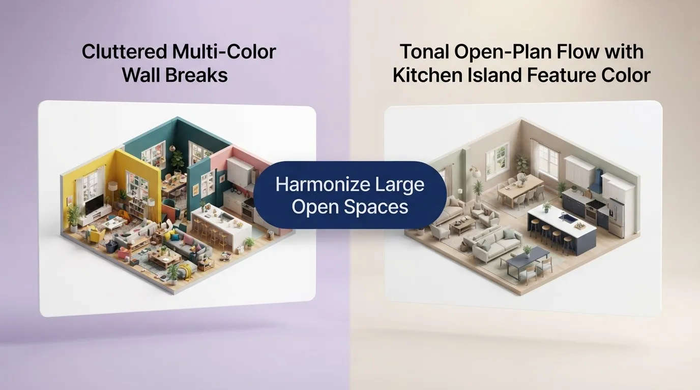
Connect Open-Plan Rooms With Color
Open layouts offer fantastic light and spaciousness, but decorating them brings unique challenges. You ask yourself: “My living room, dining room, and kitchen are visible together. How do I make them work?”
When multiple functional areas share direct sightlines, you need a unified open plan color scheme. Applying contrasting colors to adjacent walls in an open layout breaks up the room awkwardly.
To create smooth transitions across an open concept color palette:
- Use One Wall Color Across Shared Sightlines: Keep the perimeter walls in a single, high-reflectivity neutral.
- Define Zones With Cabinetry and Furnishings: Instead of changing wall paint, shift color through kitchen island cabinets, rug textures, and upholstered seating.
- Harmonize Fixed Features: Match backsplash tiles and island paint with your broader open plan paint colors so kitchen task zones feel like an extension of the living space.
If you are struggling to map out shared sightlines, explore our guide on choosing colors for adjoining rooms to master visual continuity.
Use the Same Color in Different Ways
Repetition creates harmony, but exact repetition causes boredom. The common dilemma is: “How can I use one color throughout the house without making everything look the same?”
The secret lies in shifting how and where a color is applied. By weaving coordinating colors throughout house surfaces, you build subtle rhythm.
Here is how to repeat colors in home interiors across different materials and finishes:
- Invert Wall and Trim Shades: If Room A features white walls with sage green trim, paint Room B in full sage green with crisp white trim.
- Cross-Pollinate Textiles and Architectural Features: Take the rich navy accent paint used on your kitchen island and repeat it through velvet living room throw pillows or entryway runner rugs.
- Shift Sheens: Apply a color in a matte finish on dining room walls, then use the exact same shade in a high-gloss sheen on built-in cabinetry or doors.
This approach to whole house color coordination delivers flawless home color flow—your brain recognizes the subtle color threads without ever feeling like it's looking at a carbon copy.
Make Bedrooms, Bathrooms, and Private Rooms Their Own
While open living spaces demand unified schemes, enclosed spaces give you room to play. You naturally want to know: “Can each room have its own mood too?”
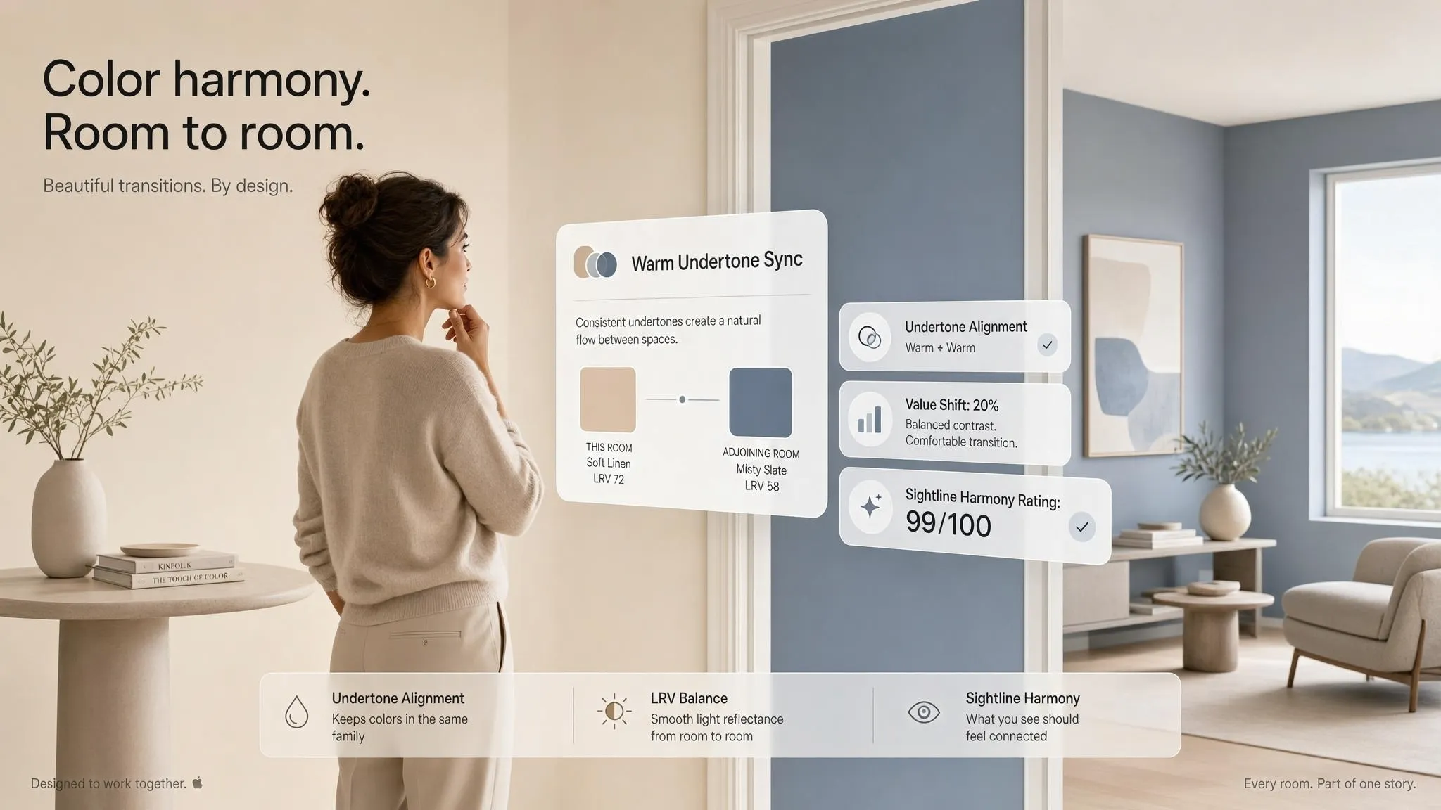
Yes! Private, enclosed spaces like bedrooms, primary bathrooms, and home offices can express individual personalities while staying connected to the larger palette.
When building a bedroom color palette or bathroom color palette:
- Keep the Base Undertone: If your main house palette uses warm, earthy undertones, choose room color schemes for private rooms that share warm bases (e.g., terracotta, warm sage, or muted plum).
- Pull From the Accent Family: Take an accent shade used sparingly in your living room and turn it into the dominant wall color in a bedroom.
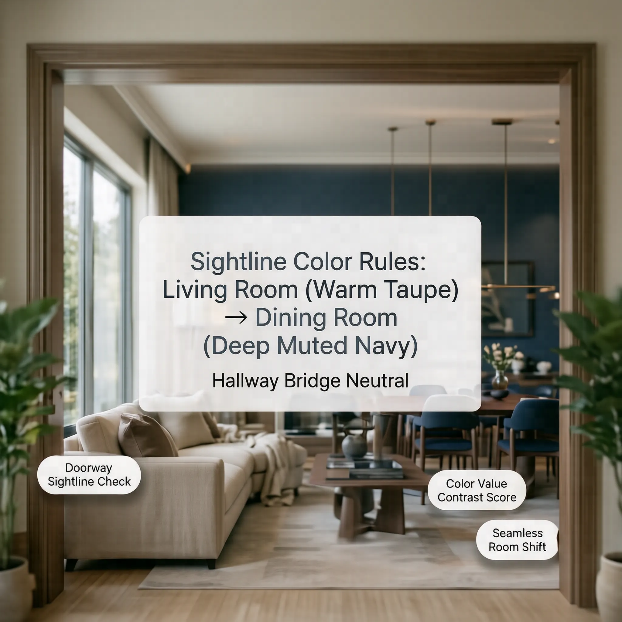
- Ensure Smooth Threshold Transitions: When standing inside a private bedroom with the door open, the view into the hallway should still feel balanced and complementary.
Using coordinating bedroom colors maintains a sense of peaceful retreat without making the room feel like it belongs in a completely different house.
Check How Lighting Changes Your Palette
Nothing is more frustrating than picking a paint chip in the store, only to realize later: “The color looked perfect in the store, but different at home.”
Color does not exist without light. The direction, intensity, and temperature of your light sources will dramatically alter how paint colors and lighting interact.
Here is how lighting and paint color behave across different exposures:
- North-Facing Light: Cool, indirect, bluish light. It drains warmth, turning cool grays icy and muted whites muddy. Use warm light paint colors containing subtle cream or yellow undertones here.
- South-Facing Light: Intense, warm sunshine all day. It amplifies pigments, allowing you to use both rich dark colors and pale neutrals effortlessly.
- East & West Light: Shifts dramatically throughout the day. Morning light is warm and golden (East), while evening light glows reddish-orange (West).
Always evaluate natural light paint colors alongside your artificial bulbs. Swapping cool LED bulbs (5000K) for warm soft white bulbs (2700K–3000K) can instantly fix a room that feels too clinical. If you are dealing with gloomy spaces, check out our guide on selecting colors that make a room feel brighter.

Coordinate Walls, Trim, Doors, and Ceilings
Walls get all the attention, but architectural details tie the entire room together. You are likely asking: “The walls work, but what should I do with the trim and doors?”
Establishing cohesive wall trim door color combinations turns standard drywalls into a custom, high-end interior.
To complete your architectural palette:
- Classic Contrast Trim: Pair soft neutral walls with crisp white trim colors (like Benjamin Moore Simply White) for a timeless, structured frame.
- Color-Drenched Surfaces: Paint walls, baseboards, crown molding, and ceiling colors in the exact same shade and sheen. This eliminates hard sightlines, making low ceilings feel higher.
- Statement Door Colors: Use a rich, dark neutral (like charcoal, deep espresso, or dark olive) on interior door colors. It grounds hallways and masks fingerprints on high-touch surfaces.
For actionable formulas on matching architectural elements, explore our breakdown of trim and wall color combinations.
Test Your Whole House Color Palette Before Painting
The biggest mistake homeowners make is buying full gallons of paint based on small 2-inch paper chips. The thought hits: “I don't want to buy paint and discover the colors clash.”
Before spending hundreds of dollars on paint cans, you must test whole house color palette choices in real-world conditions.
Follow this testing workflow:
- Order Peel-and-Stick Swatches: Use large 12x12 peel-and-stick samples from services like Samplize or paint 2x2 poster boards using 8oz sample pots.
- Move Samples Around the Room: Tape swatches next to trim, near windows, and in dark corners. Observe them at 8:00 AM, 1:00 PM, and 8:00 PM under artificial light.
- Visualize House Colors Digitally: Before sticking anything to your walls, use modern interior visualization platforms.
Using the DesignHome app, you can quickly visualize house colors across complete 3D room layouts. The app acts as an interactive paint color visualizer and home color visualizer, letting you test how wall shades, trim options, and lighting setups interact across open floor plans. Seeing your palette rendered in 3D helps you test paint colors risk-free before opening a single paint can.
For step-by-step swatch testing techniques, review our expert tips on how to test paint colors before painting.
Turn It Into a Whole House Color Plan
You have chosen your shades, tested them under natural light, and verified them digitally. Now comes the final execution phase: “Now I need to know exactly which color goes where.”
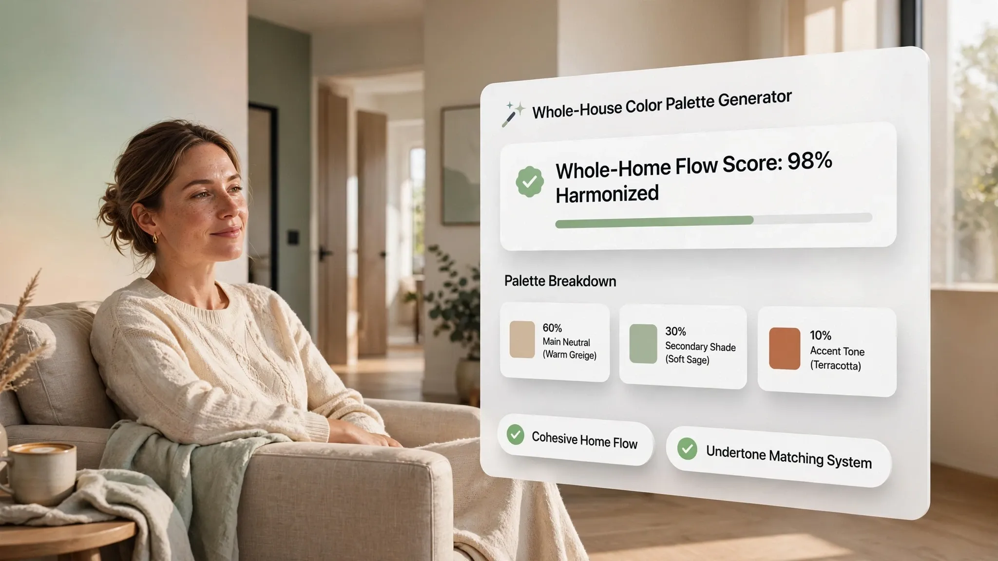
Transforming your vision into a concrete whole house color scheme requires a simple, repeatable roadmap. Creating a documented whole house paint color scheme ensures your painters (or your DIY efforts) execute the project flawlessly without miscommunications.
Your Master Home Color Palette Chart
Use this structured house color plan framework to organize your project:
| Room / Zone | Wall Color & Brand | Finish/Sheen | Trim & Ceiling Color | Accent Feature |
|---|---|---|---|---|
| Foyer & Hallways | Sherwin-Williams Alabaster | Eggshell | Simply White (Semi-Gloss) | Charcoal Front Door |
| Living Room | Benjamin Moore Pale Oak | Satin | Simply White (Semi-Gloss) | Natural Oak Mantle |
| Kitchen & Dining | Benjamin Moore Pale Oak | Satin | Simply White (Semi-Gloss) | Navy Island Cabinets |
| Primary Bedroom | Sherwin-Williams Sea Salt | Matte | Simply White (Semi-Gloss) | Muted Brass Fixtures |
| Powder Bathroom | Benjamin Moore Hale Navy | Eggshell | Hale Navy (Color-Drenched) | Brushed Gold Mirror |
Documenting your home color palette chart gives you a clear master reference for painting day, future furniture purchases, and touch-ups down the road.
Ready to eliminate the guesswork and design a stunning, connected home? Try our interactive color palette generator tool or explore complete home painting project guidance on DesignHome today. Effortlessly build, preview, and refine your entire whole house color palette in minutes—and turn your house into a beautifully cohesive home.
Creating a Whole House Color Palette: 10 Essential FAQs
1. What is a whole house color palette and why is it essential for home design?
A whole house color palette is an intentional, curated collection of three to five coordinating paint shades applied throughout an entire residence to establish visual harmony and effortless spatial flow. Without a unified palette, moving from room to room can feel disjointed as clashing undertones interrupt the natural movement of your eye across doorways. Designing a whole-home palette resolves this by creating a clear relationship between adjacent spaces. The secret comes down to shared visual character. When connected rooms share underlying warm or cool base tones, your mind naturally groups these individual areas into a single, cohesive dwelling rather than a fragmented series of isolated boxes.
2. How do you choose the main anchor color for an entire home?
The main anchor color should be a light-reflecting neutral shade that covers roughly sixty percent of the home's total wall surfaces, particularly in high-traffic shared areas like entryways, stairwells, and open living spaces. To pick the right anchor shade, look closely at your home's most permanent fixtures—such as hardwood flooring, stone fireplaces, or kitchen countertops—rather than starting with paint swatches. Think of these hard finishes as your unchangeable baseline. By identifying whether your fixed materials lean warm or cool, you can select a dominant neutral wall paint that shares those exact underlying tones, building a grounded backdrop that allows your furniture and art to take center stage.
3. How many colors should be included in a whole house color scheme?
A successful whole house color scheme typically relies on three to five carefully chosen shades organized around a structured ratio. Relying on too many colors creates visual chaos, while using only one color can leave an interior feeling flat and sterile. You can strike the perfect balance by following a whole-home color distribution strategy. Allocate one primary neutral for open corridors, one supporting neutral for secondary bedrooms or cozy dens, and one to two accent tones for cabinetry, built-in shelving, or enclosed spaces. This disciplined restraint allows the mind to complete the visual connection across the layout, making the entire interior feel complete and unified.
4. What is the best technique to create seamless color transitions between adjacent rooms?
Creating seamless color transitions between adjoining rooms requires managing the visual line of sight that connects one space to the next. When standing in a doorway, every wall surface visible in your immediate and peripheral view must share a harmonious color relationship. Here is how you make it work effortlessly. Instead of switching abruptly from a pale shade in one room to a dark hue in the next, transition gradually by shifting one or two steps lighter or darker along the same paint color strip. Carrying identical undertones across room thresholds ensures that as your eye glides from space to space, the optical path remains smooth and uninterrupted.
5. How do light reflectance values and window exposures dictate color choices across different rooms?
Light Reflectance Value (LRV), measured on a scale from 0 to 100, indicates how much light a paint color reflects or absorbs, directly governing how bright or dark a room feels. Because natural daylight shifts dramatically depending on a room's compass orientation, a single paint shade can look vastly different from room to room. North-facing rooms receive cool, bluish light that drains warmth, requiring higher LRV shades with warm cream or pink bases to avoid looking chilly and shadow-streaked. Conversely, south-facing spaces are flooded with intense golden sunlight that can handle lower LRV tones and muted greiges without losing clarity. Balancing these light shifts keeps the entire home feeling consistently luminous.
6. What role do trim, doors, and ceilings play in connecting a whole house color palette?
Trim, interior doors, and ceilings act as the continuous architectural frame that binds diverse wall colors into a single, cohesive presentation. Using a single, consistent trim and door color throughout every floor instantly stitches separate rooms together, regardless of how much individual wall shades vary. Consider this simple rule of thumb for instant cohesion. Painting baseboards, door casings, and window frames in a clean, highly reflective off-white semi-gloss finish creates a distinct border that outlines every room. Meanwhile, keeping ceilings painted in a uniform, flat ceiling white or a soft wash of your main neutral completes the upper frame, pulling the whole house together under one continuous canopy.
7. How can you add bold or dark accent colors without disrupting the home's overall flow?
Incorporating rich or dramatic accent colors into a whole house palette is best achieved by confining dark shades to fully enclosed rooms or deliberate focal surfaces. Spaces with clear architectural boundaries—such as powder rooms, home offices, pantry doors, or kitchen islands—are ideal candidates for deep navy, forest green, or moody charcoal. The trick to keeping these bold choices cohesive lies in contrast management. When a dark accent room is framed against a light, warm neutral corridor, the clear separation between the dark foreground and light background makes the bold room feel like an intentional, luxurious destination rather than an out-of-place distraction.
8. How do fixed features like flooring, cabinets, and stone dictate wall paint selections?
Fixed architectural features serve as the permanent foundation of your color palette, meaning wall paint must always adapt to hard surfaces rather than the other way around. Flooring, countertops, wall tile, and exposed brick contain locked-in undertones that cannot be altered without major renovations. Before picking a single paint swatch, analyze these permanent materials in direct natural daylight. If your hardwood floors feature warm amber or red undertones, pairing them with cool, blue-based grays will cause the floor to look aggressively orange. Selecting warm greiges or creamy whites creates a complementary background, letting your fixed surfaces look purposeful and refined.
9. What are the differences between monochromatic, analogous, and high-contrast whole house palettes?
Whole house color palettes generally fall into three structural categories: monochromatic, analogous, or high-contrast, with each offering a distinct visual atmosphere. Monochromatic palettes utilize varying shades, tints, and sheens of a single color family, creating a deeply serene and expansive environment where spatial boundaries dissolve. Analogous palettes pair neighboring colors from the color wheel—such as warm creams, soft sage greens, and muted terracotta—producing a rich, organic interior with gentle variation. High-contrast palettes combine light perimeter backdrops with dark architectural details or moody rooms, establishing a dynamic interplay that highlights the home's structural lines.
10. What is the correct step-by-step process for testing paint samples across a whole house?
The proper method for testing paint samples involves viewing large, physical swatches across multiple walls, light exposures, and room transitions over a full twenty-four-hour cycle. Small paint chips viewed on a desk are inherently misleading because artificial lighting and nearby surfaces alter perceived color dramatically. To test accurately, place large peel-and-stick samples directly adjacent to trim, flooring, and doorway sightlines. Observe how morning sunlight, sharp afternoon glare, and warm evening lamps alter the paint's underlying tones. Evaluating your test swatches at key transition points prevents costly painting mistakes and ensures your entire palette performs flawlessly around the clock.


