

You walk into your compact bedroom or narrow living room and immediately feel the four corners closing in around your shoulders
Your furniture is thoughtfully scaled and clutter is tucked away, yet stark contrasting trim lines, choppy doorway transitions, and flat builder-grade paint chop the room into a tight, boxy grid. You stand in the center of the rug, scan the walls, and ask yourself: My room already feels cramped—can changing the wall color actually make this limited space feel taller, wider, and genuinely open?
Here is the architectural reality of compact interior color: selecting paint colors for small rooms isn't about blindly slapping stark white onto every square inch—it is about erasing harsh visual boundaries where walls meet ceilings, controlling light reflectance across shadowed corners, and matching color intensity to your room's exact proportions.
A compact room shrinks visually when bright white baseboards chop vertical height into horizontal stripes, when cool gray paint turns dreary in low-light corners, and when adjacent rooms switch colors abruptly at every doorway. By color-drenching walls and millwork in unified tones, softening edges with misty greens or luminous greiges, and extending continuous wall shades across hallways, you trick the human eye into perceiving expansive architectural depth.
Whether you are opening up a tight studio apartment or refreshing a cozy guest bedroom, here is how to plan, test, and execute your small-room paint palette step by step.
1. Paint Colors for Small Rooms That Make Limited Space Feel More Open
Before buying gallons of stark gallery white because an old decorating rule told you small rooms can only handle white walls, look closely at how human eyes actually measure room boundaries.
Most compact rooms feel tight not because of their square footage, but because high-contrast color breaks—dark walls meeting bright white ceilings and baseboards—draw a sharp picture frame around the room's small perimeter.
To master paint colors for small rooms, evaluate small room paint colors, and apply high-impact colors for small spaces, anchor your layout around three foundational rules:
- Blur Corner and Ceiling Boundaries: When walls, baseboards, and ceilings share the same color family, the eye stops noticing where one plane ends and another begins, making walls feel taller and wider.
- Match Color Value to Natural Light: Rooms flooded with sunshine thrive in crisp, airy tints that bounce daylight, whereas dim rooms without windows look far richer in saturated mid-tones or warm creams than flat white.
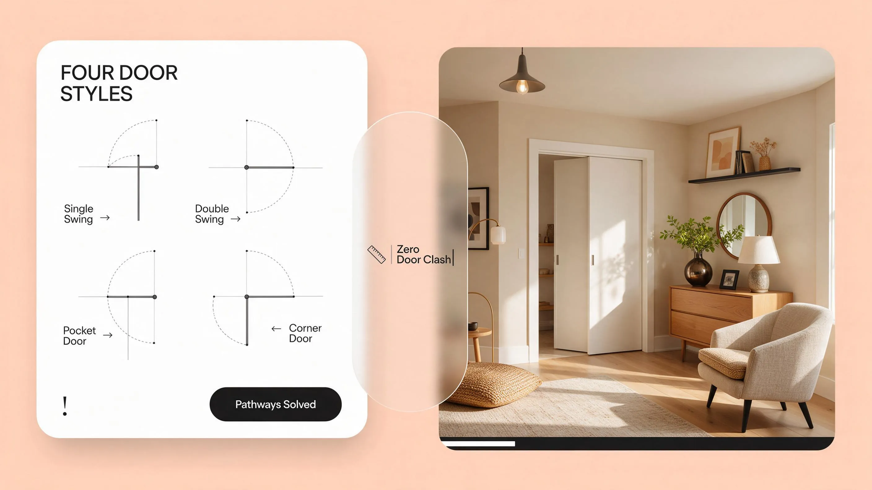
- Eliminate Visual Interruptions: Keep wall colors continuous across doors, closets, and built-in bookcases so bulky storage disappears into the architecture rather than jutting into the room.
Explore our architectural strategies for choosing interior wall colors to see how directional compass light and fixed flooring finishes guide every paint decision in your home.
2. Choose Light or Dark Paint Colors Based on the Room's Layout
The endless debate between airy pale shades and moody dark tones comes down to one simple question: do you want your walls to reflect daylight outward, or dissolve shadowy corners into cozy depth?
Comparing light vs dark paint colors for small rooms, selecting the best colors for small spaces, and testing dark paint colors for small rooms lets you pick the exact intensity your architecture needs.
Follow this 3-step diagnostic before choosing light or dark paint:
- Use Light Colors Where Sunlight Enters Freely: If your small room features a large window, pale warm neutrals and soft misty hues multiply incoming daylight and make walls visually recede.
- Embrace Dark Colors Where Natural Light Is Scarce: Painting a windowless powder room or cozy den stark white only highlights every shadow; deep charcoal, espresso, or forest green blurs room corners and adds dramatic luxury.
- Avoid Mid-Tone Muddy Grays in Tight Spaces: Medium-dark cool grays without rich color saturation often look flat and dreary in small rooms—commit either to luminous lightness or rich, intentional depth.
3. Use Warm and Cool Paint Colors to Change How a Small Room Feels
Color temperature acts like an invisible thermostat inside a compact room, shifting whether four walls feel like an expansive open sky or a warm, protective cocoon.
Understanding warm paint colors for small rooms, selecting cool paint colors for small spaces, and comparing warm vs cool wall colors helps you shape your room's exact atmosphere.
• Visually pushes walls outward from eye
• Ideal for sunny living rooms & kitchens
• Draws walls closer for cozy comfort
• Ideal for bedrooms & evening reading nooks
Color temperature rules for compact rooms:
- Push Walls Outward With Cool Undertones: Because cool colors like pale slate blue, seafoam, and soft sage sit farther back on the visual spectrum, they trick your eye into perceiving extra breathing room in tight living areas.
- Create Cozy Intimacy With Warm Undertones: Creamy ivory, warm putty, and soft camel visually advance slightly, wrapping small bedrooms and dining corners in welcoming warmth.
- Balance Temperature Against Room Exposure: Pair sun-drenched south-facing small rooms with cool-leaning shades to calm glare, while warming up north-facing compact rooms with golden or earthy undertones.
4. Check Natural Light Before Choosing Paint Colors for Small Rooms
A paint shade that looks luminous in a bright corner bedroom can turn dull, flat, and lifeless inside a small room shaded by neighboring buildings or evergreen trees.
Selecting paint colors for small rooms with little natural light, pairing small room colors with natural light, and evaluating wall colors for dark rooms prevents disappointing results.
Daylight evaluation guidelines:
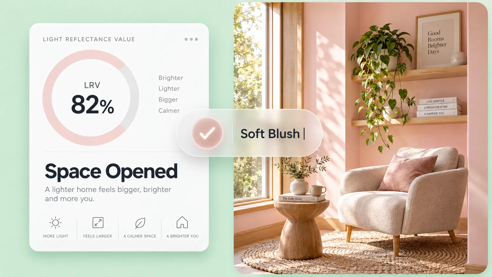
- Skip Stark Ice-White in Dim Rooms: Without direct sunbeams to bounce off it, pure brilliant white turns shadowy gray in small low-light rooms; choose warm alabaster or rich deep hues instead.
- Check Light Reflectance Value (LRV): Look at the LRV rating printed on your paint swatch—shades between 65 and 82 reflect generous light in small rooms without creating harsh glare.
- Supplement Paint With Layered 2700K Lighting: Even the brightest paint needs light to come alive; pair compact room walls with wall sconces and table lamps to illuminate dark corners evenly.
For technical specifications on residential daylighting metrics, Light Reflectance Value (LRV), and small-space illumination levels, visit the Illuminating Engineering Society (IES).
5. Choose the Right White and Neutral Paint Colors for Small Spaces
White and neutral walls remain the most popular choice for compact homes, yet picking the wrong undertone leaves a small room feeling either sterile like a clinic or dingy like aged paper.
Comparing white paint colors for small rooms, selecting neutral paint colors for small spaces, and testing beige paint colors for small rooms ensures a crisp, tailored backdrop.
White and neutral selection guidelines:
- Choose Softened Off-Whites Over Pure Brilliant White: Whites with a whisper of warm gray or cream—like classic alabaster or soft Swiss coffee—keep small spaces airy while feeling soft and livable.
- Use Light Greige for Architectural Depth: A pale greige gives small walls just enough pigment to contrast subtly against white furniture without closing in the room.
- Avoid Heavy Yellow-Tan Beiges: Outdated yellow-based beiges can make tight walls feel heavy; opt for updated sandy oat or warm mushroom neutrals with clean, modern undertones.
Turn your compact square footage into an airy, expansive sanctuary without costly guesswork. Upload a photo or floor plan of your space to DesignHome, and discover the best Paint Colors for Small Rooms tailored specifically to your layout—testing color-drenched ceilings, luminous neutrals, and furniture pairings in interactive 3D so your small room feels dramatically bigger and truly one-of-a-kind.
Make Your Small Room Feel Bigger Today with DesignHome →See Your Small Room Transform From Cramped to Spacious in 3D
Picking a paint swatch from a tiny paper strip makes it almost impossible to picture how unified wall and trim colors will open up your tight floor plan. You shouldn't have to spend a weekend painting four walls only to realize the shade makes your room feel smaller than before.
🎨 Open Color Studio →6. Try Soft Greens, Blues, and Other Colors Beyond White
You do not have to sentence your small room to plain white walls just because square footage is tight; muted botanicals and dusty blues actually expand perceived depth.
Exploring green paint colors for small rooms, testing blue paint colors for small rooms, and applying colorful small room paint ideas brings effortless character into compact layouts.
Color beyond white tactics:
- Bring Nature In With Muted Sage Green: Soft gray-greens act almost like a neutral, visually blurring the boundary between your room and outdoor greenery so walls feel open and restful.
- Expand Sightlines With Pale Dusty Blue: Because the human eye associates soft blue with distant skies and horizons, pale blue-gray walls naturally make small bedrooms and bathrooms feel deeper.
- Keep Colors Desaturated and Soft: Choose colors with a touch of gray or brown mixed into the pigment rather than bright primary hues, keeping compact rooms calm and sophisticated.
For guidance on zero-VOC interior paints, non-toxic mineral pigments, and sustainably crafted home finishes, consult the Sustainable Furnishings Council (SFC).
7. Paint Ceilings and Trim to Make a Small Room Feel More Balanced
Traditional bright white crown molding and baseboards slice a small room's walls into rigid horizontal bands, constantly reminding your eye exactly how short your ceiling is.
Mastering ceiling paint colors for small rooms, coordinating trim colors for small rooms, and learning how to paint walls and ceiling same color unlocks instant vertical height.
• Ceiling line stops eye abruptly at 8 feet
• Doors & closets stick out as visual clutter
• Ceiling painted same shade blurs top edge
• Room feels noticeably taller & seamless
Ceiling and trim guidelines:
- Color-Drench Walls, Trim, and Doors Together: Paint your walls in eggshell and coat your baseboards, window casings, and closet doors in the exact same color using satin sheen; eliminating contrast makes walls look taller and uninterrupted.
- Extend Wall Color Onto the Ceiling: In small bedrooms, dining nooks, and hallways, painting the ceiling the exact same shade as the walls erases the sharp corner shadow where wall meets ceiling, creating an expansive canopy effect.
- Keep Trim Clean If Using High Contrast: If you prefer classic white trim, match its undertone strictly to your wall paint and keep baseboard profiles slim so millwork never overwhelms compact proportions.
8. Use One Paint Color Across Connected Walls to Create Visual Continuity
Switching from a blue hallway into a beige living room and a green dining nook chops a small home into tiny, disconnected compartments.
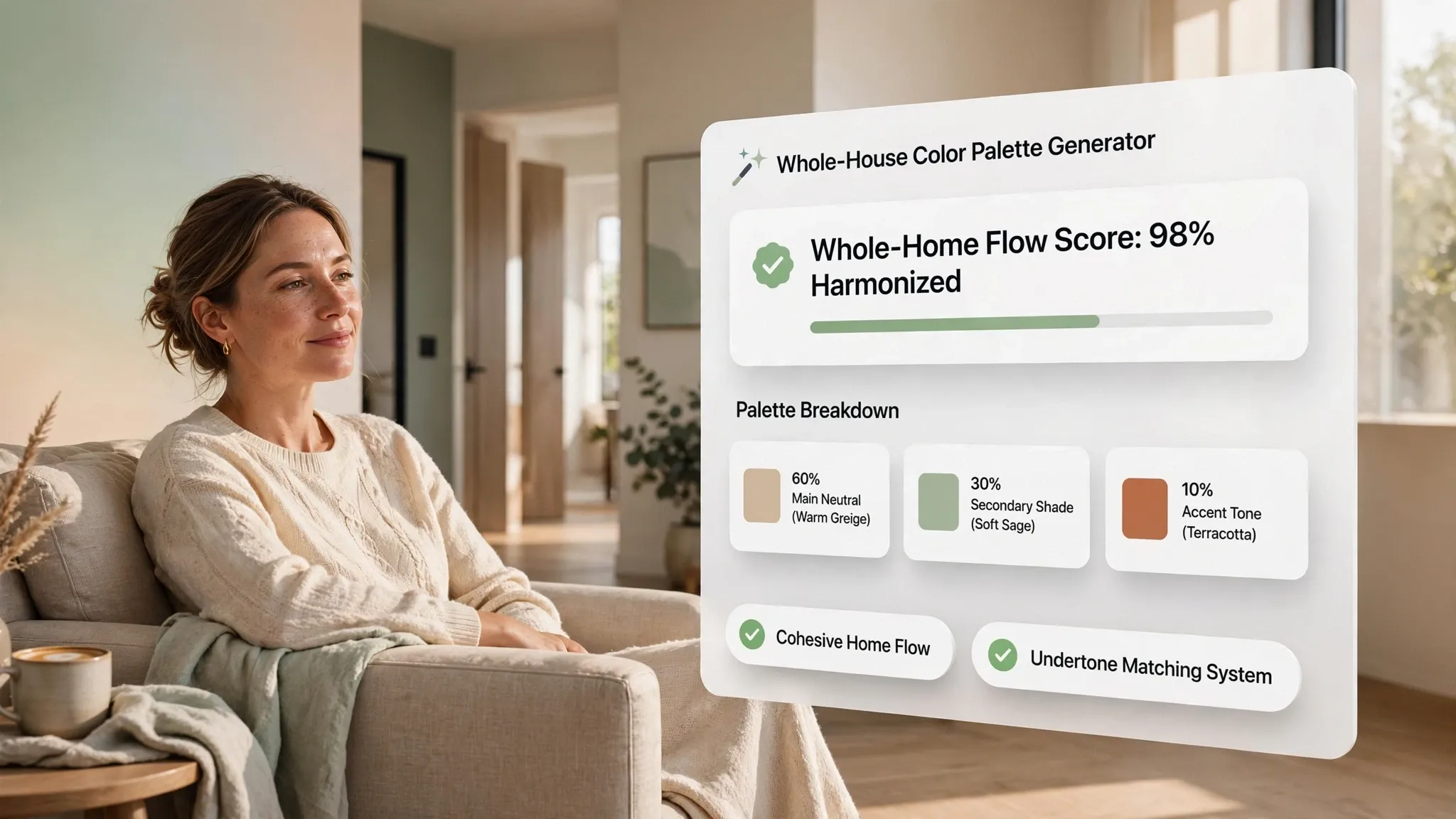
Applying paint colors for connected rooms, building a unified small home color scheme, and using continuous wall colors makes your entire floor plan read as one generous space.
Whole-home continuity rules:
- Unify Sightlines With One Foundational Shade: Stand in the center of your home and paint every wall visible from that spot in one cohesive color so your eye glides smoothly from room to room.
- Eliminate Choppy Transition Corners: In compact apartments or bungalows where drywall corners wrap tightly from hallway to living room, wrapping the exact same color around outside corners prevents jarring visual breaks.
- Create Subtle Tonal Shifts Between Rooms: If you want variety, move one or two steps lighter or darker on the exact same paint swatch card when transitioning into adjacent spaces.
Explore our architectural strategies for flexible small home design to see how continuous color palettes and multi-duty furniture make compact homes work harder.
9. Choose Paint Colors for Small Living Rooms, Bedrooms, and Kitchens
Each compact room in your house carries a completely different daily purpose—meaning your small kitchen needs crisp light reflection while your bedroom thrives in soothing calm.
Selecting tailored small living room paint colors, restful small bedroom paint colors, and bright small kitchen paint colors optimizes every square foot.
Room-by-room selection tactics:
- Keep Small Living Rooms Airy and Adaptable: Choose warm greige, soft alabaster, or pale eucalyptus in compact living rooms so seating feels open during the day and cozy under evening lamps.
- Turn Small Bedrooms Into Restful Retreats: Lean into desaturated dusty blue, warm mushroom, or rich dark green in tight bedrooms to transform compact dimensions into a peaceful sleeping sanctuary.
- Match Small Kitchen Walls to Cabinet Colors: Painting small kitchen walls the exact same soft off-white or pale stone color as your upper cabinets eliminates visual clutter and makes tight kitchens feel twice as wide.
Explore our guide on use vertical space in a small home to pair seamless wall colors with floor-to-ceiling storage that keeps small rooms clutter-free.
10. Coordinate Small Room Wall Colors With Flooring and Furniture
In a compact room, large furniture pieces like your sofa, bed frame, and area rug occupy a huge percentage of your visual field—meaning wall paint must harmonize with them seamlessly.
Matching small room wall colors with furniture, pairing paint colors with wood floors, and matching wall colors with flooring prevents visual crowding.
• Orange oak floors fight icy cool gray walls
• Too many competing colors shrink the room
• Warm neutral walls flatter wood floor grain
• Unified tones let furniture blend effortlessly
Coordination rules for compact interiors:
- Match Wall Tones to Your Largest Furniture Piece: In a tight bedroom or living room, choosing a wall color within two shades of your upholstered headboard or sofa helps large furniture visually recede into the wall.
- Harmonize Undertones With Hardwood Planks: Pair warm honey oak floors with creamy off-white or soft sage walls, and pair cool gray or dark walnut floors with balanced greige or crisp neutral white.
- Keep Window Treatments Blended With Walls: Hang curtains in a shade closely matching your wall paint so window coverings extend the wall plane rather than cutting the room into vertical stripes.
11. Test Paint Samples to See How Colors Look in a Small Room
Because walls in a small room sit closer together, paint colors bounce off opposing walls and intensify each other—making a soft shade look twice as saturated once all four walls are painted.
Knowing how to test paint colors in small rooms, evaluate small room paint samples, and master how to choose wall paint colors prevents expensive repainting mistakes.
Foolproof small-room testing steps:
- Test in Inside Corners Where Walls Bounce Light: Place two painted sample boards meeting in a 90-degree room corner; in small spaces, adjacent walls reflect color onto each other, making shades look deeper than on a flat card.
- Use Movable Foam Boards Instead of Painting Drywall: Never paint small swatches directly onto your old wall color, as the surrounding old paint tricks your eyes into misreading undertones.
- Evaluate Under Evening Artificial Lighting: Check your shortlisted shades at night with only your room lamps turned on to ensure shadows stay warm and inviting.
For official residential indoor air quality standards, low-VOC emission guidelines, and safe surface preparation practices, consult the International Code Council (ICC).
12. Create a Small Room Color Scheme That Makes the Space Feel Complete
Bringing unified wall and trim colors, light-balanced undertones, continuous hallway sightlines, and furniture-matched palettes together turns a cramped small room into a serene, spacious jewel.
Finalizing balanced small room color schemes, building winning small space paint color combinations, and selecting the right interior paint colors for small rooms gives you lasting confidence.
Your Small Room Paint Color Sign-Off Checklist:
Make Your Compact Room Feel Spacious, Balanced, and Effortlessly Yours
You shouldn't have to knock down walls or live inside a sterile white box just to make a small room feel open and welcoming. When you erase sharp trim boundaries, harmonize wall undertones with your flooring and furniture, and carry continuous color across connected spaces, every square inch of your room breathes with unexpected depth.
Which compact space—a tight bedroom, a narrow living room, or a dim hallway—are you ready to open up with color right now? Share your room photos with DesignHome, test custom small-room paint schemes and color-drenched ceilings in interactive 3D, and craft a breathtaking space that feels bigger, brighter, and unmistakably yours.
Frequently Asked Questions About Paint Colors for Small Rooms
My bedroom already feels tight and boxy—can changing the wall color genuinely make this limited space feel more open and airy?
Here is the raw truth: a compact room feels suffocating not because of its square footage alone, but because sharp contrast lines where dark walls meet bright white baseboards draw a tight picture frame around a small perimeter.
Choosing smart paint colors for small rooms isn't about slapping stark white onto every wall—it is about blurring visual corner boundaries, matching shade intensity to natural light, and maintaining continuous sightlines. Applying thoughtful small room paint colors and curating colors for small spaces lets your eye read a wider, more relaxed room without knocking down a single wall.
Should I paint my compact room a bright light shade to stretch the space, or can rich dark paint actually work in a small room?
The old rule that small rooms must stay pale white ignores how light and shadow actually behave inside tight corners and windowless alcoves.
Weighing light vs dark paint colors for small rooms lets you pick the exact depth your layout demands rather than guessing blindly. While airy pale tones open up sunny spaces, dark paint colors for small rooms—and the right best colors for small spaces—can dissolve harsh shadows in dim rooms and turn compact quarters into rich, intentional sanctuaries.
Why does one color make my small room feel open and breezy while another makes the walls feel like they are closing in?
Color temperature acts like a quiet visual shift inside a compact space, changing whether walls feel gently receding or warmly enveloping.
Balancing warm paint colors for small rooms against cool paint colors for small spaces gives you direct control over room atmosphere. Understanding warm vs cool wall colors helps you pair cool, muted shades where you want an airy feel and warm, creamy tones where you want cozy comfort.
My small room barely gets any natural sunlight—which wall colors will still look lively instead of dull and shadowy?
A paint shade that looks crisp in a bright corner room can turn flat and gloomy inside a compact space shaded by neighboring buildings or trees.
Picking paint colors for small rooms with little natural light starts with checking how much daylight reaches your walls and choosing undertones that stay warm rather than turning icy gray. Matching small room colors with natural light and smart wall colors for dark rooms keeps dim spaces looking intentional instead of dreary.
White seems like the safest choice for a tight room, yet I worry white paint will look sterile like a hospital or dull like gray.
Pure bright white in a compact room often bounces harsh glare or turns shadowy gray in corners lacking direct sunlight.
Comparing white paint colors for small rooms, exploring neutral paint colors for small spaces, and testing beige paint colors for small rooms helps you find soft, livable neutrals with balanced undertones. Choosing creamy off-whites, warm greiges, or sandy neutrals gives small walls gentle warmth without feeling heavy.
I want more personality than plain white walls, but I don't want green or blue to make my small room feel crowded.
You do not have to lock a small room into plain white just to keep it feeling open; muted botanicals and softened blues bring character while maintaining calm visual flow.
Exploring green paint colors for small rooms, testing blue paint colors for small rooms, and trying colorful small room paint ideas adds depth without visual noise. Softened, grayed-down shades of sage, eucalyptus, or misty blue feel relaxed and expansive when paired with uncluttered furnishings.
Should my ceiling always stay stark white in a small room, or will matching ceiling and trim colors change the proportions?
Bright white trim and ceilings slice a small room's height into horizontal bands, constantly reminding your eye where the walls stop.
Smart ceiling paint colors for small rooms, coordinated trim colors for small rooms, and learning when to paint walls and ceiling same color help erase sharp boundary lines. Color-drenching walls, baseboards, doors, and ceilings in one unified shade makes compact rooms feel taller and more seamless.
My home has several small rooms and hallways—how do I stop every doorway from feeling like a choppy, disconnected box?
Jumping from one unrelated shade to another across tiny rooms and narrow corridors chops a small home into fragmented pieces.
Using paint colors for connected rooms and building a unified small home color scheme around continuous wall colors creates smooth visual flow from space to space. Carrying a consistent foundational neutral through adjoining hallways and shared walls makes a compact home feel noticeably more generous.
Can I use the exact same paint color across a small living room, bedroom, and kitchen, or does each room need its own shade?
Each small room carries its own daily rhythm and lighting setup, so a shade that feels calm for sleeping might feel too dim for morning kitchen prep.
Tailoring small living room paint colors, small bedroom paint colors, and small kitchen paint colors lets every compact room serve its purpose while staying part of one harmonious home. Subtle shifts in warmth and depth keep each room suited to its function without breaking visual continuity.
The paint swatch looks pretty on its own, but how do I make sure it won't clash with my sofa, bed, and wood floors in a small room?
In a compact room, large furniture and flooring fill a big share of your view, so wall shades must harmonize with your existing finishes rather than fighting them.
Coordinating small room wall colors with furniture, pairing paint colors with wood floors, and matching wall colors with flooring prevents visual crowding. Aligning wall undertones with your wood grain, upholstery, and curtains lets furniture blend smoothly into the room instead of standing out starkly.
How can I be sure a paint shade won't look too intense or completely different once all four walls of my small room are painted?
In a small room, nearby walls reflect color onto one another, making a shade look richer and deeper than it does on a small paper chip.
Knowing how to test paint colors in small rooms using large small room paint samples and careful how to choose wall paint colors habits saves you from expensive repainting. Testing full-coat sample boards in room corners across morning, afternoon, and evening lamp light confirms how the shade behaves before you buy gallons.


