

You stand in the hardware store aisle, staring at a wall of three thousand tiny paper paint swatches under buzzing fluorescent lights, holding five shades of "warm white" that all look identical until you bring them home and realize one turns sickly yellow next to your sofa and another looks like wet concrete at dusk. You tape swatch after swatch onto your drywall, step back, and ask yourself: With thousands of shades to pick from, how do I actually know which wall color will look stunning in my real home instead of turning into an expensive repainting regret?
Here is the unvarnished reality of interior color architecture: choosing interior wall colors isn't about chasing trending paint swatches—it is about reading your room's natural directional light, identifying hidden undertones beneath fixed flooring and cabinetry, and testing large-scale samples across morning and evening hours before buying a single gallon.
A room's color palette fails when homeowners pick shades under bright store lights, ignore warm versus cool undertones clashing against oak floors or kitchen stone, and treat every room as an isolated box rather than part of a continuous sightline. By anchoring your home with a cohesive neutral foundation, matching paint sheen to daily wall wear, and testing shortlisted colors directly beside permanent finishes, you turn guesswork into an effortless, breathtaking transformation.
Whether you are refreshing a single sunlit living area or mapping a whole-house renovation, here is how to plan, test, and execute your wall color palette step by step.
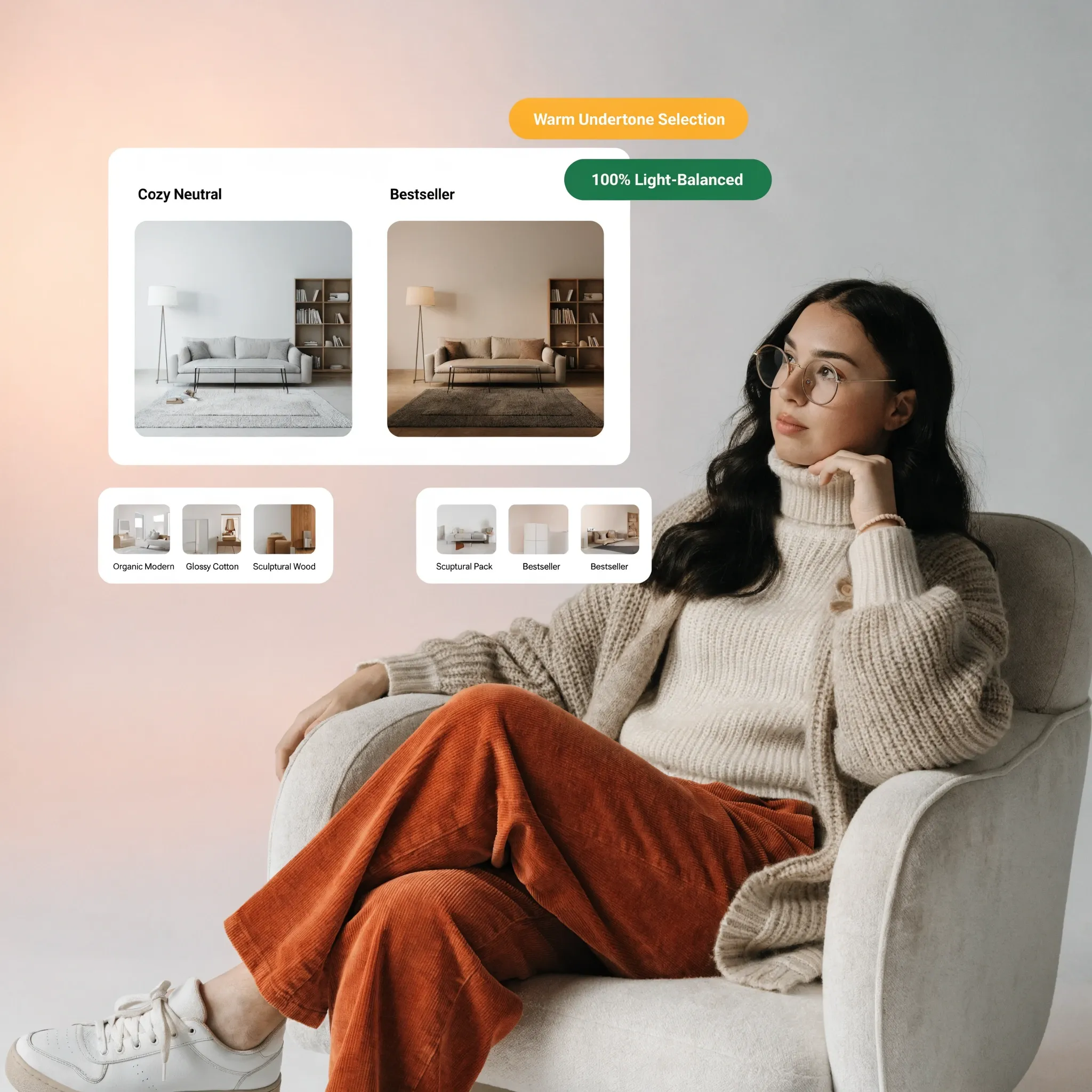
1. Choosing Interior Wall Colors That Work With Your Home
Before opening a paint fan deck or buying sample pots, pause and examine the permanent elements already locked into your rooms—your flooring, countertops, window trim, and major upholstery.
Most homeowners feel overwhelmed by choosing interior wall colors because they start with thousands of abstract paint chips instead of letting their existing architecture narrow the field down to five reliable contenders.
To master interior wall color ideas and streamline choosing paint colors for your home, anchor your decision process around three foundational rules:
- Let Fixed Finishes Lead: Your hardwood planks, tile grout, and kitchen cabinets are expensive to replace; treat them as your non-negotiable starting palette and choose wall paint that flatters them.
- Evaluate Sightlines Between Rooms: Stand in your main hallway or open living area and note every wall visible at once so adjacent rooms transition smoothly without jarring color shocks.
- Prioritize Light Reflectance Value (LRV): Check the LRV number printed on the back of every paint swatch (0 = pure black, 100 = pure white) to predict how much daylight a shade will bounce back into your room.
Explore our architectural strategies for create zones in an open plan home to see how cohesive color palettes connect open living, dining, and kitchen spaces seamlessly.
2. Decide How You Want Each Room to Look and Feel
Picking a color before deciding how you actually use a room often leaves bedrooms feeling overly clinical or dining spaces feeling cold and uninviting.
Effective room color selection starts with defining the emotional temperature you want to experience the moment you step across the threshold.
Follow this 3-step diagnostic to match interior paint colors by mood and select colors for different rooms:
- Define Daytime vs. Evening Use: Rooms used primarily at night under warm lamps—like dining rooms and bedrooms—thrive in richer, cocooning tones, while morning workspaces shine in crisp, light-reflective neutrals.
- Match Saturation to Activity Level: High-focus zones benefit from low-contrast, calming backdrops, whereas powder rooms and entryways can handle bold, memorable color statements.
- Avoid Copying Magazine Rooms Blindly: A moody charcoal wall that looks dramatic in a sunlit loft with 12-foot ceilings will feel oppressive in a compact room with one small window.

3. Check Natural Light Before Choosing a Wall Color
Natural daylight shifts dramatically throughout the day depending on which compass direction your windows face, completely transforming how the exact same paint formula reads on your walls.
Mastering wall colors for natural light and selecting paint colors for dark rooms requires understanding natural lighting and paint colors before committing to a shade.
• Needs creamy whites & warm undertones
• Stark cool whites look flat and sterile
• Handles cool blues, crisp whites & rich tones
• Strong yellows can appear overly neon
Compass-direction lighting rules:
- Warm Up North-Facing Rooms: Because northern light carries a cool, bluish cast all day, counteract the chill with creamy whites, warm greiges, or soft earthy tones rather than icy grays.
- Balance South-Facing Rooms: Abundant warm sunlight flatters almost any shade, allowing you to use crisp whites, cool coastal blues, or deeper hues without the room feeling dark.
- Account for East and West Shifts: East-facing rooms glow warm in the morning and turn cool by afternoon, while west-facing rooms stay shadowy until late afternoon golden sun intensifies warm undertones.
For technical specifications on residential daylighting metrics, spectral reflectance, and color rendering under artificial bulbs, visit the Illuminating Engineering Society (IES).
4. Consider Room Size When Selecting Interior Paint Colors
Old decorating myths claim small rooms must always be painted stark white, yet painting a tiny, windowless room bright white often just highlights every shadow and corner.
Choosing wall colors for small rooms, paint colors for large rooms, and interior colors for spacious rooms works best when you manipulate contrast rather than relying on rigid brightness rules.
Proportion and scale guidelines:
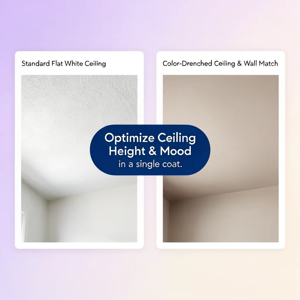
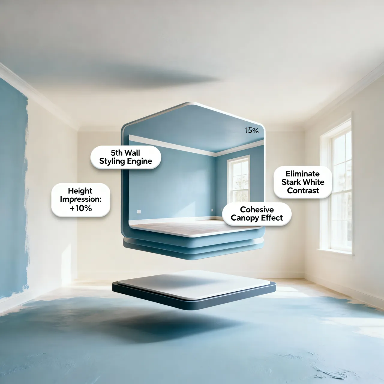
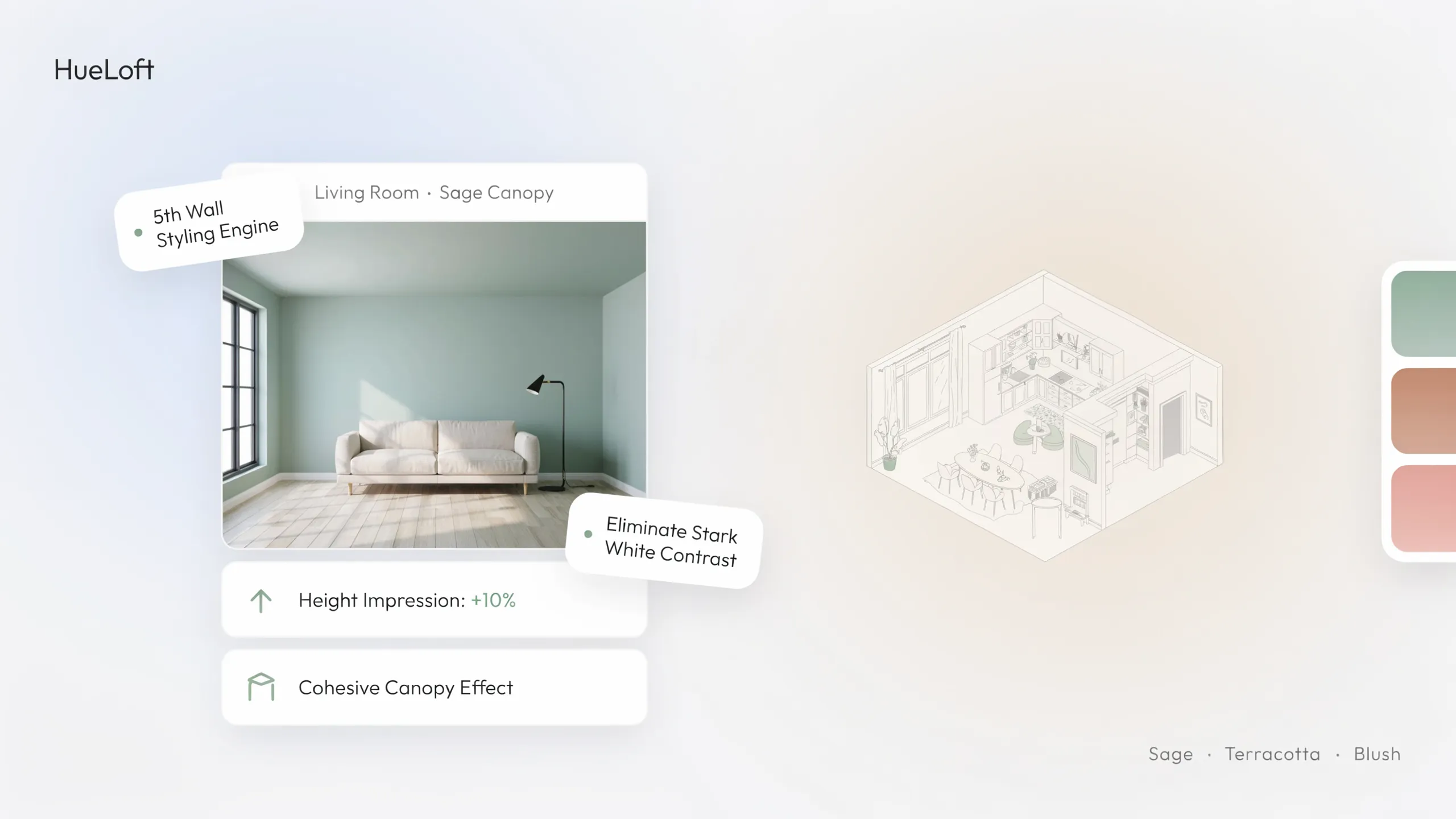
- Color-Drench Compact Rooms: Paint the walls, baseboards, crown molding, and ceiling the exact same soft color to erase visual boundary lines where walls meet ceilings, making tight rooms feel noticeably taller.
- Embrace Moody Shades in Small Powder Rooms: Because powder rooms lack natural light anyway, leaning into deep navy, forest green, or warm espresso turns tight dimensions into a dramatic, high-end feature.
- Anchor Large Open Rooms With Mid-Tone Warmth: Vast rooms painted stark white can feel cold and echoing; warm taupe, soft clay, or muted olive walls bring architectural warmth and human scale back into large spaces.
5. Understand Paint Undertones Before Settling on a Shade
Every white, gray, and beige paint contains hidden pigment undertones—pink, yellow, green, blue, or violet—that stay invisible until placed beside another surface.
Decoding paint color undertones, weighing warm vs cool paint colors, and choosing neutral wall colors prevents the heartbreak of painting an entire living room only to discover your "pure gray" looks baby blue.
Undertone verification tactics:
- Use the White Paper Trick: Lay your paint swatch flat on a plain white sheet of printer paper; the stark white contrast immediately exposes whether a neutral leans creamy yellow, pinky-beige, or icy blue.
- Identify "Greige" Balance: True greige blends warm beige and cool gray pigments, making it the most forgiving neutral for bridging warm oak hardwood floors with cool gray quartz countertops.
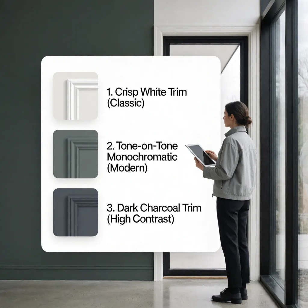
- Keep Trim Whites Consistent: Never mix a creamy yellow-undertone wall with a stark blue-white baseboard trim unless creating deliberate high contrast, as the yellow undertone will look dingy beside bright white.
Stop guessing how paint undertones and lighting will behave on your walls. Upload a photo or floor plan of your space to DesignHome, and craft your beloved color for every wall—testing real-time sunlight shifts, pairing shades with your existing flooring and furniture, comparing room-to-room transitions, and making your home look truly spectacular before opening a single paint can.
Preview Your Dream Wall Colors in 3D Today with DesignHome →Preview Your Exact Wall Colors Across Every Room in 3D
Staring at tiny paper swatches taped to your drywall makes it nearly impossible to picture how a shade will wrap around four walls, interact with your sofa, and flow into adjacent hallways. You shouldn't have to gamble hundreds of dollars on paint cans and labor just to see if a color truly belongs in your home.
Start Designing Free →6. Match Wall Colors With Flooring, Furniture, and Cabinets
Your walls act as the largest visual backdrop in your house, meaning every shade you choose immediately reflects off your wood floors, stone counters, and fabric upholstery.
Coordinating wall colors with wood floors, pairing paint colors with furniture, and matching wall colors with flooring guarantees a tailored, designer-level finish.
Finish coordination rules:
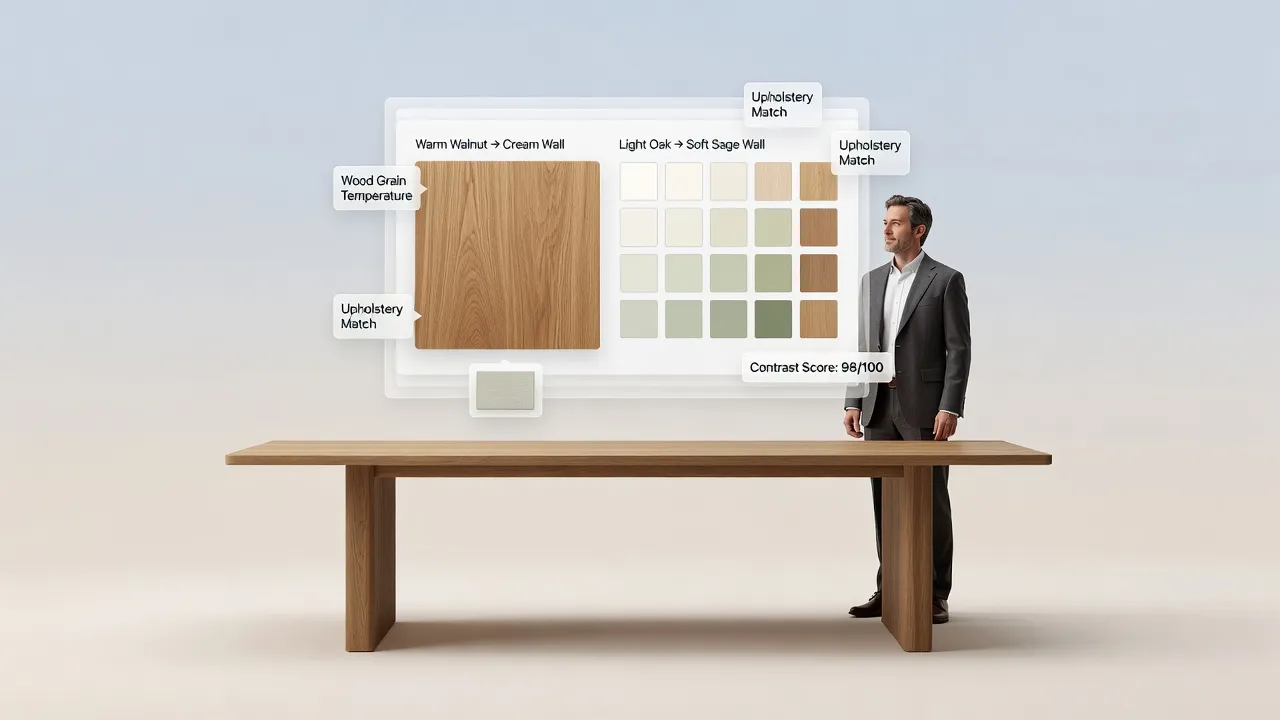
- Tame Orange-Toned Oak Floors: If you have traditional golden or orange-toned oak floors, pair them with muted sage green, soft slate blue, or warm off-white walls—avoiding yellow-based beiges that amplify orange wood tones.
- Pull Secondary Colors From Large Rugs or Art: Look at the quietest secondary accent thread inside your living room area rug or favorite framed artwork and match your wall paint to that exact undertone.
- Check Kitchen Cabinet Undertones First: Always hold wall swatches directly against your kitchen cabinet doors and countertop edges, as subtle differences between two shades of white will clash immediately.
7. Choose a Main Wall Color and Build a Balanced Color Palette
Picking five unrelated colors for five different rooms creates visual whiplash as you walk through your house, whereas a structured ratio keeps every space connected.
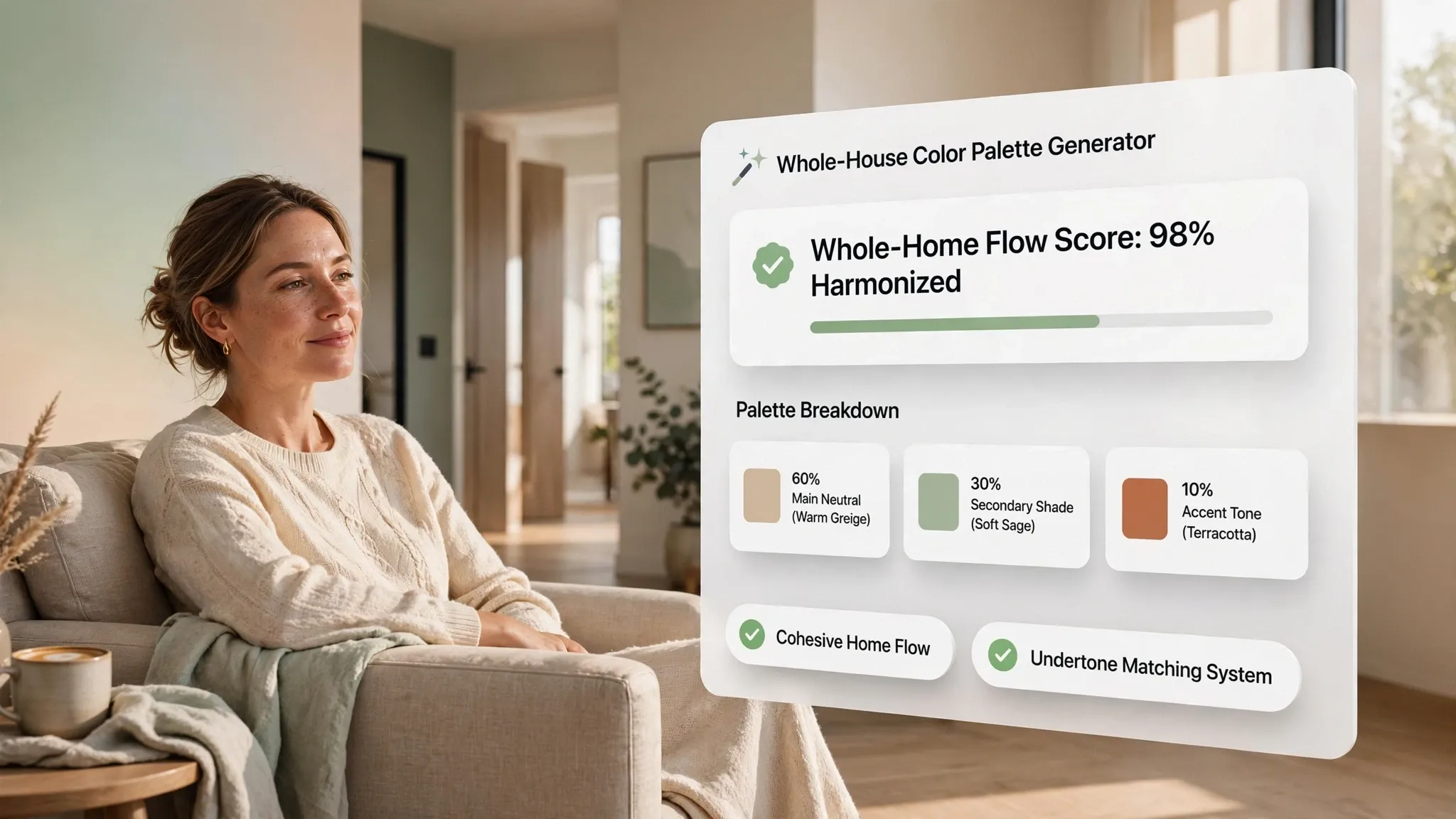
Building winning interior color combinations, designing a cohesive home interior color palette, and selecting matching interior paint colors relies on the proven 60-30-10 spatial ratio.
Palette construction rules:
- Assign 60% to Your Dominant Backdrop: Dedicate roughly 60% of the room's visual surface—primarily your walls and largest area rug—to a calm, livable foundational shade.
- Layer 30% Secondary Supporting Color: Introduce your secondary color through upholstered sofas, window drapery, and accent furniture to add depth without overwhelming the eye.
- Punctuate With 10% High-Impact Accents: Save your boldest, most saturated colors for the final 10%—throw pillows, ceramic vases, and artwork—so you can refresh seasonal trends easily without repainting walls.
For guidance on choosing zero-VOC interior paints, non-toxic wall finishes, and eco-friendly home furnishings, consult the Sustainable Furnishings Council (SFC).
8. Choose Interior Wall Colors for Living Rooms, Bedrooms, and Kitchens
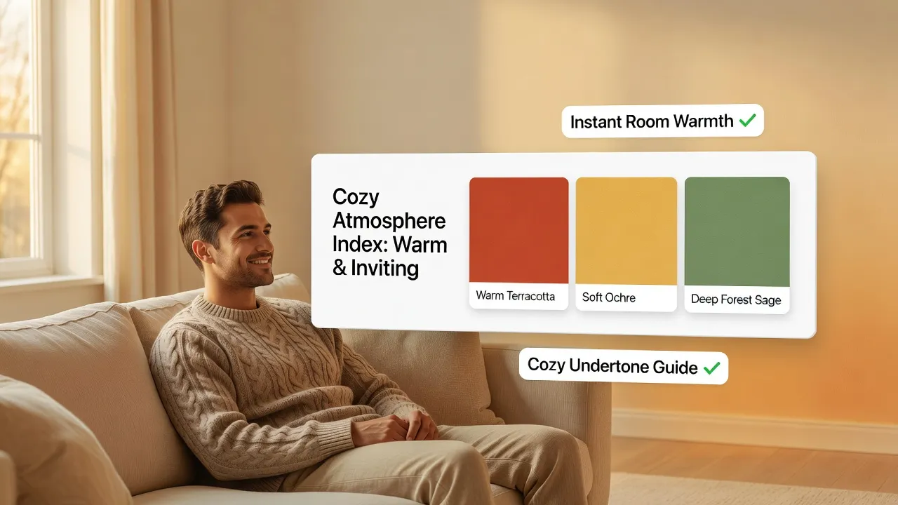
Different rooms demand completely different energy levels, lighting setups, and durability standards—meaning one single paint formula rarely suits every space equally.
Selecting tailored living room wall colors, restful bedroom wall colors, and crisp kitchen wall colors creates interior paint colors for every room that feel intentional and harmonious.
Room-by-room selection guidelines:
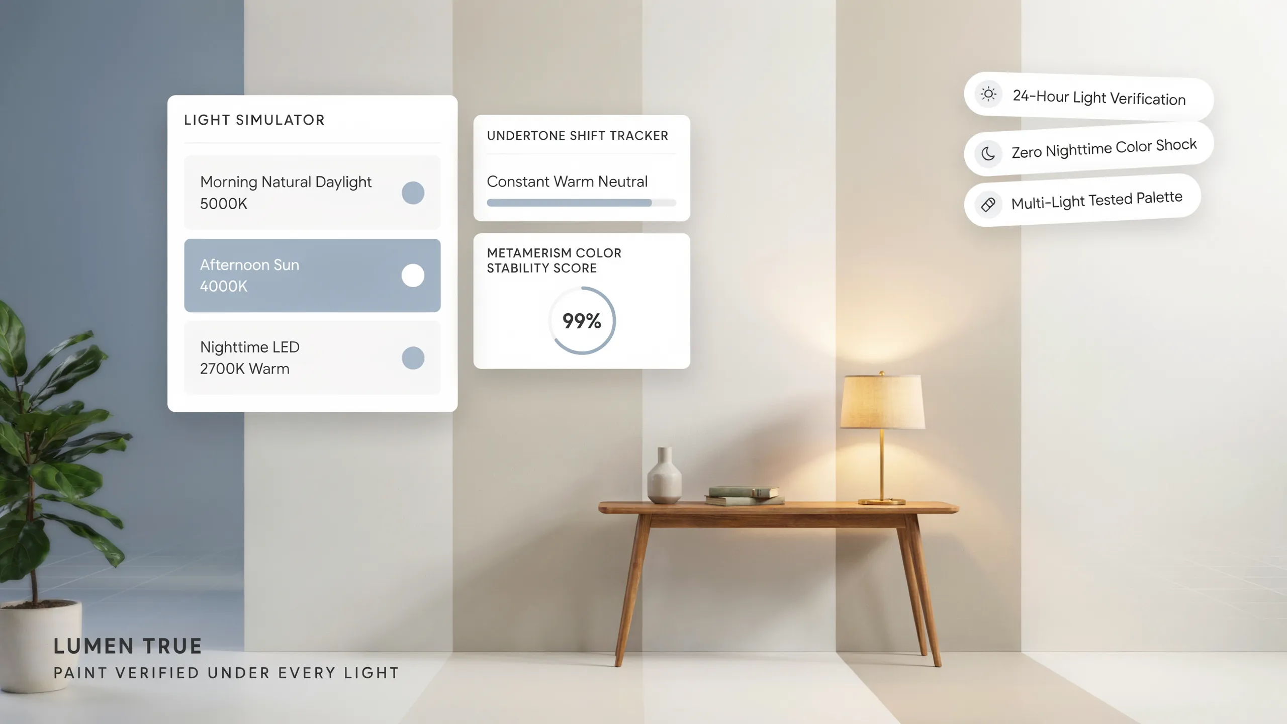
- Keep Living Rooms Versatile: Choose warm, adaptable neutrals that look bright during sunny afternoon gatherings and glow softly under warm 2700K table lamps at night.
- Cool Down Bedrooms for Deeper Rest: Opt for desaturated blues, misty greens, or soft mushroom tones that visually quiet the room and support evening relaxation.
- Keep Kitchen Walls Fresh and Appetizing: Pair clean warm whites or soft organic greens with natural wood and stone counters—avoiding heavy neon yellows or harsh purple tones that cast unflattering light on food.
9. Use Accent Walls and Contrasting Colors Without Overdoing Them
Painting a random wall bright red or dark charcoal just to add excitement often throws a room off balance and makes awkward architectural angles stick out.
Executing smart accent wall color ideas, pairing contrasting wall colors, and choosing feature wall paint colors requires anchoring color to genuine architectural focal points.
• High-contrast neon shade that clashes
• Leaves opposite walls feeling unfinished
• Deep tonal shade 3 steps darker on same strip
• Echoed in throw pillows across the room
Feature wall placement rules:
- Choose a Solid, Unbroken Architectural Wall: Place accent colors only on walls that naturally command attention—such as the wall behind your bed headboard, a fireplace surround, or built-in dining room shelving—never on walls broken up by awkward doors or closets.
- Try Two-Tone Wainscoting Instead of One Loud Wall: Install crisp white board-and-batten paneling on the lower third of all four walls and paint the upper two-thirds a rich navy or olive for balanced, whole-room drama.
- Repeat the Accent Shade Elsewhere in the Room: Tie a feature wall into the space by repeating its exact color in at least two smaller decor items, such as velvet cushions or framed prints on the opposite wall.
10. Select the Right Paint Finish for Each Interior Wall
Choosing the perfect color shade won't save your walls if you buy a high-gloss finish that highlights every drywall bump or a chalky flat paint in a busy hallway that scuffs permanently.
Comparing interior wall paint finishes, weighing matte vs satin paint, and picking the best paint finish for interior walls protects your investment from daily wear and tear.
Paint finish selection rules:
- Use Eggshell as Your Whole-Home Standard: Eggshell offers a soft, low-luster finish that hides minor drywall imperfections while resisting scuffs and wiping clean easily with a damp cloth.
- Step Up to Satin in High-Moisture Zones: Choose satin finish for bathrooms, laundry rooms, and kitchen walls where steam, water splashes, and grease require frequent scrubbing.
- Reserve Semi-Gloss for Trim and Doors: Coat baseboards, window casings, crown molding, and interior doors in durable semi-gloss so architectural millwork pops subtly against softer wall sheens.
11. Test Paint Samples Before Painting the Entire Room
Painting tiny 4-inch squares directly onto your existing colored wall is a classic mistake—your old wall color surrounds the sample and tricks your eyes into misreading the new shade.
Knowing how to test paint colors on walls, use paint color samples, and master how to choose the right paint color eliminates costly repainting surprises.
Foolproof sample testing steps:
- Paint Portable Poster Boards Instead of Drywall: Apply two coats of your shortlisted sample pots onto large white foam core boards, leaving a 2-inch white border around the edge so your old wall color never skews your perception.
- Observe Samples Across Three Lighting Cycles: Prop your painted boards against different walls and check them in bright morning daylight, overcast afternoon light, and warm evening lamp light before deciding.
- Test Next to Floorboards and Cabinets: Lean each painted board directly on the floor against your baseboards and kitchen cabinets to verify that undertones harmonize cleanly.
12. Create a Consistent Interior Color Scheme for Your Entire Home
Walking from a bright yellow kitchen into a dark purple hallway and a cold gray living room makes a house feel fragmented and smaller than its actual square footage.
Crafting a unified whole house interior color scheme, selecting reliable home paint color combinations, and building a cohesive interior color palette creates effortless visual flow from front door to back bedroom.
Your Whole-Home Wall Color Sign-Off Checklist:
For official residential indoor air quality standards, low-VOC emission guidelines, and surface preparation safety codes, consult the International Code Council (ICC).
Transform Every Wall Into a Stunning Backdrop You Love Coming Home To
You shouldn't have to stare at three thousand paper paint chips in agony or cross your fingers hoping a gallon of paint doesn't clash with your floors once it dries. When you read your room's natural directional light, match hidden undertones to your existing wood and stone finishes, and build a balanced whole-home palette, your walls instantly elevate every piece of furniture you own.
Which room in your home—a shadowy north-facing living room, an open-concept kitchen, or a bedroom craving calm—is giving you the toughest color decision right now? Share your space with DesignHome, preview your beloved wall colors across real lighting and furniture in interactive 3D, and make your entire home look truly spectacular before buying a single drop of paint.
Frequently Asked Questions About Choosing Interior Wall Colors
I stand in the store staring at three thousand paint chips, and every warm white looks identical until I paint my walls and it turns sickly yellow. How do I stop guessing?
Here is the raw truth: holding tiny paper paint swatches under buzzing fluorescent store lights guarantees repainting regret because store illumination completely masks the hidden pigment undertones that explode under real residential daylight.
Mastering choosing interior wall colors isn't about collecting abstract color cards—it is about evaluating your room's compass direction, matching undertones to fixed flooring, and testing large-scale samples across morning and evening light cycles. Applying expert principles of interior wall color ideas and choosing paint colors for your home transforms color selection from an expensive gamble into a reliable, foolproof design system.
Should my bedroom feel calm while my living room feels warm and welcoming? How do I decide the atmosphere for each room?
Picking a paint color without defining the emotional temperature you want to experience in a space often leaves bedrooms feeling clinical or dining areas feeling cold and uninspired.
Effective room color selection starts with matching color temperature and saturation to your daily routines and evening lighting. By exploring interior paint colors by mood and choosing colors for different rooms based on whether a space is used for restful slumber or energetic morning prep, you create a home that supports your exact lifestyle.
The color looked gorgeous on the store card, but it feels completely different on my drywall. How does natural light change paint appearance?
Natural daylight shifts dramatically throughout the day depending on which compass direction your windows face, instantly altering how a paint formula reads on your walls.
Mastering wall colors for natural light and selecting paint colors for dark rooms requires understanding natural lighting and paint colors before buying a single gallon. Warming up north-facing rooms with creamy undertones or balancing south-facing sunlight with crisp neutrals ensures your paint performs flawlessly from sunrise to sunset.
Will a dark color make my small room feel cramped, or can a tight space handle bolder shades?
Old decorating myths claim compact rooms must always be painted stark white, yet painting a tiny, windowless room bright white often just highlights every harsh shadow and corner.
Choosing wall colors for small rooms, paint colors for large rooms, and interior colors for spacious rooms works best when you manipulate contrast rather than rigid brightness rules. Color-drenching compact rooms to erase visual boundary lines or embracing moody jewel tones in powder rooms turns tight dimensions into a high-end, intentional design feature.
Why does my supposedly pure white paint look yellow in the living room and gray in the kitchen?
Every white, gray, and beige paint contains hidden pigment undertones—pink, yellow, green, or blue—that stay invisible until placed beside your flooring or trim.
Decoding paint color undertones, weighing warm vs cool paint colors, and choosing neutral wall colors prevents subtle mismatches that clash with fixed cabinetry. Using the white paper test to expose hidden pigments ensures your neutral walls harmonize effortlessly with your existing wood floors and stone surfaces.
I already have flooring, furniture, and cabinets installed. How do I choose a wall color that doesn't clash with my permanent finishes?
Your walls act as the largest visual backdrop in your house, meaning every shade you choose immediately reflects off your wood floors, stone counters, and upholstery.
Coordinating wall colors with wood floors, pairing paint colors with furniture, and matching wall colors with flooring guarantees a tailored, designer-level finish. Treating your existing timber planks and kitchen cabinets as non-negotiable starting points lets you select wall paint that flatters your permanent architecture.
How many colors should I use across my rooms, and how do I stop everything from looking mismatched?
Picking five unrelated colors for five different rooms creates visual whiplash as you walk through your house, whereas a structured ratio keeps every space connected.
Building winning interior color combinations, designing a cohesive home interior color palette, and selecting matching interior paint colors relies on the proven 60-30-10 spatial ratio. Assigning 60% to foundational walls, 30% to upholstery, and 10% to bold decor accents builds a repeatable color framework for your entire home.
A color that works brilliantly in my bedroom might look terrible in the kitchen. What are the best choices for each room?
Different rooms demand completely different energy levels, lighting setups, and durability standards—meaning one single paint formula rarely suits every space equally.
Selecting tailored living room wall colors, restful bedroom wall colors, and crisp kitchen wall colors creates interior paint colors for every room that feel intentional. Keeping living spaces adaptable, cooling down bedrooms for restorative rest, and keeping kitchen walls fresh and appetizing makes every room work harder for its specific function.
I want some character, but I don't want a feature wall to overpower the entire space. When should I use accent walls?
Painting a random wall bright red or dark charcoal just to add excitement often throws a room off balance and makes awkward architectural angles stick out.
Executing smart accent wall color ideas, pairing contrasting wall colors, and choosing feature wall paint colors requires anchoring color to genuine architectural focal points. Restricting accent shades to solid, unbroken walls like bed headboards or fireplace surrounds—and repeating that exact tone in room accessories—maintains total visual balance.
I've finally chosen my perfect color shade, but which paint finish or sheen should I actually buy?
Choosing the perfect color won't save your walls if you buy a high-gloss finish that highlights every drywall bump or a chalky flat paint in a busy hallway that scuffs permanently.
Comparing interior wall paint finishes, weighing matte vs satin paint, and picking the best paint finish for interior walls protects your investment from daily wear and tear. Standardizing on low-luster eggshell for living walls, stepping up to satin for moisture-prone kitchens, and reserving semi-gloss for trim millwork ensures lasting durability.
How can I be one hundred percent sure I won't regret my paint choice after the whole room is painted?
Painting tiny four-inch squares directly onto your existing colored wall is a classic mistake because your old wall color surrounds the sample and tricks your eyes.
Knowing how to test paint colors on walls, use paint color samples, and master how to choose the right paint color eliminates costly repainting surprises. Painting two full coats onto large white foam core boards and moving them across sunlit and shadowed walls through morning and evening lighting cycles confirms your shade before buying gallons.
How do I choose different paint colors for different rooms without making my home feel disconnected?
Walking from a yellow kitchen into a purple hallway and a gray living room makes a house feel fragmented and smaller than its actual square footage.
Crafting a unified whole house interior color scheme, selecting reliable home paint color combinations, and building a cohesive interior color palette creates effortless visual flow. By uploading your room photos and testing real-time sunlight shifts, color undertones, and whole-house transitions directly in interactive 3D, you can preview your beloved wall shades and make your entire home look truly spectacular before opening a single paint can.


