

You stand in the middle of your kitchen, holding four painted wood swatches against your countertop, shifting your position as the afternoon light changes across the room.
One shade of white looks crisp and bright in the sunlight, but under your artificial ceiling lights, it turns stark and clinical. Another warm greige sample looks rich and cozy next to your backsplash, but suddenly casts a muddy tone against your hardwood floorboards. You take a step back and think: How do I pick a cabinet color I will love every morning without making a costly mistake?
Cabinetry accounts for up to 70% of the visible surface area in a kitchen, making it the primary color anchor of your entire home.
Choosing the right shade isn't about blindly following short-lived viral trends. By systematically evaluating your room's fixed finishes, matching warm or cool undertones, and observing how natural light behaves across different times of day, you can build a timeless palette that elevates your entire space. If you're planning a low-demo refresh instead of a full repaint, our targeted refresh playbook for upgrading finishes without demo pairs perfectly with the steps below.
Whether you are refinishing existing doors or ordering custom cabinetry, here is how to select, test, and finalize your kitchen cabinet colors step by step.
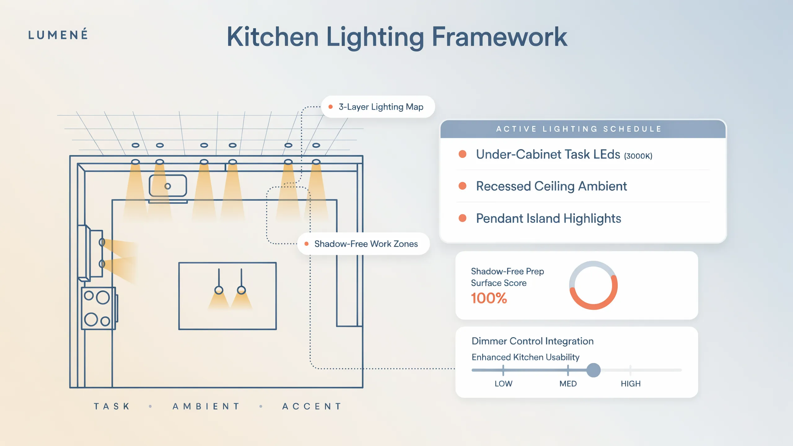
1. Choosing Kitchen Cabinet Colors: How to Find the Right Shade for Your Kitchen
Before browsing paint samples or placing non-refundable cabinet deposits, step back and evaluate your kitchen's complete spatial composition.
A cabinet color does not exist in isolation. It interacts continuously with surrounding stone countertops, tile backsplashes, floorboards, and natural daylight.
[ Phase 1: Identify Fixed Architectural Finishes ] ===> Audit counter slabs, tile & flooring
                                                              |
[ Phase 2: Analyze Undertones & Natural Daylight ] ==> Match warm/cool bases to window direction
                                                              |
[ Phase 3: Physical Sample Testing & Verification ] ===> Test 12x12 swatches in morning/evening light
Establish these foundational color selection principles:
- Anchor to Unchanging Surfaces: Always choose your cabinet shade to complement fixed or expensive-to-replace features—such as quartz counter slabs, stone tile backsplashes, and hardwood flooring.
- Respect Environmental Lighting: A paint shade will look completely different under northern window light than it does under warm LED lamps or inside a brightly lit showroom.
- Balance Visual Weight: Saturated dark shades absorb light and ground lower cabinets, while light neutrals bounce daylight to expand eye-level spatial volume.
2. Look at Your Countertops, Flooring, and Backsplash Before Choosing a Color
The most common design mistake homeowners make when exploring kitchen cabinet color ideas is selecting a paint shade before looking at their existing room finishes.
If your kitchen features warm gold-veined granite counters and rich red oak floorboards, painting your cabinets a stark, blue-toned cool white will cause a jarring visual clash.
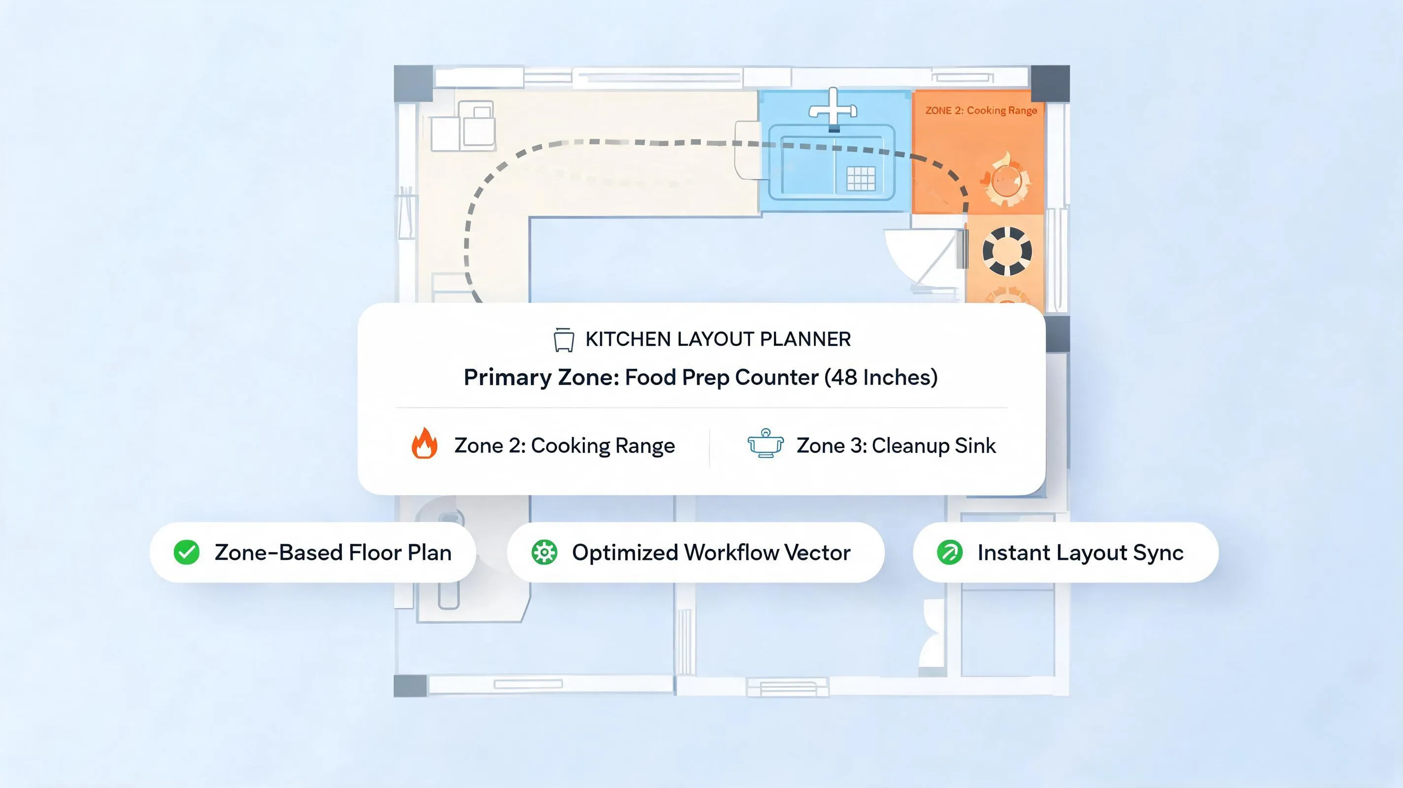
Follow this surface alignment strategy:
- Identify the Dominant Stone Veining: Look closely at your countertop slab. If the veining contains charcoal or slate, cool cabinet tones will harmonize beautifully. If it contains caramel or gold, opt for warm neutrals.
- Evaluate Floor undertones: Hardwood and tile floors cast light upward onto cabinet faces. Ensure your cabinet base paint shares the same undertone family as your flooring.
- Coordinate Grout Lines: If keeping an existing tile backsplash, select a cabinet paint that bridges the shade of the tile and the grout line.
If you are coordinating layout proportions alongside your color palette, review our complete floor plan workflow before ordering cabinetry.
3. Choose Between White, Cream, Gray, and Other Neutral Cabinet Colors
Neutral colors remain the most sought-after choice for kitchen cabinetry because they deliver high visual versatility, exceptional light reflection, and long-term value.
However, selecting white kitchen cabinet colors requires choosing the precise temperature that brings your room to life.
- Pairs with stainless steel & marble
- Best for brightly sunlit south rooms
- Pairs with brass hardware & warm wood
- Best for dim or north-facing kitchens
Comparing neutral families:
- Crisp Off-Whites: Ideal for creating an airy, light-filled environment. Works best in modern or transitional kitchens paired with dark or medium countertops.
- Cream Kitchen Cabinets: Infused with subtle yellow or peach undertones. Cream softens hard stone surfaces, creating a welcoming, traditional, or farmhouse feel.
- Gray Kitchen Cabinets: Ranges from pale morning mist to deep charcoal. Gray serves as a sophisticated middle ground that balances both warm wood floors and cool metal appliances.
- Warm Greige: The ultimate modern neutral. Greige combines the crispness of gray with the warmth of beige, adapting effortlessly as room lighting shifts throughout the day.
4. Explore Green, Blue, and Other Colorful Kitchen Cabinet Ideas
If you want to inject rich personality into your home, moving beyond standard neutrals opens up breathtaking design possibilities.
Incorporating green kitchen cabinet colors or moody blues transforms built-in cabinetry into an intentional architectural feature.
Design guidelines for colorful cabinetry:
- Select Muted, Desaturated Tones: Avoid pure, highly saturated primary colors. Choose muted shades infused with gray or brown undertones (such as sage green or dusty navy) to keep the look sophisticated.
- Anchor Dark Colors to Lower Cabinets: If using deep forest green or rich navy, apply the dark color to lower base cabinets or a central island, keeping upper cabinets light to preserve openness.
- Pair with Natural Wood Elements: Balance colorful millwork with raw oak floating shelves, butcher block accents, or natural woven barstool seating.
5. Match Cabinet Colors to Warm or Cool Undertones
Have you ever seen a kitchen where two shades of white look dirty or clashing when placed right next to each other? That frustrating phenomenon is caused by conflicting kitchen cabinet color undertones.
Every paint color possesses an underlying mass tone paired with a subtle undertone created during pigment blending.
   WARM UNDERTONES (Yellow, Red, Beige Base)  <===> Pairs with Gold, Brass, Oak & Cream Tile
   COOL UNDERTONES (Blue, Green, Violet Base) <===> Pairs with Stainless Steel, Marble & Gray Slate
How to identify and pair undertones:
- The White Paper Test: Place your paint sample swatch on top of a sheet of pure white printer paper in natural daylight. The hidden undertone—whether pink, green, yellow, or blue—will immediately reveal itself.
- Never Mix Opposing Extreme Undertones: Avoid pairing a stark, blue-based cool gray cabinet directly against warm, orange-toned Tuscan tile flooring. The stark temperature clash makes both surfaces look discolored.
- Unify Metallic Hardware: Match warm cabinet undertones with brass, copper, or bronze cabinet handles. Pair cool cabinet undertones with polished chrome, brushed nickel, or matte black hardware.
For guidance on non-toxic paint formulations, low-VOC certifications, and sustainable material standards, visit the Sustainable Furnishings Council (SFC).
6. Choose Cabinet Colors That Work With Your Kitchen's Natural Light
Natural daylight is the most powerful variable influencing how paint colors appear inside your home.
Understanding how to choose kitchen cabinet colors requires evaluating your room's window orientation and daylight intensity.
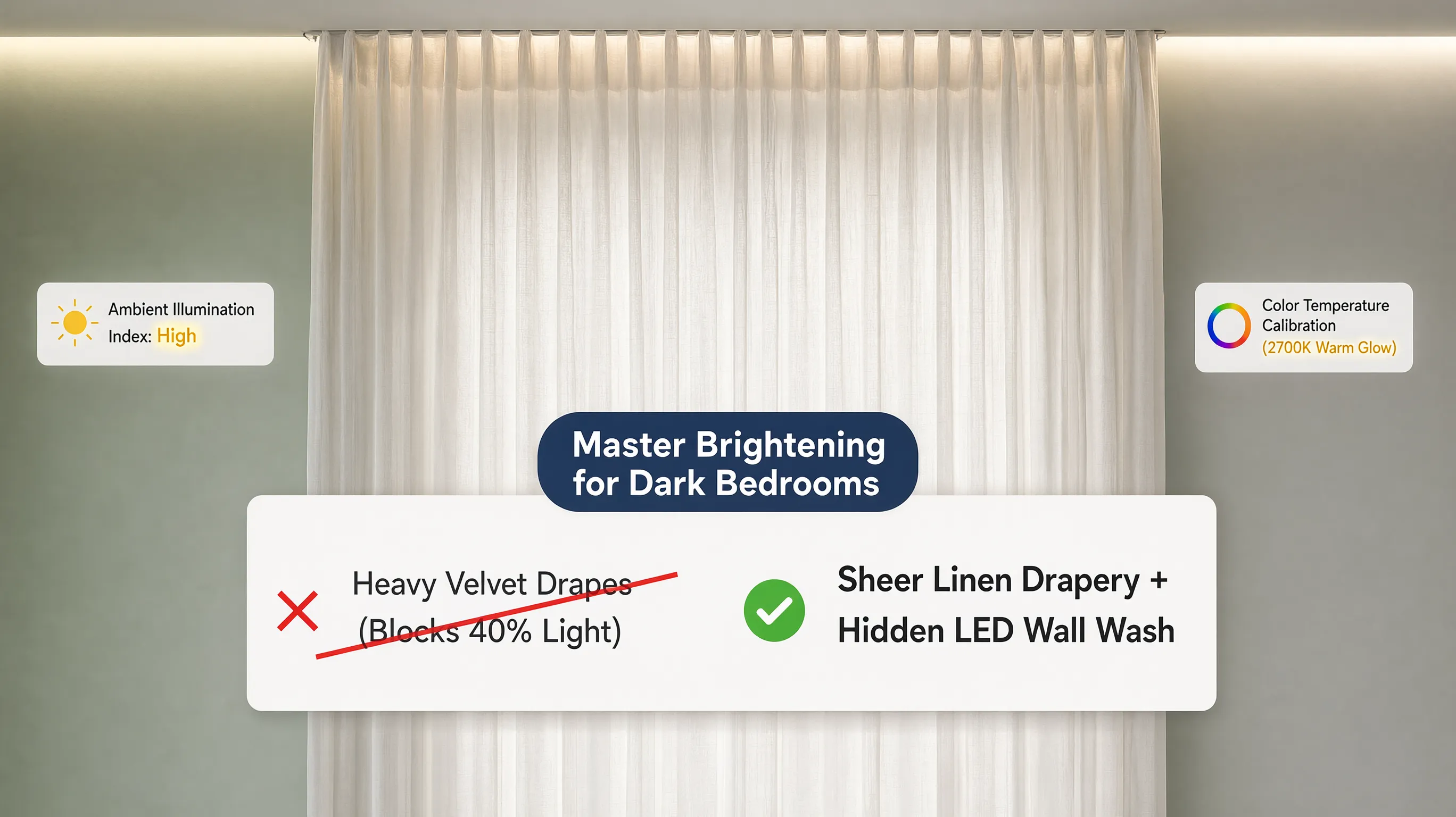
Daylight adaptation rules:
- Cabinet Colors for Dark Kitchens: If your room lacks natural windows, avoid dark absorbing charcoal or muddy browns. Choose light-reflecting off-whites or soft creams paired with continuous under-cabinet LED lighting.
- Account for Artificial LED Temperatures: Equip your ceiling fixtures with LED bulbs strictly rated between 2700K and 3000K (Kelvin) with a High Color Rendering Index (CRI 90+). Warm, high-CRI lighting prevents paint colors from looking washed out at night.
For rooms with northern exposure, our warm palettes that soften cool northern daylight offers deeper shade guidance. For southern rooms, see our cool-toned swatches that balance intense golden sun. For official technical specifications on residential lighting standards, bulb warmth ratings, and color rendering metrics, consult the Illuminating Engineering Society (IES).
7. Decide Whether Upper and Lower Kitchen Cabinets Should Match
You don't have to paint every single cabinet box the exact same shade.
Designing a two tone kitchen cabinet colors scheme allows you to ground lower storage while keeping eye-level surfaces light and open.
| Upper: Soft Alabaster White |
+-----------------------------------+
| Lower: Soft Alabaster White |
+-----------------------------------+
(Creates a seamless, continuous wall)
| Upper: Crisp Light Cream |
+----------------------------------+
| Lower: Deep Navy or Olive Green |
+----------------------------------+
(Grounds floor plane; expands room)
Two-tone arrangement strategies:
- Light Uppers / Dark Lowers: Paint lower base cabinets a dark, grounding shade (like charcoal, slate blue, or forest green) and upper cabinets a light off-white. This arrangement keeps eye-level sightlines open.
- Island Accent Color: Keep all perimeter wall cabinets a uniform neutral (like warm greige), and paint your central island a contrasting accent shade to create an inviting social focal point.
- Share a Common Undertone: Ensure both paint shades in a two-tone kitchen share the exact same warm or cool undertone base so they feel intentionally paired.
If you are planning an open-concept space, explore our guide on flowing cabinet tones into adjoining living room furniture.
8. Coordinate Cabinet Colors With Wood Tones, Metal Finishes, and Appliances
A high-performance kitchen balances painted cabinetry with natural wood flooring, metallic hardware pulls, and stainless steel appliances.
Creating an intentional palette requires linking separate textures into a cohesive visual story.
Finish integration rules:
- Pairing with Wood Floors: If your kitchen features prominent natural wood flooring, choose painted cabinet colors that contrast softly with the wood grain rather than matching it precisely.
- Repeat Metal Accents: Pair brass hardware pulls with warm white or green cabinets. Match matte black hardware with clean white, light gray, or light wood millwork for a striking modern contrast.
For official technical guidelines on residential cabinet construction, hardware durability, and finish testing standards, consult the Furniture Industry Research Association (FIRA).
9. Use Cabinet Color to Change How Large or Small the Kitchen Feels
Color is a powerful tool for shifting perceived spatial volume. Dark colors absorb light and draw surfaces inward, while light colors reflect daylight to expand room boundaries.
Selecting kitchen cabinet colors for small kitchens relies on strategic color distribution.
- Matches Wall Paint Color Exactly
- Erases Eye-Level Cabinet Boundaries
- High-Contrast Quartz Counter Slabs
- Grounds Oversized High-Ceiling Spaces
Spatial manipulation rules:
- Match Cabinet Paint to Wall Paint: In compact or low-ceiling kitchens, paint your upper cabinets the exact same shade as your perimeter walls. Erasing the visual boundary between cabinet boxes and drywall makes walls recede.
- Embrace Dark Shades in Large Rooms: If you have an expansive, high-ceiling room with abundant south-facing windows, rich dark kitchen cabinet ideas (like deep espresso, black, or dark navy) create a cozy, luxurious, and grounded atmosphere.
If you want to maximize perceived spatial volume in a compact room, review our step-by-step guide on spatial expansion tactics using light-reflecting finishes. For shade-specific guidance, see our warm neutrals that visually expand tight kitchen walls and our expanding shade families for small footprints.
10. Choose a Cabinet Color That Fits Your Kitchen's Design Style
Your cabinet color should honor the architectural character of your home, whether you live in a historic craftsman, a rustic farmhouse, or a modern urban apartment.
Aligning color choices with distinct interior styles creates a timeless, high-value result. To pin down your home's overall aesthetic before picking shades, see our style identification guide to lock in your home's character.
Style alignment strategies:
- Transitional Kitchens: Combine clean Shaker-style door profiles with warm greige or muted blue paint, paired with quartz countertops and polished nickel hardware.
- Modern Kitchens: Opt for sleek flat-panel slab cabinet doors painted in matte charcoal, soft cashmere, or crisp white with integrated J-pull handles.
11. Test Kitchen Cabinet Paint Colors Before Making the Final Decision
Never purchase gallons of cabinet paint or order custom factory finishes based solely on a tiny 2-inch paper swatch or a photo on a screen.
Learning how to test kitchen cabinet colors using large physical samples prevents costly painting mistakes. For a deeper testing protocol, see our physical sample testing protocol to prevent color mistakes and our side-by-side swatch comparison under shifting daylight.
  [ Step 1: Paint 12" x 12" Sample Boards with Real Cabinet Enamel ]
                                 |
  [ Step 2: Place Sample Beside Countertop, Flooring & Backsplash ]
                                 |
  [ Step 3: Observe Color at 8:00 AM, 1:00 PM & 8:00 PM (LEDs On) ]
                                 |
  [ Step 4: Confirm Color Selection with Total Confidence ]
Sample testing protocol:
- Paint Large Sample Boards: Apply two coats of actual cabinet enamel onto 12x12-inch poster boards or wood scraps rather than painting directly onto existing cabinets.
- Move Samples Across the Room: Move your sample board to different walls—placing it directly beside your countertop slab, on top of your hardwood floor, and next to your window.
- Observe Color Shifts Over 24 Hours: Check your sample at morning sunrise, bright noon daylight, and under evening artificial lighting to verify how the undertones react.
12. Build a Kitchen Cabinet Color Palette You'll Feel Good About Long-Term
Ready to finalize a breathtaking, long-lasting color scheme for your dream kitchen?
Before hiring professional painters or ordering custom cabinetry, bring all your material swatches, paint samples, and hardware finishes together into a single, cohesive kitchen cabinet color palette. To preview everything before committing to gallons, read our digital preview workflow for testing palettes before buying paint.
  [ Primary Cabinet Paint: Warm Greige (Satin Finish) ]
                           |
  [ Countertop Slab: Calacatta Quartz with Warm Gold Veining ]
                           |
  [ Backsplash Tile: Handmade Cream Ceramic Subway Tile ]
                           |
  [ Accent Hardware: Brushed Brass D-Pulls & Faucet ]
                           |
  [ Flooring: Wide-Plank Natural Light Oak Hardwood ]
The Ultimate Cabinet Color Sign-Off Checklist:
- [ ] Audit Fixed Surfaces: Confirm your cabinet shade harmonizes with your countertop, flooring, and backsplash.
- [ ] Verify Undertone Alignment: Check that paint undertones match your metal hardware and stone veining (warm vs. cool).
- [ ] Test in Natural Light: Observe 12x12 physical sample boards inside your room across morning, noon, and evening light.
- [ ] Check Spatial Proportions: Use light neutrals in compact kitchens or dark grounded shades on lower base cabinets.
- [ ] Select Cabinet-Grade Enamel Finishes: Specify durable satin or semi-gloss urethane enamel paint designed for heavy kitchen use.
Visualize Your Complete Kitchen Cabinet Palette Today
Why risk spending thousands of dollars on cabinet repainting or custom millwork without seeing how your color choices will actually look inside your space?
Designing a breathtaking, perfectly balanced kitchen should be an exciting and rewarding experience. You don't need to spend thousands of dollars on professional color consultants or struggle with complicated CAD software to build a cohesive palette.
With DesignHome, you can simply upload a picture or floor plan of your room to test layout ideas, experiment with custom cabinet color combinations, compare countertop finishes, check lighting interactions, and unlock custom spatial possibilities tailored to your exact floor plan.
Eliminate design guesswork—visualize, refine, and bring your complete kitchen cabinet color vision to life with total confidence using DesignHome today!
Frequently Asked Questions About Choosing Kitchen Cabinet Colors
Will painting my cabinets a dark color make my kitchen feel too small and cramped?
Not if you balance visual mass correctly. Darker cabinet colors—like deep navy, charcoal, slate gray, or forest green—ground the room when applied to lower base cabinets or a central island. To keep the space feeling open, pair dark lower cabinets with crisp off-white upper walls, light-reflecting quartz countertops, and continuous under-cabinet task lighting to prevent heavy shadows.
Are white kitchen cabinets still in style, or will they make my home look dated?
White kitchen cabinets remain a timeless, high-value choice, but the shift is away from stark, clinical whites toward warm neutrals. Shades like creamy off-white, warm alabaster, and soft greige offer high light reflection while adding depth and comfort. They create a clean visual foundation that adapts effortlessly as your accents, hardware, and wall colors evolve over time.
How do I keep my new cabinet paint from clashing with my existing granite or quartz countertops?
Always pull your cabinet undertones directly from the stone's natural veining or speckled background. Look closely at your countertop in daylight: if the veining features charcoal, cool gray, or slate, select a cool-toned paint. If the stone contains gold, caramel, taupe, or beige, choose a warm cream or greige. Matching undertone families prevents discolored visual clashes.
What is the secret to picking a shade of white that doesn't look yellow or clinical?
Never pick a white paint shade under store fluorescent lights; examine physical samples directly against your room's natural daylight. Whites with subtle blue or green undertones look crisp in south-facing sun but turn sterile in dim rooms. Whites with yellow, peach, or beige undertones soften cold northern daylight without appearing dingy under warm evening lamps.
How can I be 100% sure I'll like a cabinet paint color before buying gallons of it?
Paint two coats of actual cabinet enamel onto large 12x12-inch poster boards or wood scraps—never rely on tiny 2-inch paper paint chips. Move these sample boards around your kitchen throughout the day, placing them directly beside your countertop slab, hardwood flooring, and backsplash to observe how the undertones shift at 8:00 AM, 1:00 PM, and 8:00 PM under artificial lights.
Should upper and lower kitchen cabinets always be the exact same color?
No. A two-tone cabinet scheme is an effective way to introduce rich personality without overwhelming a room. Painting lower base cabinets a darker, grounded shade—like deep navy, olive green, or charcoal—and keeping upper cabinets a light off-white opens eye-level sightlines, creates an attractive visual focal point, and makes ceilings feel higher.
How do I choose a cabinet color that complements natural hardwood floors?
Focus on soft contrast rather than trying to match the wood grain precisely. If you have orange-toned honey oak floors, avoid bright blue paint, which creates a harsh contrast that highlights yellow tones. Instead, pair warm wood flooring with soft sage green, warm greige, creamy alabaster, or deep charcoal to make the natural wood look intentional and modern.
Which cabinet colors look best in dark kitchens with very little natural light?
Stick to light-reflecting neutrals with warm yellow or beige undertones, such as creamy off-white, light warm taupe, or pale greige. Avoid stark cool whites, which can look flat and dreary in shadowed rooms, and stay away from muddy mid-tone grays. Pair your light cabinet paint with warm 2700K–3000K LED under-cabinet lights to maximize spatial brightness.
Do colorful cabinets like sage green or navy blue hurt my home's resale value?
Muted, desaturated earth tones—such as muted sage green, soft slate blue, and deep navy—act as modern neutrals in contemporary kitchen design. Because these shades draw inspiration from natural stone and foliage, they appeal strongly to homebuyers. The key is choosing a desaturated, muted shade with gray or brown undertones rather than a bright primary color.
What hardware metal finish looks best with painted kitchen cabinets?
Match your metal finishes to your cabinet paint's undertone family. Warm cabinet shades (creams, greiges, olive green, and warm whites) look stunning paired with brushed brass, antique bronze, or warm copper hardware. Cool cabinet shades (navy blue, crisp white, and cool slate gray) pair seamlessly with polished nickel, chrome, or matte black handles for a clean, modern contrast.
What paint sheen level should I specify for kitchen cabinetry?
Choose a high-durability satin or semi-gloss urethane acrylic enamel designed specifically for cabinetry and trim. Flat or matte paints absorb oils, show smudges, and degrade under frequent cleaning. Satin and semi-gloss enamels provide a smooth, low-sheen finish that repels moisture, resists fingerprints, and wipes clean easily without looking overly shiny.
How do I select a cabinet color that fits my kitchen's architectural style?
Align your color choices with your home's structural character. Transitional / Classic: Warm greige, soft off-white, or muted navy paired with Shaker door profiles and brass hardware. Modern / Contemporary: Matte charcoal, cashmere, or stark white on flat-panel slab doors with integrated handles. Farmhouse / Cottage: Creamy alabaster, soft sage green, or muted blue paired with apron-front sinks and natural wood accents.


