

Let's face it: staring at hundreds of tiny paint swatches under harsh hardware store lighting is an absolute nightmare.
You hold a subtle greige swatch in your hand, but deep down, a terrifying question keeps looping in your mind: What if this undertone shifts to a sickly purple or muddy olive once it spreads across 2,000 square feet of siding?
Here is the cold, hard truth: choosing house paint colors shouldn't feel like an agonizing gamble that leaves you second-guessing every choice. Paint is the single most defining layer of your home's exterior identity. It dictates visual height, material depth, and curb presence. Yet, most homeowners end up copying a neighbor's palette or picking safe, washed-out neutrals simply because they are afraid of making an expensive, permanent mistake.
You do not need to struggle through endless sample pots, messy wall patches, or linear swatch booklets. By applying proven architectural color ratios, Gestalt visual grouping, and modern layout intelligence systems, you can build a cohesive, head-turning palette with absolute confidence. Here is your definitive blueprint to selecting house colors that work seamlessly together.
Start With the Style of Your House
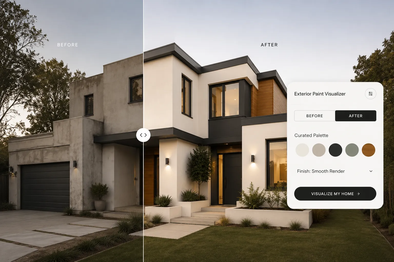
Pay attention to this detail: forcing a high-contrast modern black-and-white color scheme onto a classic Spanish revival or rustic timber cottage always creates severe visual friction.
To avoid decision paralysis—a classic hurdle of Hick’s Law—narrow your swatch selection immediately by honoring your home's core architectural DNA.
Think about it this way: your home's structural silhouette provides natural boundaries for color. Craftsman homes thrive on low-saturation, organic earth tones that anchor the building into surrounding greenery. Modern minimalist elevations require sharp contrast boundaries to emphasize crisp geometric rooflines.
Aligning your initial palette options with your building’s native style instantly eliminates 80% of mismatched swatches before you spend a single dollar.
Choose a Main Exterior Color
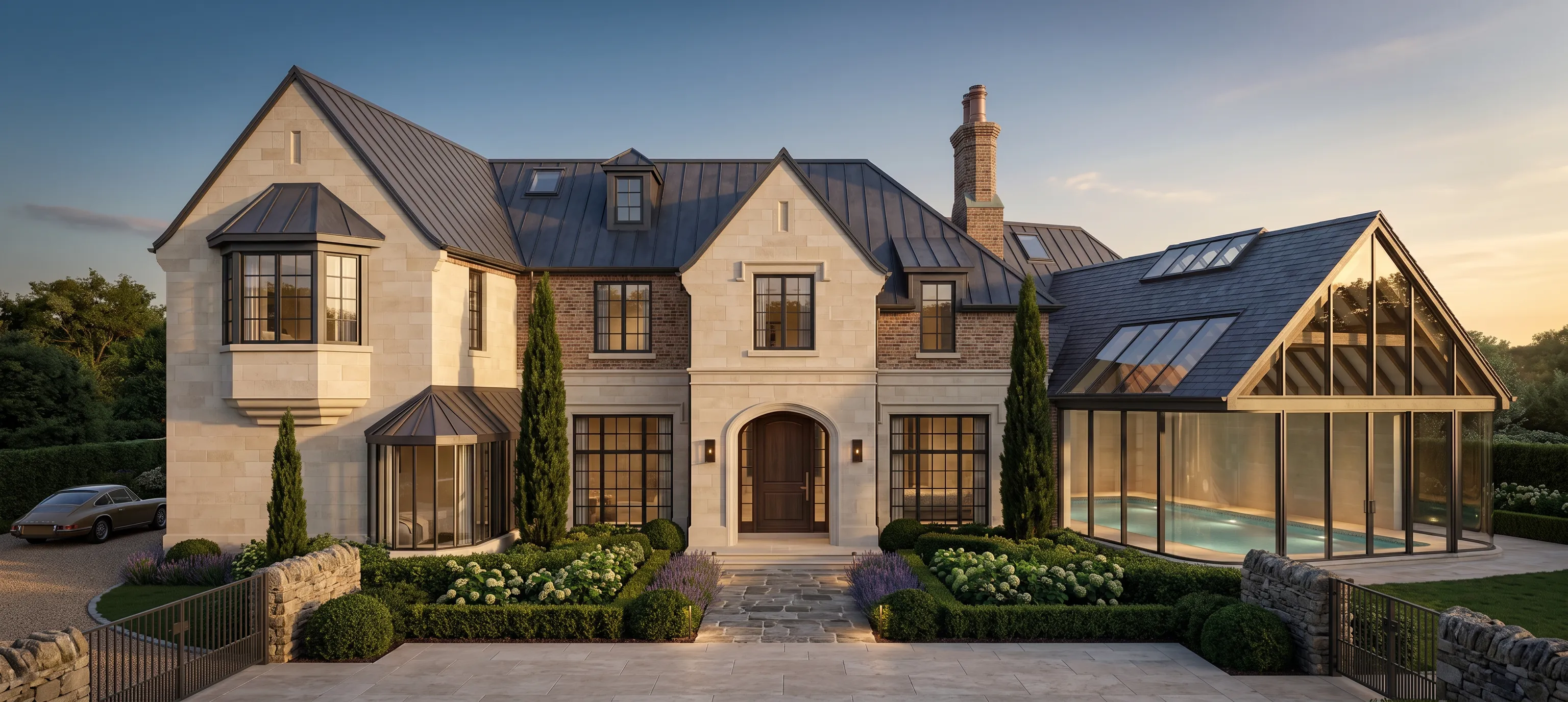
The primary body color forms the foundation of your entire exterior palette, covering roughly 60% of your total building envelope.
Selecting your main house color requires evaluating how light reflects across large physical wall surfaces under direct, unguided sunlight.
Look closer: paint colors always appear 10% to 20% lighter and significantly brighter outdoors than they do inside a store. A shade that looks like a cozy, rich cream on a 2-inch swatch can easily wash out into a glaring, blinding white across a two-story elevation at mid-day.
When picking your primary body shade, opt for low-saturation tones with grounding undertones—such as warm alabaster, mineral gray, or muted slate—to keep your home looking substantial and rich under intense daylight.
Pick a Trim Color That Complements It
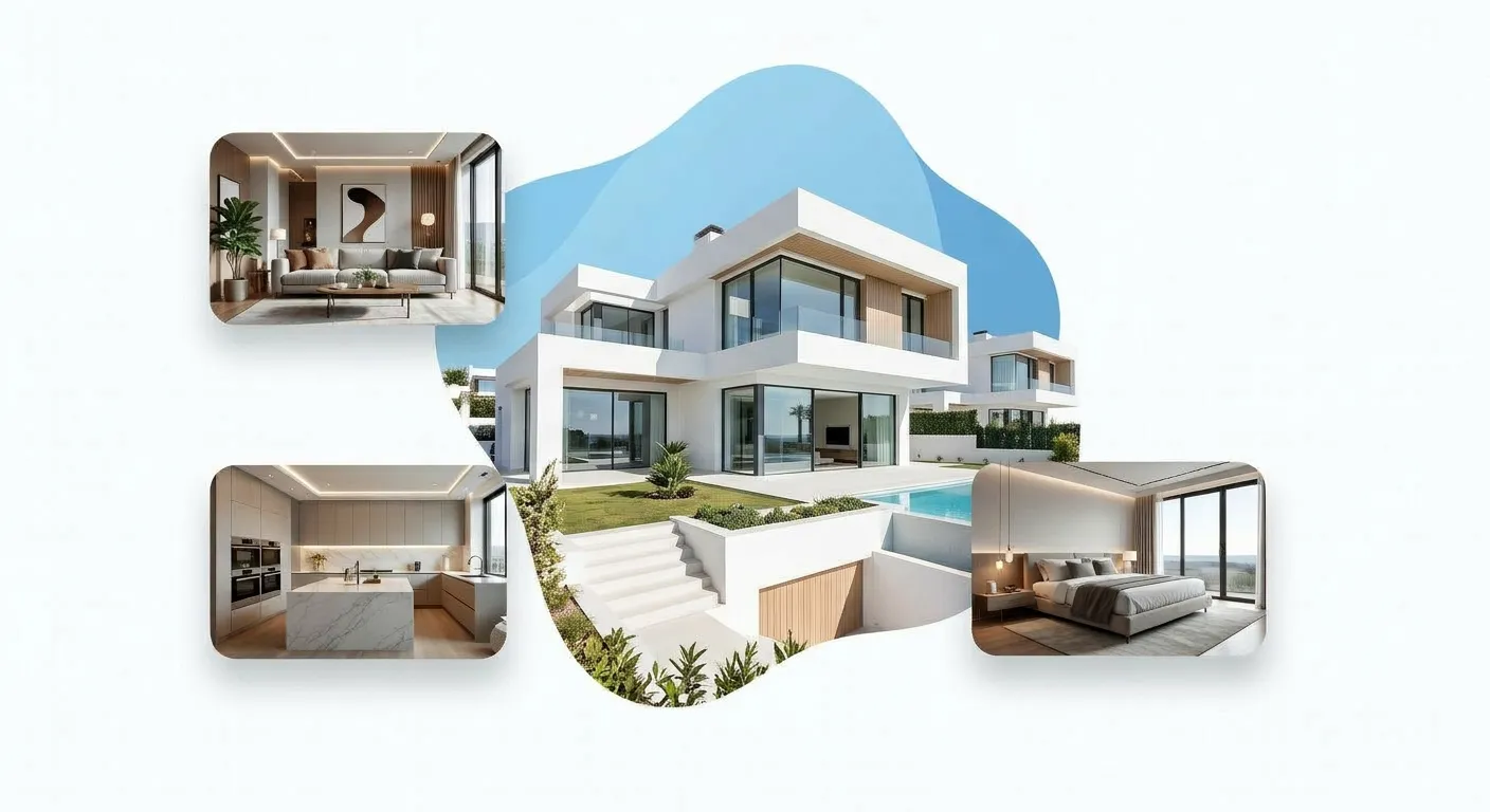
Here is where standard DIY paint jobs fail: homeowners treat window trim, roof eaves, and corner boards as an afterthought, painting them either flat builder-white or matching them directly to the wall color.
According to visual Gestalt principles, human sight organizes complex visual structures through grouping and edge alignment. Your trim acts as a geometric frame that defines the architecture.
And it gets better: applying dark bronze or matte black to narrow window casings instantly gives plain vinyl or wood frames the sleek appearance of expensive custom anodized aluminum windows.
Ensuring your house color and trim combinations maintain deliberate contrast creates clean architectural shadow lines that make the whole house look well-crafted.
Choose an Accent Color for the Front Door
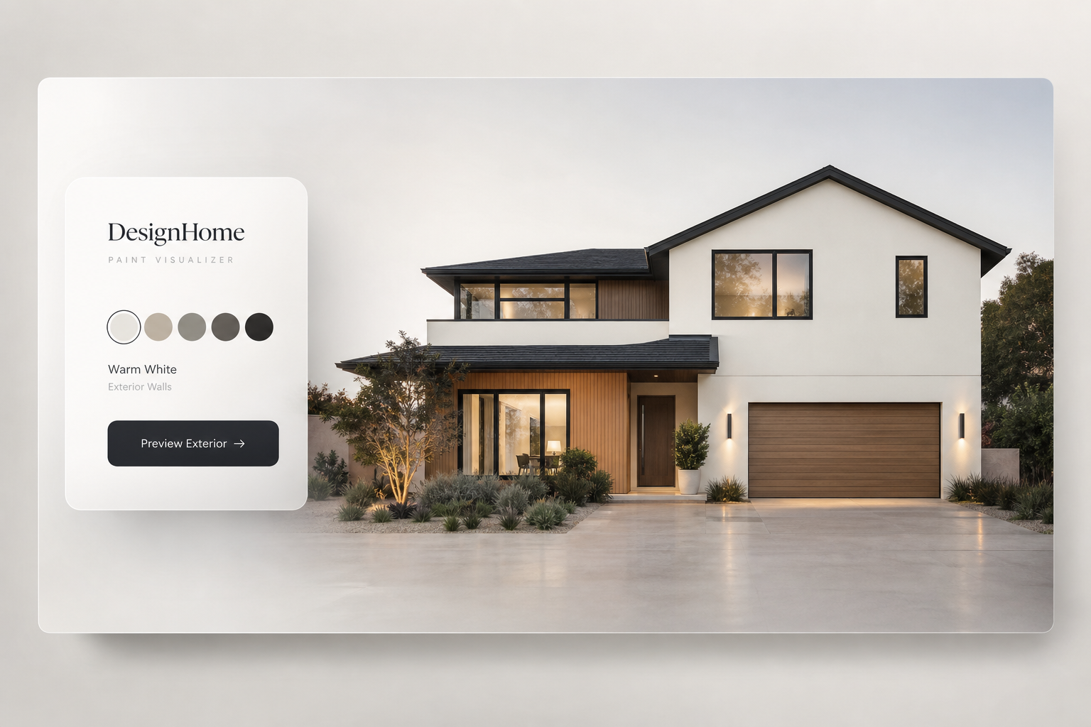
Your front entrance is the absolute crown jewel of your home's facade. In color psychology, this is where you deploy your 10% accent ratio to build an intentional focal anchor.
Instead of playing it safe with an uninspired neutral, explore high-value front door color ideas that draw immediate visual interest.
The front entrance is the one zone on your exterior where saturated colors or rich natural wood stains belong.
Whether you choose a deep nautical navy, a vibrant burnt terracotta, or a rich stained hardwood finish, your front door should stand out clearly against your body and trim colors, guiding guests straight to your entryway.
Consider the Roof Before Choosing Paint
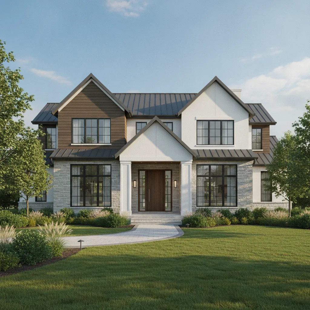
Here’s a massive mistake that costs homeowners thousands: picking wall paint without taking the existing roof shingles or metal tiles into account.
Your roof covers up to 40% of your home's visible profile, and unlike trim paint, replacing a roof purely for color matching is financially impractical.
Look at your roof under natural sunlight:
- Black or Charcoal Shingles: Function as cool neutrals, giving you total freedom to use crisp whites, modern grays, blues, or deep charcoals.
- Brown, Earth, or Cedar Shingles: Carry heavy warm yellow, red, or orange undertones. They require warm wall bases like creamy alabasters, soft olive greens, or muted beige to prevent visual clashing.
- Red Terracotta Tiles: Demand earthy, Mediterranean-inspired wall tones like soft warm ochre, off-white, or sand.
Treating your roof as an unchangeable anchor ensures your new wall paint seamlessly integrates with the rest of the structure.
Think About Sunlight and Surroundings
Have you ever wondered why a paint color looks stunning on a sample board but turns harsh or washed out once painted on an exterior wall?
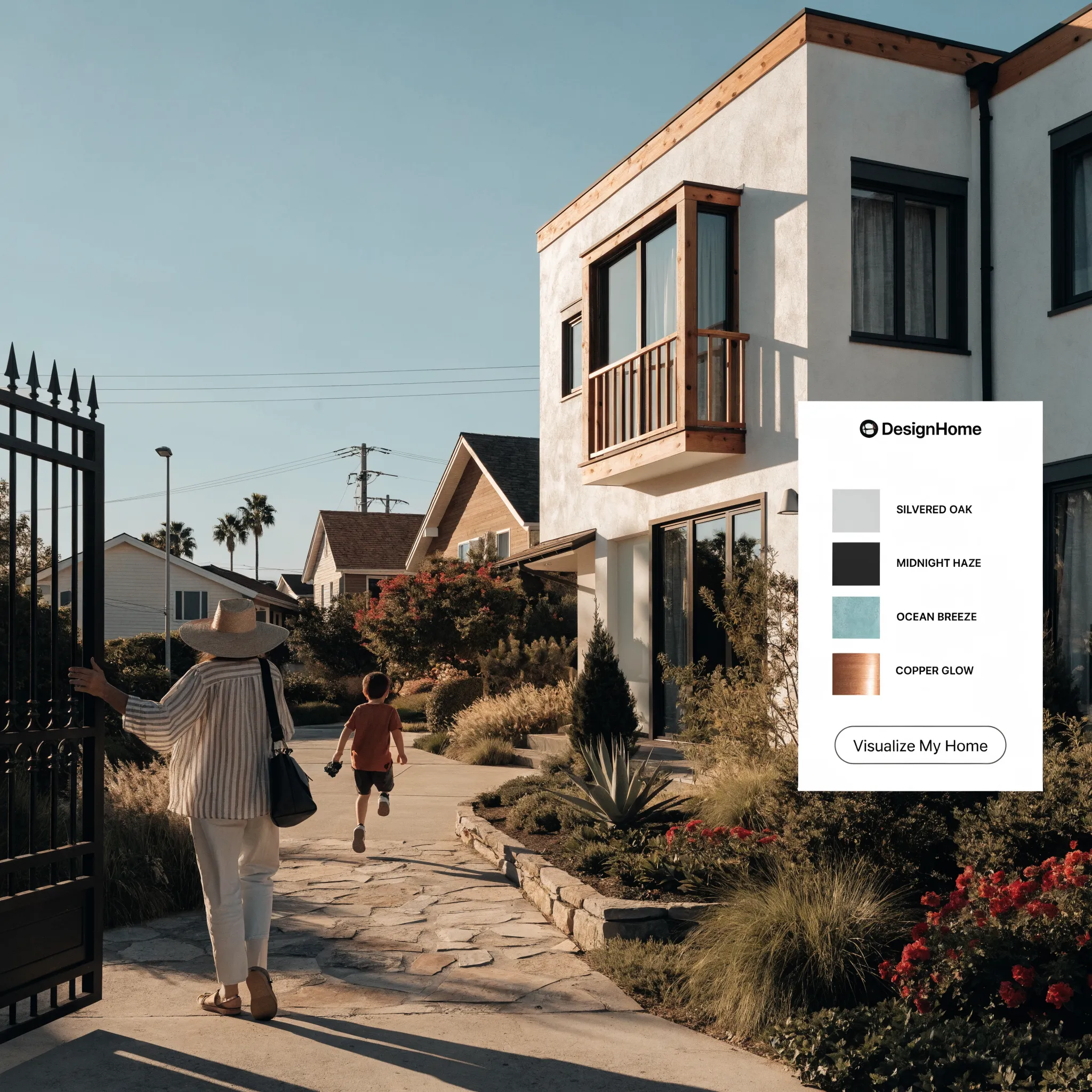
It comes down to natural light orientation and environmental reflection. The direction your house faces completely alters how color pigments behave throughout the day.
Applying Loss Avoidance principles means testing colors in their actual real-world environment before buying gallons of paint:
- North-Facing Walls: Receive indirect, cool-toned daylight that draws out gray and blue undertones. Use warm-based whites or greiges to prevent the home from looking chilly or flat.
- South-Facing Walls: Absorbs continuous, intense direct sunlight. Light pastel paint will wash out completely, while high-saturation colors can appear aggressively vivid.
- Heavy Foliage Surroundings: Bright green lawns and large tree canopies reflect green light directly onto your lower exterior walls, causing light gray paint to take on an unwanted greenish tint.
Accounting for natural lighting conditions stops you from falling for tricky swatch misrepresentations.
Use the Right Number of Exterior Colors
Here is a golden rule in architectural design: never overcrowd your exterior color scheme. Using five or six different paint colors across a single facade destroys visual order, making your home look chaotic and disjointed.
Rely on the proven Three-Color Rule to build balanced house exterior color combinations:
Limiting your core palette to three coordinated shades keeps the eyes focused on your home's structural geometry rather than competing paint colors.
If you want to introduce additional depth, vary the shade or sheen of your primary colors (using flat sheen on body siding and semi-gloss on trims) rather than adding entirely new colors to the mix.

Compare Light, Neutral, and Bold House Colors
Which overall aesthetic direction best aligns with your goals? Choosing between light, neutral, or dark exterior palettes completely transforms how your property is perceived within the neighborhood.
Pay attention to this: light colors make a home feel larger and more expansive on its lot, while dark charcoal and deep navy tones pull the home inward, creating a sleek, dramatic silhouette against surrounding trees.
Selecting the right color direction sets the overall mood for your entire exterior redesign.
See the Colors on Your Actual House Before Painting
Here is the biggest game-changer in modern home improvement: you no longer need to spend hundreds of dollars on paint sample pots, climb ladders to paint random test patches on siding, or rely on guesswork swatches.
Choosing paint colors is widely recognized as the single most critical decision step after designing or building a home. Whether you are painting a newly constructed property or updating a semi-furnished space, seeing how colors interact across your actual walls before buying paint saves immense time and stress.
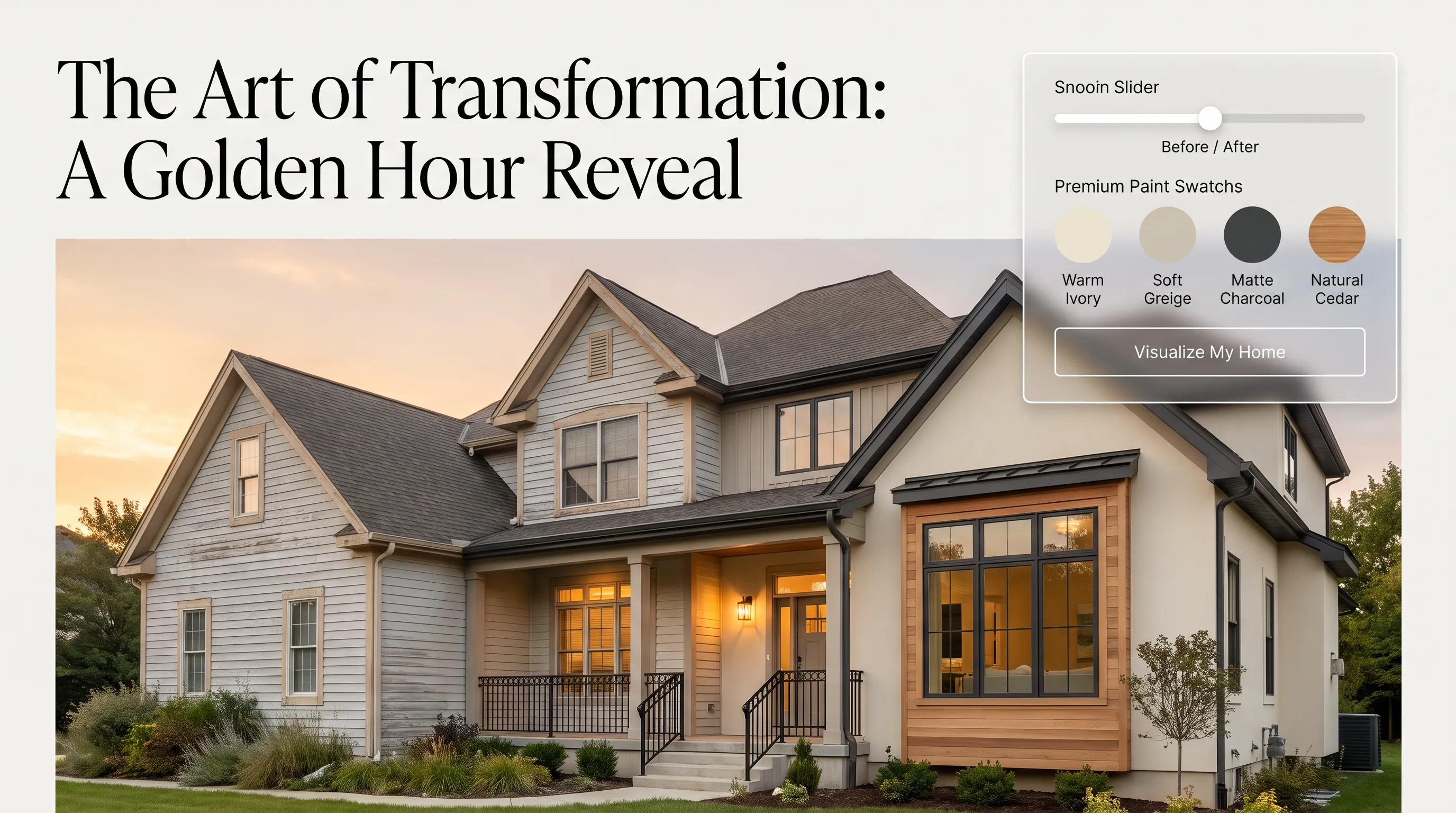
This is where advanced architectural visual intelligence changes everything. By using DesignHome Synthesis™, you can upload a photo of your house or floor plan into our layout intelligence system and instantly discover tailored color palettes designed for your space.
Unlike generic swatch tools or standard AI filters, DesignHome Synthesis™ evaluates state-of-the-art architectural research and lighting models. It projects how undertones behave across dynamic daylight conditions, ensuring your home looks modern and fresh for the next decade.
You can swap primary body colors, try high-contrast bronze trims, test wood-stained front doors, and preview warm 2700K night lighting schemes side-by-side.
Visualizing changes on your actual home eliminates costly trial-and-error mistakes, giving you complete confidence in your final selection.

Check Your Color Combination From Different Angles
Before finalizing your paint order, walk around your home to evaluate how your proposed palette looks from multiple viewing angles and distances.
A color combination that looks stunning up close on your front porch must also maintain its visual balance from the street curb 50 feet away.
Checking your colors under direct morning sunlight, flat afternoon shade, and evening dusk ensures your palette looks beautiful at any hour.
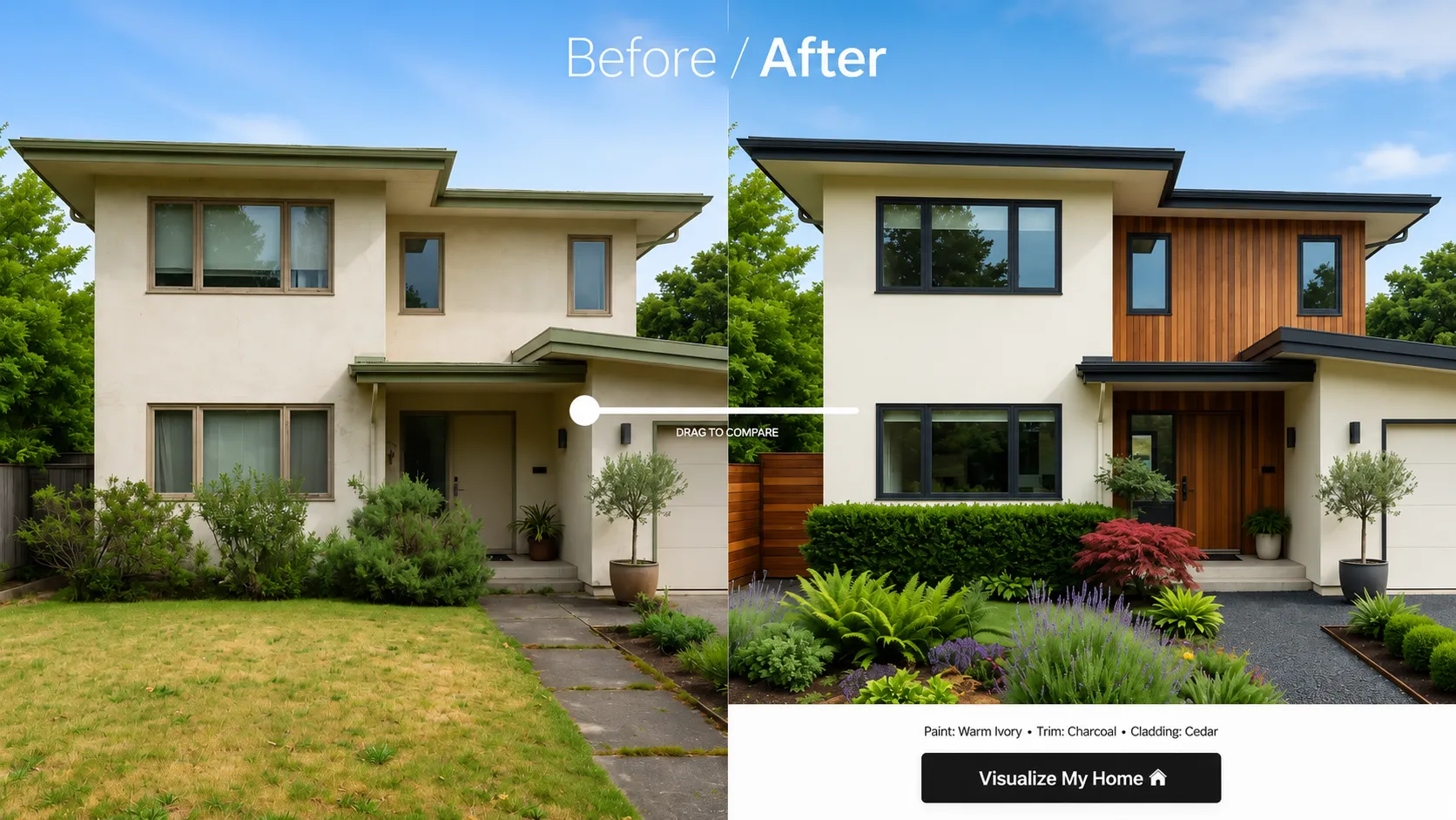
Choose a House Color Palette You Can Commit To
It is time to make your final choice. Grounding your selection in architectural proportions, real-world lighting conditions, and validated visual previews allows you to lock in your paint order with absolute certainty.
Use this final decision framework to confirm your palette before hiring a professional painter or opening your first paint can:
When every box is checked, your paint decision is complete.
By leveraging digital planning tools like DesignHome Synthesis™ and sticking to proven color ratios, you take the stress out of painting. You end up with a beautifully coordinated exterior that brings daily pride and long-term equity to your home.
Choosing House Paint Colors: Answers to Common Paint Selection Questions
Picking the right paint colors for your home often feels like trying to solve a puzzle with a thousand identical pieces. A subtle greige swatch can shift into a muddy olive green on a south-facing wall, while an elegant off-white can turn into a cold, clinical glare under midday sunlight.
Before you invest thousands in professional painting crews or buy endless sample pots, you need to know how pigments behave across large architectural surfaces.
Here are the 12 definitive answers to your biggest paint selection, lighting, and exterior color coordination questions.
How do I choose an exterior paint palette that won't look outdated in five years?
Stick to low-saturation tones derived from natural mineral bases—think warm alabaster, slate blue, mineral greige, or soft olive. Trend-heavy neon accents or extreme contrast schemes fall out of favor quickly. Choosing muted base shades anchored by organic undertones ensures your building facade remains timeless and sophisticated well into the next decade.
What is the 60-30-10 rule, and how does it apply to house paint?
The 60-30-10 rule is a visual ratio that creates automatic balance across any surface:
- 60% Primary Body: Your main wall siding, stucco, or brick color.
- 30% Secondary Trim: Window casings, roof eaves, fascia boards, and garage frames.
- 10% Accent Anchor: Your front entry door, timber shutters, or portico details.
Following this split prevents colors from competing with each other, giving your home clear visual structure and spatial depth.
Why does paint look so much lighter on an exterior wall than on the swatch?
Direct sunlight washes out paint pigments by up to 20%. In addition, when a color is expanded from a tiny two-inch paper card onto thousands of square feet of outdoor siding, the reflected light intensifies the shade. Always choose a paint tone that is one step darker and slightly more muted than what looks ideal on an indoor swatch card.
How do I pick paint colors that match my roof or existing stone?
Your roof, brickwork, and stone foundations are fixed features—replacing them just to match paint is rarely an option. Group these fixed features into cool or warm undertones first:
Matching your paint base to the undertones of your masonry creates seamless visual harmony across the entire structure.
Should trim color match or contrast with the house body?
Contrast creates definition, while monochromatic matching creates scale. Dark bronze or black trim against light siding frames your window openings, producing a sleek, modern architectural look. Conversely, painting trim in a shade close to your wall color softens building edges, making smaller homes appear larger and more cohesive.
What front door colors boost curb appeal without clashing?
Your front door serves as the primary focal point of the entrance. If your house body and trim are quiet neutrals, your front door is where you can safely introduce high-saturation color. Deep indigo blue, rich crimson red, forest sage, or a natural stained timber finish draw the eye straight to the entryway without overpowering the surrounding facade.
How does sun exposure (North vs. South) change how paint looks?
Natural lighting orientation completely alters color presentation throughout the day:
- North-Facing Walls: Receive indirect, cool blue light. Soft grays or pure whites can look chilly or dingy here. Use warm-based whites or greiges to balance the shadows.
- South-Facing Walls: Absorbs continuous, intense sunlight. Pastels wash out instantly, while dark colors look crisp and rich. Warm undertones will appear significantly more golden.
Can I paint my house dark charcoal or navy without causing fading?
Yes, but you must select the right paint formula. Dark colors absorb more solar heat and UV radiation, which can accelerate pigment breakdown and surface heating. When going dark, choose 100% acrylic latex paints equipped with fade-resistant inorganic pigments and high UV-blocking resins to maintain color integrity over time.
How many paint colors are too many for one house exterior?
According to Hick’s Law, introducing too many choices creates visual clutter and friction. Capping your core exterior palette at three distinct colors (Body, Trim, Accent) maintains visual order. If you want to add more depth, alter the sheen (e.g., flat on siding, semi-gloss on trim) or shift a primary color by one shade rather than introducing a fourth unique hue.
How do I visualize new paint colors on my house before buying gallons of paint?
You don't need to spend money on sample pots, paint messy test patches on your siding, or hire an expensive 3D rendering agency just to see what works.
With DesignHome Synthesis™, you can upload a photo of your existing house or room to test custom paint colors, trim contrasts, and front door finishes instantly. Our layout intelligence system models real-world lighting shifts, surface textures, and 10-year architectural trends so you can preview dozens of color palettes on your actual building, giving you total confidence before buying a single can of paint.
What is Light Reflectance Value (LRV), and why does it matter?
LRV measures the percentage of light a paint color reflects on a scale from 0 (pure black, absorbing all light) to 100 (pure white, reflecting all light). Exterior body paint typically performs best in the 40 to 70 LRV range. Tones with an LRV above 80 can cause blinding glare in direct sunlight, while tones below 20 absorb significant thermal heat.
How do I pick paint colors that fit HOA guidelines while keeping my home unique?
Start by reviewing your HOA’s approved color palette list to identify the baseline boundaries. To stand out tastefully within those rules, play with low-risk high-impact accent zones: upgrade your front door to a rich wood stain or custom hue, increase the contrast between your casing trim and main siding, or install modern 2700K exterior wall sconces to highlight architectural textures at night.


